Content from Before we Start
Last updated on 2025-01-14 | Edit this page
Estimated time: 40 minutes
- The main goal here is to help the learners be comfortable with the RStudio interface.
- Go very slowly in the “Getting set up” section. Make sure everyone
is following along (remind learners to use the stickies). Plan with the
helpers at this point to go around the room, and be available to help.
It’s important to make sure that learners are in the correct working
directory, and that they create a
data(all lowercase) subfolder.
Overview
Questions
- How to find your way around RStudio?
- How to interact with R?
- How to manage your environment?
- How to install packages?
Objectives
- Install latest version of R.
- Install latest version of RStudio.
- Navigate the RStudio GUI.
- Install additional packages using the packages tab.
- Install additional packages using R code.
What is R? What is RStudio?
The term “R” is used to refer to both the programming
language and the software that interprets the scripts written using
it.
RStudio is currently a very popular way to not only write your R scripts but also to interact with the R software. To function correctly, RStudio needs R and therefore both need to be installed on your computer.
To make it easier to interact with R, we will use RStudio. RStudio is the most popular IDE (Integrated Development Environment) for R. An IDE is a piece of software that provides tools to make programming easier.
You can also use the R Presentations feature to present your work in an HTML5 presentation mixing Markdown and R code. You can display these within R Studio or your browser. There are many options for customising your presentation slides, including an option for showing LaTeX equations. This can help you collaborate with others and also has an application in teaching and classroom use.
Why learn R?
R does not involve lots of pointing and clicking, and that’s a good thing
The learning curve might be steeper than with other software but with R, the results of your analysis do not rely on remembering a succession of pointing and clicking, but instead on a series of written commands, and that’s a good thing! So, if you want to redo your analysis because you collected more data, you don’t have to remember which button you clicked in which order to obtain your results; you just have to run your script again.
Working with scripts makes the steps you used in your analysis clear, and the code you write can be inspected by someone else who can give you feedback and spot mistakes.
Working with scripts forces you to have a deeper understanding of what you are doing, and facilitates your learning and comprehension of the methods you use.
R code is great for reproducibility
Reproducibility is when someone else (including your future self) can obtain the same results from the same dataset when using the same analysis.
R integrates with other tools to generate manuscripts from your code. If you collect more data, or fix a mistake in your dataset, the figures and the statistical tests in your manuscript are updated automatically.
An increasing number of journals and funding agencies expect analyses to be reproducible, so knowing R will give you an edge with these requirements.
To further support reproducibility and transparency, there are also packages that help you with dependency management: keeping track of which packages we are loading and how they depend on the package version you are using. This helps you make sure existing workflows work consistently and continue doing what they did before.
Packages like renv let you “save” and “load” the state of your project library, also keeping track of the package version you use and the source it can be retrieved from.
R is interdisciplinary and extensible
With 10,000+ packages that can be installed to extend its capabilities, R provides a framework that allows you to combine statistical approaches from many scientific disciplines to best suit the analytical framework you need to analyze your data. For instance, R has packages for image analysis, GIS, time series, population genetics, and a lot more.
R works on data of all shapes and sizes
The skills you learn with R scale easily with the size of your dataset. Whether your dataset has hundreds or millions of lines, it won’t make much difference to you.
R is designed for data analysis. It comes with special data structures and data types that make handling of missing data and statistical factors convenient.
R can connect to spreadsheets, databases, and many other data formats, on your computer or on the web.
R produces high-quality graphics
The plotting functionalities in R are endless, and allow you to adjust any aspect of your graph to convey most effectively the message from your data.
R has a large and welcoming community
Thousands of people use R daily. Many of them are willing to help you through mailing lists and websites such as Stack Overflow, or on the RStudio community. Questions which are backed up with short, reproducible code snippets are more likely to attract knowledgeable responses.
Not only is R free, but it is also open-source and cross-platform
Anyone can inspect the source code to see how R works. Because of this transparency, there is less chance for mistakes, and if you (or someone else) find some, you can report and fix bugs.
Because R is open source and is supported by a large community of developers and users, there is a very large selection of third-party add-on packages which are freely available to extend R’s native capabilities.


RStudio extends what R can do, and makes it easier to write R code and interact with R. Left photo credit; Right photo credit.
A tour of RStudio
Knowing your way around RStudio
Let’s start by learning about RStudio, which is an Integrated Development Environment (IDE) for working with R.
The RStudio IDE open-source product is free under the Affero General Public License (AGPL) v3. The RStudio IDE is also available with a commercial license and priority email support from RStudio, Inc.
We will use the RStudio IDE to write code, navigate the files on our computer, inspect the variables we create, and visualize the plots we generate. RStudio can also be used for other things (e.g., version control, developing packages, writing Shiny apps) that we will not cover during the workshop.
One of the advantages of using RStudio is that all the information you need to write code is available in a single window. Additionally, RStudio provides many shortcuts, autocompletion, and highlighting for the major file types you use while developing in R. RStudio makes typing easier and less error-prone.
Getting set up
It is good practice to keep a set of related data, analyses, and text self-contained in a single folder called the working directory. All of the scripts within this folder can then use relative paths to files. Relative paths indicate where inside the project a file is located (as opposed to absolute paths, which point to where a file is on a specific computer). Working this way makes it a lot easier to move your project around on your computer and share it with others without having to directly modify file paths in the individual scripts.
RStudio provides a helpful set of tools to do this through its “Projects” interface, which not only creates a working directory for you but also remembers its location (allowing you to quickly navigate to it). The interface also (optionally) preserves custom settings and open files to make it easier to resume work after a break.
Create a new project
- Under the
Filemenu, click onNew project, chooseNew directory, thenNew project - Enter a name for this new folder (or “directory”) and choose a
convenient location for it. This will be your working
directory for the rest of the day (e.g.,
~/data-carpentry) - Click on
Create project - Create a new file where we will type our scripts. Go to File >
New File > R script. Click the save icon on your toolbar and save
your script as “
script.R”.
The simplest way to open an RStudio project once it has been created
is to navigate through your files to where the project was saved and
double click on the .Rproj (blue cube) file. This will open
RStudio and start your R session in the same directory
as the .Rproj file. All your data, plots and scripts will
now be relative to the project directory. RStudio projects have the
added benefit of allowing you to open multiple projects at the same time
each open to its own project directory. This allows you to keep multiple
projects open without them interfering with each other.
The RStudio Interface
Let’s take a quick tour of RStudio.
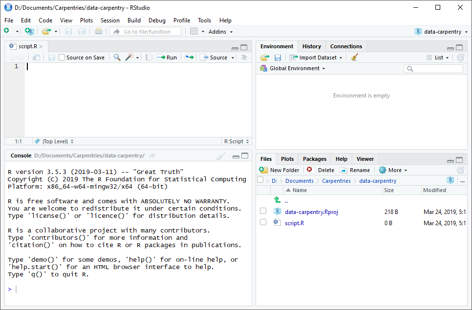
RStudio is divided into four “panes”. The placement of these panes and their content can be customized (see menu, Tools -> Global Options -> Pane Layout).
The Default Layout is:
- Top Left - Source: your scripts and documents
- Bottom Left - Console: what R would look and be like without RStudio
- Top Right - Environment/History: look here to see what you have done
- Bottom Right - Files and more: see the contents of the project/working directory here, like your Script.R file
Organizing your working directory
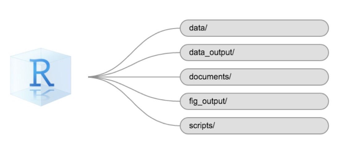
Using a consistent folder structure across your projects will help keep things organized and make it easy to find/file things in the future. This can be especially helpful when you have multiple projects. In general, you might create directories (folders) for scripts, data, and documents. Here are some examples of suggested directories:
-
data/Use this folder to store your raw data and intermediate datasets. For the sake of transparency and provenance, you should always keep a copy of your raw data accessible and do as much of your data cleanup and preprocessing programmatically (i.e., with scripts, rather than manually) as possible. -
data_output/When you need to modify your raw data, it might be useful to store the modified versions of the datasets in a different folder. -
documents/Used for outlines, drafts, and other text. -
fig_output/This folder can store the graphics that are generated by your scripts. -
scripts/A place to keep your R scripts for different analyses or plotting.
You may want additional directories or subdirectories depending on your project needs, but these should form the backbone of your working directory.
The working directory
The working directory is an important concept to understand. It is the place where R will look for and save files. When you write code for your project, your scripts should refer to files in relation to the root of your working directory and only to files within this structure.
Using RStudio projects makes this easy and ensures that your working
directory is set up properly. If you need to check it, you can use
getwd(). If for some reason your working directory is not
the same as the location of your RStudio project, it is likely that you
opened an R script or RMarkdown file not your
.Rproj file. You should close out of RStudio and open the
.Rproj file by double clicking on the blue cube! If you
ever need to modify your working directory in a script,
setwd('my/path') changes the working directory. This should
be used with caution since it makes analyses hard to share across
devices and with other users.
Downloading the data and getting set up
For this lesson we will use the following folders in our working
directory: data/,
data_output/ and
fig_output/. Let’s write them all in
lowercase to be consistent. We can create them using the RStudio
interface by clicking on the “New Folder” button in the file pane
(bottom right), or directly from R by typing at console:
R
dir.create("data")
dir.create("data_output")
dir.create("fig_output")
You can either download the data used for this lesson from GitHub or
with R. You can copy the data from this GitHub
link and paste it into a file called
youtube-27082024-open-refine-200-na.csv in the
data/ directory you just created. Or you can do this
directly from R by copying and pasting this in your terminal (your
instructor can place this chunk of code in the Etherpad):
R
download.file(
  "https://raw.githubusercontent.com/marionwalton/media-test/main/episodes/data/youtube-27082024-open-refine-200-na.csv",
  "youtube-27082024-open-refine-200-na.csv", mode = "wb"
  )
Interacting with R
The basis of programming is that we write down instructions for the computer to follow, and then we tell the computer to follow those instructions. We write, or code, instructions in R because it is a common language that both the computer and we can understand. We call the instructions commands and we tell the computer to follow the instructions by executing (also called running) those commands.
There are two main ways of interacting with R: by using the console or by using script files (plain text files that contain your code). The console pane (in RStudio, the bottom left panel) is the place where commands written in the R language can be typed and executed immediately by the computer. It is also where the results will be shown for commands that have been executed. You can type commands directly into the console and press Enter to execute those commands, but they will be forgotten when you close the session.
Because we want our code and workflow to be reproducible, it is better to type the commands we want in the script editor and save the script. This way, there is a complete record of what we did, and anyone (including our future selves!) can easily replicate the results on their computer.
RStudio allows you to execute commands directly from the script editor by using the Ctrl + Enter shortcut (on Mac, Cmd + Return will work). The command on the current line in the script (indicated by the cursor) or all of the commands in selected text will be sent to the console and executed when you press Ctrl + Enter. If there is information in the console you do not need anymore, you can clear it with Ctrl + L. You can find other keyboard shortcuts in this RStudio cheatsheet about the RStudio IDE.
At some point in your analysis, you may want to check the content of a variable or the structure of an object without necessarily keeping a record of it in your script. You can type these commands and execute them directly in the console. RStudio provides the Ctrl + 1 and Ctrl + 2 shortcuts allow you to jump between the script and the console panes.
If R is ready to accept commands, the R console shows a
> prompt. If R receives a command (by typing,
copy-pasting, or sent from the script editor using Ctrl +
Enter), R will try to execute it and, when ready, will show
the results and come back with a new > prompt to wait
for new commands.
If R is still waiting for you to enter more text, the console will
show a + prompt. It means that you haven’t finished
entering a complete command. This is likely because you have not
‘closed’ a parenthesis or quotation, i.e. you don’t have the same number
of left-parentheses as right-parentheses or the same number of opening
and closing quotation marks. When this happens, and you thought you
finished typing your command, click inside the console window and press
Esc; this will cancel the incomplete command and return you
to the > prompt. You can then proofread the command(s)
you entered and correct the error.
Installing additional packages using the packages tab
In addition to the core R installation, there are in excess of 10,000 additional packages which can be used to extend the functionality of R. Many of these have been written by R users and have been made available in central repositories, like the one hosted at CRAN, for anyone to download and install into their own R environment. You should have already installed the packages ‘ggplot2’ and ’dplyr. If you have not, please do so now using these instructions.
You can see if you have a package installed by looking in the
packages tab (on the lower-right by default). You can also
type the command installed.packages() into the console and
examine the output.
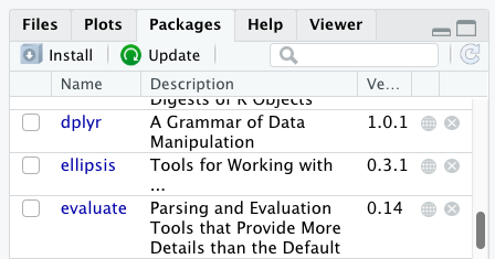
Additional packages can be installed from the ‘packages’ tab. On the packages tab, click the ‘Install’ icon and start typing the name of the package you want in the text box. As you type, packages matching your starting characters will be displayed in a drop-down list so that you can select them.
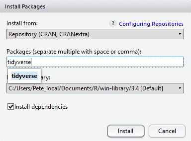
At the bottom of the Install Packages window is a check box to ‘Install’ dependencies. This is ticked by default, which is usually what you want. Packages can (and do) make use of functionality built into other packages, so for the functionality contained in the package you are installing to work properly, there may be other packages which have to be installed with them. The ‘Install dependencies’ option makes sure that this happens.
Exercise
Use both the Console and the Packages tab to confirm that you have the tidyverse installed.
Scroll through packages tab down to ‘tidyverse’. You can also type a few characters into the searchbox. The ‘tidyverse’ package is really a package of packages, including ‘ggplot2’ and ‘dplyr’, both of which require other packages to run correctly. All of these packages will be installed automatically. Depending on what packages have previously been installed in your R environment, the install of ‘tidyverse’ could be very quick or could take several minutes. As the install proceeds, messages relating to its progress will be written to the console. You will be able to see all of the packages which are actually being installed.
Because the install process accesses the CRAN repository, you will need an Internet connection to install packages.
It is also possible to install packages from other repositories, as well as Github or the local file system, but we won’t be looking at these options in this lesson.
Installing additional packages using R code
If you were watching the console window when you started the install of ‘tidyverse’, you may have noticed that the line
R
install.packages("tidyverse")
was written to the console before the start of the installation messages.
You could also have installed the
tidyverse packages by running this command
directly at the R terminal.
We will be using another package called
here throughout the workshop to manage
paths and directories. We will discuss it more detail in a later
episode, but we will install it now in the console:
R
install.packages("here")
Key Points
- Use RStudio to write and run R programs.
- Use
install.packages()to install packages (libraries).
Content from Introduction to R
Last updated on 2025-01-14 | Edit this page
Estimated time: 80 minutes
- The main goal is to introduce users to the various objects in R, from atomic types to creating your own objects.
- While this epsiode is foundational, be careful not to get caught in the weeds as the variety of types and operations can be overwhelming for new users, especially before they understand how this fits into their own “workflow.”
Overview
Questions
- What data types are available in R?
- What is an object?
- How can values be initially assigned to variables of different data types?
- What arithmetic and logical operators can be used?
- How can subsets be extracted from vectors?
- How does R treat missing values?
- How can we deal with missing values in R?
Objectives
- Define the following terms as they relate to R: object, assign, call, function, arguments, options.
- Assign values to objects in R.
- Learn how to name objects.
- Use comments to inform script.
- Solve simple arithmetic operations in R.
- Call functions and use arguments to change their default options.
- Inspect the content of vectors and manipulate their content.
- Subset values from vectors.
- Analyze vectors with missing data.
Creating objects in R
You can get output from R simply by typing math in the console:
R
3 + 5
OUTPUT
[1] 8R
12 / 7
OUTPUT
[1] 1.714286However, to do useful and interesting things, we need to assign values to objects.
Let’s start by imagining we are creating a tiny dataset by hand. To do this we’ll store the information about three videos posted to YouTube. Each video has associated information such as its:
- video id (a unique text identifying the video stored in the object named video_id)
- duration in seconds (a number stored in the object named duration_sec)
- view count (a number stored in the object named view_count)
- comment count (a number stored in the object named comment_count)
- category label (a text label stored in the object named category_label)
To create an object, we need to give it a name followed by the
assignment operator <-, and the value we want to give
it:
R
duration_sec <- 1000
In this case our first video is 1000 seconds in duration.
We set the duration by using <- or the assignment
operator. It assigns values on the right to objects on the left.
So, after we execute view_count <- 1000, the value of
view_count is set to 1000.
The arrow can be read as 3 goes into
view_count. For historical reasons, you can also use
= for assignments, but not in every context. Because of the
slight
differences in syntax, it is good practice to always use
<- for assignments. More generally we prefer the
<- syntax over = because it makes it clear
what direction the assignment is operating (left assignment), and it
increases the read-ability of the code.
In RStudio, typing Alt + - (push Alt
at the same time as the - key) will write <-
in a single keystroke in a PC, while typing Option +
- (push Option at the same time as the
- key) does the same in a Mac.
Objects can be given any name such as category_name,
view_count, or video_id. You want your object
names to be explicit and not too long. They cannot start with a number
(2x is not valid, but x2 is). R is case
sensitive (e.g., age is different from Age).
There are some names that cannot be used because they are the names of
fundamental objects in R (e.g., if, else,
for, see here
for a complete list). In general, even if it’s allowed, it’s best to not
use them (e.g., c, T, mean,
data, df, weights). If in doubt,
check the help to see if the name is already in use. It’s also best to
avoid dots (.) within an object name as in
my.dataset. There are many objects in R with dots in their
names for historical reasons, but because dots have a special meaning in
R (for methods) and other programming languages, it’s best to avoid
them. The recommended writing style is called snake_case, which implies
using only lowercaseletters and numbers and separating each word with
underscores (e.g., animals_weight, average_income). It is also
recommended to use nouns for object names, and verbs for function names.
It’s important to be consistent in the styling of your code (where you
put spaces, how you name objects, etc.). Using a consistent coding style
makes your code clearer to read for your future self and your
collaborators. In R, three popular style guides are Google’s, Jean Fan’s and the tidyverse’s. The tidyverse’s is
very comprehensive and may seem overwhelming at first. You can install
the lintr
package to automatically check for issues in the styling of your
code.
Objects vs. variables
What are known as objects in R are known as
variables in many other programming languages. Depending on
the context, object and variable can have
drastically different meanings. However, in this lesson, the two words
are used synonymously. For more information see: https://cran.r-project.org/doc/manuals/r-release/R-lang.html#Objects
When assigning a value to an object, R does not print anything. You can force R to print the value by using parentheses or by typing the object name:
R
duration_sec <- 100    # doesn't print anything
(duration_sec <- 100)  # putting parenthesis around the call prints the value of `area_hectares`
OUTPUT
[1] 100R
duration_sec # and so does typing the name of the object
OUTPUT
[1] 100Now that R has a value for duration_sec in memory, we
can do arithmetic with it. For instance, we may want to convert the
seconds into minutes (minutes are the time in seconds divided by
60):
R
duration_sec / 60
OUTPUT
[1] 1.666667We can also change an object’s value by assigning it a new one:
R
duration_sec <- 600
duration_sec / 60
OUTPUT
[1] 10This means that assigning a value to one object does not change the values of other objects.
For example, let’s store the duration in minutes in a new object,
duration_min:
R
duration_min <- duration_sec/60
and then change duration_sec to 2400.
R
duration_sec <- 2400
Exercise
What do you think is the current content of the object
duration_min? 40 or 10
The value of duration_min is still 10 because you have
not re-run the line duration_min <- duration_sec/60
since changing the value of duration_min.
Comments
All programming languages allow the programmer to include comments in their code. Including comments to your code has many advantages: it helps you explain your reasoning and it forces you to be tidy. A commented code is also a great tool not only to your collaborators, but to your future self. Comments are the key to a reproducible analysis.
To do this in R we use the # character. Anything to the
right of the # sign and up to the end of the line is
treated as a comment and is ignored by R. You can start lines with
comments or include them after any code on the line.
R
duration_sec <- 250      # duration in seconds
duration_min <- duration_sec /60  # convert to minutes
duration_min        # print duration in minutes
OUTPUT
[1] 4.166667RStudio makes it easy to comment or uncomment a paragraph: after selecting the lines you want to comment, press at the same time on your keyboard Ctrl + Shift + C. If you only want to comment out one line, you can put the cursor at any location of that line (i.e. no need to select the whole line), then press Ctrl + Shift + C.
Exercise
Create two variables like_count and
commment_count and assign them values.
Create a third variable ratio and give it a value based
on the current values of like_count and
comment_count. Show that changing the values of either
like_count and comment_count does not affect
the value of ratio.
R
like_count <- 100
comment_count <- 200
ratio <- like_count/comment_count
ratio
OUTPUT
[1] 0.5R
# change the values of like_count and comment_count
like_count <- 1000
comment_count <- 100
# the value of ratio isn't changed
ratio
OUTPUT
[1] 0.5Functions and their arguments
Functions are “canned scripts” that automate more complicated sets of
commands including operations assignments, etc. Many functions are
predefined, or can be made available by importing R packages
(more on that later). A function usually gets one or more inputs called
arguments. Functions often (but not always) return a
value. A typical example would be the function
nchar(), which returns the number of individual characters
in a word, sentence, or longer text. The input (the argument) must be a
string (text), and the return value (in fact, the output) is the number
of characters in the string. Executing a function (‘running it’) is
called calling the function. An example of a function call
is:
R
length <- nchar("Tweebuffelsmeteenskootmorsdoodgeskietfontein")
length
Here, the string
Tweebuffelsmeteenskootmorsdoodgeskietfontein is given to
the nchar() function, the nchar() function
counts the number of characters, and returns the value “44” which is
then assigned to the object length. This function has just
one argument.
The return ‘value’ of a function need not be numerical (like that of
nchar()), and it also does not need to be a single item: it
can be a set of things, or even a dataset. We’ll see that when we read
data files into R.
Arguments can be anything, not only numbers or filenames, but also other objects. Exactly what each argument means differs per function, and must be looked up in the documentation (see below). Some functions take arguments which may either be specified by the user, or, if left out, take on a default value: these are called options. Options are typically used to alter the way the function operates, such as whether it ignores ‘bad values’, or what symbol to use in a plot. However, if you want something specific, you can specify a value of your choice which will be used instead of the default.
Let’s try a function that can take multiple arguments:
paste().
R
paste("🚙","😊🕺")
OUTPUT
[1] "🚙 😊🕺"Here, we’ve called paste() with two arguments, “🚙” and
“😊🕺”, and it returns the string “🚙 😊🕺”. It has concatenated the
first argument (the car) with the second argument (the smiley and
dancing emoji). We can use args(paste) or look at the help
for this function using ?paste.
R
args(paste)
OUTPUT
function (..., sep = " ", collapse = NULL, recycle0 = FALSE)
NULL
R
?paste
We see that if we want to separate the terms with the | symbol, we
can type sep=| or any other separator.
R
paste("🚙","😊🕺","😳",sep="|")
OUTPUT
[1] "🚙|😊🕺|😳"It’s good practice to put the non-optional arguments (like the strings you’re pasting) first in your function call, and to specify the names of all optional arguments(like sep). If you don’t, someone reading your code might have to look up the definition of a function with unfamiliar arguments to understand what you’re doing.
R
paste0("🚙","😊🕺","😳",collapse="")
OUTPUT
[1] "🚙😊🕺😳"Exercise
Type in ?grepl at the console and then look at the
output in the Help pane. What other functions exist that are similar to
grepl? How do you use the ignore.case
parameter in the grepl function?
Vectors and data types

A vector is the most common and basic data type in R, and is pretty
much the workhorse of R. A vector is composed of a series of values,
which can be either numbers or characters. We can assign a series of
values to a vector using the c() function. For example we
can create a vector of the number of views of the videos we’re studying
and assign it to a new object view_count:
R
view_count <- c(120987, 789, 1, 2)
view_count
OUTPUT
[1] 120987 789 1 2A vector can also contain characters. For example, we can have a
vector of the categories content creators have used to classify their
YouTube videos (video_category_label):
R
video_category_label <- c("politics", "society", "business")
video_category_label
OUTPUT
[1] "politics" "society" "business"The quotes around “politics”, etc. are essential here. Without the
quotes R will assume there are objects called politics,
society and business. As these objects don’t
exist in R’s memory, there will be an error message.
There are many functions that allow you to inspect the content of a
vector. length() tells you how many elements are in a
particular vector:
R
length(view_count)
OUTPUT
[1] 4R
length(video_category_label)
OUTPUT
[1] 3An important feature of a vector, is that all of the elements are the
same type of data. The function typeof() indicates the type
of an object:
R
typeof(view_count)
OUTPUT
[1] "double"R
typeof(video_category_label)
OUTPUT
[1] "character"The function str() provides an overview of the structure
of an object and its elements. It is a useful function when working with
large and complex objects:
R
str(view_count)
OUTPUT
num [1:4] 120987 789 1 2R
str(video_category_label)
OUTPUT
chr [1:3] "politics" "society" "business"You can use the c() function to add other elements to
your vector:
R
default_l_audio_language <- c("en", "af", "zu")
default_l_audio_language <- c(default_l_audio_language, "fr") # add to the end of the vector
default_l_audio_language <- c("ar", default_l_audio_language) # add to the beginning of the vector
default_l_audio_language
OUTPUT
[1] "ar" "en" "af" "zu" "fr"In the first line, we take the original vector
default_l_audio_language, add the value "fr"
to the end of it, and save the result back into
default_l_audio_language. Then we add the value
"ar" to the beginning, again saving the result back into
default_l_audio_language.
We can do this over and over again to grow a vector, or assemble a dataset. As we program, this may be useful to add results that we are collecting or calculating.
An atomic vector is the simplest R data
type and is a linear vector of a single type. Above, we saw 2
of the 6 main atomic vector types that R uses:
"character" and "numeric" (or
"double"). These are the basic building blocks that all R
objects are built from. The other 4 atomic vector types
are:
-
"logical"forTRUEandFALSE(the boolean data type) -
"integer"for integer numbers (e.g.,2L, theLindicates to R that it’s an integer) -
"complex"to represent complex numbers with real and imaginary parts (e.g.,1 + 4i) and that’s all we’re going to say about them -
"raw"for bitstreams that we won’t discuss further
You can check the type of your vector using the typeof()
function and inputting your vector as the argument.
Vectors are one of the many data structures that R
uses. Other important ones are lists (list), matrices
(matrix), data frames (data.frame), factors
(factor) and arrays (array).
Exercise
We’ve seen that atomic vectors can be of type character, numeric (or double), integer, and logical. But what happens if we try to mix these types in a single vector?
R implicitly converts them to all be the same type.
Exercise (continued)
What will happen in each of these examples? (hint: use
class() to check the data type of your objects):
R
num_char <- c(1, 2, 3, "a")
num_logical <- c(1, 2, 3, TRUE)
char_logical <- c("a", "b", "c", TRUE)
tricky <- c(1, 2, 3, "4")
Why do you think it happens?
Vectors can be of only one data type. R tries to convert (coerce) the content of this vector to find a “common denominator” that doesn’t lose any information.
Exercise (continued)
How many values in combined_logical are
"TRUE" (as a character) in the following example:
R
num_logical <- c(1, 2, 3, TRUE)
char_logical <- c("a", "b", "c", TRUE)
combined_logical <- c(num_logical, char_logical)
Only one. There is no memory of past data types, and the coercion
happens the first time the vector is evaluated. Therefore, the
TRUE in num_logical gets converted into a
1 before it gets converted into "1" in
combined_logical.
Exercise (continued)
You’ve probably noticed that objects of different types get converted into a single, shared type within a vector. In R, we call converting objects from one class into another class coercion. These conversions happen according to a hierarchy, whereby some types get preferentially coerced into other types. Can you draw a diagram that represents the hierarchy of how these data types are coerced?
Subsetting vectors
Subsetting (sometimes referred to as extracting or indexing) involves accessing out one or more values based on their numeric placement or “index” within a vector. If we want to subset one or several values from a vector, we must provide one index or several indices in square brackets. For instance:
R
audio_language <- c("en", "af", "zu")
audio_language[2]
OUTPUT
[1] "af"R
audio_language[c(3, 2)]
OUTPUT
[1] "zu" "af"We can also repeat the indices to create an object with more elements than the original one:
R
extra_audio_language <- audio_language[c(3,2,2,1,3,2)]
extra_audio_language
OUTPUT
[1] "zu" "af" "af" "en" "zu" "af"R indices start at 1. Programming languages like Fortran, MATLAB, Julia, and R start counting at 1, because that’s what human beings typically do. Languages in the C family (including C++, Java, Perl, and Python) count from 0 because that’s simpler for computers to do.
Conditional subsetting
Another common way of subsetting is by using a logical vector.
TRUE will select the element with the same index, while
FALSE will not:
R
view_count <- c(120987, 789, 1, 2)
view_count[c(TRUE, FALSE, TRUE, FALSE)]
OUTPUT
[1] 120987 1Typically, these logical vectors are not typed by hand, but are the output of other functions or logical tests. For instance, if you wanted to select only the values above 5:
R
view_count > 5 # will return logicals with TRUE for the indices that meet the condition
OUTPUT
[1] TRUE TRUE FALSE FALSER
## so we can use this to select only the values above 5
view_count[view_count > 5]
OUTPUT
[1] 120987 789You can combine multiple tests using
-& (both conditions are true, AND) or -
| (at least one of the conditions is true, OR)
R
view_count[view_count >= 10 | view_count <= 1000]
OUTPUT
[1] 120987 789 1 2R
view_count[view_count >= 10 & view_count <= 10000]
OUTPUT
[1] 789Here, < stands for “less than”, > for
“greater than”, >= for “greater than or equal to”, and
== for “equal to”. The double equal sign == is
a test for numerical equality between the left and right hand sides, and
should not be confused with the single = sign, which
performs variable assignment (similar to <-).
A common task is to search for certain strings in a vector. One could
use the “or” operator | to test for equality to multiple
values, but this can quickly become tedious.
R
audio_language <- c("ar", "en", "af","zu","fr")
audio_language[audio_language == "zu" | audio_language == "af"] # returns both zu and af
OUTPUT
[1] "af" "zu"The function %in% allows you to test if any of the
elements of a search vector (on the left hand side) are found in the
target vector (on the right hand side):
R
audio_language %in% c("en", "fr")
OUTPUT
[1] FALSE TRUE FALSE FALSE TRUENote that the output is the same length as the search vector on the
left hand side, because %in% checks whether each element of
the search vector is found somewhere in the target vector. Thus, you can
use %in% to select the elements in the search vector that
appear in your target vector:
R
audio_language %in% c("en", "af", "xh", "zu","fr","ar")
OUTPUT
[1] TRUE TRUE TRUE TRUE TRUER
audio_language[audio_language %in% c("en", "af", "xh", "zu", "fr", "ar")]
OUTPUT
[1] "ar" "en" "af" "zu" "fr"R
audio_language[audio_language %in% c("en", "fr")]
OUTPUT
[1] "en" "fr"Missing data
As R was designed to analyze datasets, it includes the concept of
missing data (which is uncommon in other programming languages). Missing
data are represented in vectors as NA.
When doing operations on numbers, most functions will return
NA if the data you are working with include missing values.
This feature makes it harder to overlook the cases where you are dealing
with missing data. You can add the argument na.rm=TRUE to
calculate the result while ignoring the missing values.
R
comment_count <- c(2, 1, 1, NA, 7)
mean(comment_count)
OUTPUT
[1] NAR
max(comment_count)
OUTPUT
[1] NAR
mean(comment_count, na.rm = TRUE)
OUTPUT
[1] 2.75R
max(comment_count, na.rm = TRUE)
OUTPUT
[1] 7If your data include missing values, you may want to become familiar
with the functions is.na(), na.omit(), and
complete.cases(). See below for examples.
R
## Extract those elements which are not missing values.
## The ! character is also called the NOT operator
comment_count[!is.na(comment_count)]
OUTPUT
[1] 2 1 1 7R
## Count the number of missing values.
## The output of is.na() is a logical vector (TRUE/FALSE equivalent to 1/0) so the sum() function here is effectively counting
sum(is.na(comment_count))
OUTPUT
[1] 1R
## Returns the object with incomplete cases removed. The returned object is an atomic vector of type `"numeric"` (or `"double"`).
na.omit(comment_count)
OUTPUT
[1] 2 1 1 7
attr(,"na.action")
[1] 4
attr(,"class")
[1] "omit"
R
## Extract those elements which are complete cases. The returned object is an atomic vector of type `"numeric"` (or `"double"`).
comment_count[complete.cases(comment_count)]
OUTPUT
[1] 2 1 1 7Recall that you can use the typeof() function to find
the type of your atomic vector.
Exercise
- Using this vector of comments, create a new vector with the NAs removed.
R
comment_count <- c(10000, 2, 19, 1, NA, 3, 1, 3, 2, 1999, 1, 89, 3, 1, NA, 1)
Use the function
median()to calculate the median of thecomment_countvector.Use R to figure out how many videos in the set received more than two comments.
R
comment_count <- c(10000, 2, 19, 1, NA, 3, 1, 3, 2, 1999, 1, 89, 3, 1, NA, 1)
comments_no_na <- comment_count[!is.na(comment_count)]
# or
comments_no_na <- na.omit(comment_count)
# 2.
median(comment_count, na.rm = TRUE)
OUTPUT
[1] 2.5R
# 3.
comments_above_2 <- comments_no_na[comments_no_na > 2]
length(comments_above_2)
OUTPUT
[1] 7Now that we have learned how to write scripts, and the basics of R’s data structures, we are ready to start working with the YouTube dataset we have been using in the other lessons, and learn about data frames.
Key Points
- Access individual values by location using
[]. - Access arbitrary sets of data using
[c(...)]. - Use logical operations and logical vectors to access subsets of data.
Content from Starting with Data
Last updated on 2025-01-14 | Edit this page
Estimated time: 80 minutes
The two main goals for this lessons are:
- To make sure that learners are comfortable with working with data frames, and can use the bracket notation to select slices/columns.
Overview
Questions
- What is a data.frame?
- How can I read a complete csv file into R?
- How can I get basic summary information about my dataset?
- How are dates represented in R and how can I change the format?
Objectives
- Describe what a data frame is.
- Load external data from a .csv file into a data frame.
- Summarize the contents of a data frame.
- Subset values from data frames.
- Change how character strings are handled in a data frame.
- Examine and change date formats.
What are data frames?
Data frames are the de facto data structure for tabular data
in R, and what we use for data processing, statistics, and
plotting.
A data frame is the representation of data in the format of a table where the columns are vectors that all have the same length. Data frames are analogous to the more familiar spreadsheet in programs such as Excel, with one key difference. Because columns are vectors, each column must contain a single type of data (e.g., characters, integers, factors). For example, here is a figure depicting a data frame comprising a numeric, a character, and a logical vector.
Data frames can be created by hand, but most commonly they are
generated by the functions read_csv() or
read_table(); in other words, when importing spreadsheets
from your hard drive (or the web). We will now demonstrate how to import
tabular data using read_csv().
Presentation of the Clicks YouTube data
We will be working with a dataset of 200 Youtube posts. Here is some background to the dataset.
An initial dataset of 314 posts were returned by the YouTube API in response to the following query: “Query: clicks south africa* hair (ad OR advertisement) -click” covering videos posted during the period 2020 - 2023 The dataset was prepared using a spreadsheet and OpenRefine to identify missing values, change variable names to “snake case”, change tags and topics to lowercase, and to use semicolons to separate tags and topics. Owing to the ambiguity of the keyword “clicks”, many irrelevant results were returned. The dataset was reviewed and any posts which were not related to the controversy, or which did not relate to issues about body politics and racism were excluded. This resulted in a dataset of 200 posts selected for computational analysis. In case you need a refresher, here are some details about how YouTube API derives the variables in this dataset.
We will be using a subset of the dataset that was prepared in
OpenRefine (data/youtube-27082024-open-refine-200-na.csv).
In this dataset, the missing data is encoded as “na”, each row holds
information for a single YouTube video, and the columns represent |
| column_name | description |
|---|---|
| ‘position’ | |
| ‘randomise’ | |
| ‘channel_id’ | |
| ‘channel_title’ | |
| ‘video_id’ | |
| ‘url’ | |
| ‘published_at’ | |
| ‘published_at_sql’ | |
| ‘year’ | |
| ‘month’ | |
| ‘day’ | |
| ‘video_title’ | |
| ‘video_description’ | |
| ‘tags’ | |
| ‘video_category_label’ | |
| ‘topic_categories’ | |
| ‘duration_sec’ | |
| ‘definition’ | |
| ‘caption’ | |
| ‘default_language’ | |
| ‘default_l_audio_language’ | |
| ‘thumbnail_maxres’ | |
| ‘licensed_content’ | |
| ‘location_description’ | |
| ‘view_count’ | |
| ‘like_count’ | |
| ‘favorite_count’ | |
| ‘comment_count’ | |
| ‘controversy’ | |
| ‘clicks’ | |
| ‘body_politics’ | |
| ‘eff_lead’ |
Importing data
You are going to load the data in R’s memory using the function
read_csv() from the readr
package, which is part of the tidyverse;
learn more about the tidyverse collection
of packages here.
readr gets installed as part as the
tidyverse installation. When you load the
tidyverse
(library(tidyverse)), the core packages (the packages used
in most data analyses) get loaded, including
readr.
Before proceeding, however, this is a good opportunity to talk about
conflicts. Certain packages we load can end up introducing function
names that are already in use by pre-loaded R packages. For instance,
when we load the tidyverse package below, we will introduce two
conflicting functions: filter() and lag().
This happens because filter and lag are
already functions used by the stats package (already pre-loaded in R).
What will happen now is that if we, for example, call the
filter() function, R will use the
dplyr::filter() version and not the
stats::filter() one. This happens because, if conflicted,
by default R uses the function from the most recently loaded package.
Conflicted functions may cause you some trouble in the future, so it is
important that we are aware of them so that we can properly handle them,
if we want.
To do so, we just need the following functions from the conflicted package:
-
conflicted::conflict_scout(): Shows us any conflicted functions.
-
conflict_prefer("function", "package_prefered"): Allows us to choose the default function we want from now on.
It is also important to know that we can, at any time, just call the
function directly from the package we want, such as
stats::filter().
Even with the use of an RStudio project, it can be difficult to learn
how to specify paths to file locations. Enter the here
package! The here package creates paths relative to the top-level
directory (your RStudio project). These relative paths work
regardless of where the associated source file lives inside
your project, like analysis projects with data and reports in different
subdirectories. This is an important contrast to using
setwd(), which depends on the way you order your files on
your computer.

Before we can use the read_csv() and here()
functions, we need to load the tidyverse and here packages.
Also, if you recall, the missing data is encoded as “na” in the
dataset. We’ll tell it to the function, so R will automatically convert
all the “na” entries in the dataset into NA.
R
library(tidyverse)
library(here)

videos <- read_csv(
  here("data", "youtube-27082024-open-refine-200-na.csv"),
  na = "na")
In the above code, we notice the here() function takes
folder and file names as inputs (e.g., "data",
"youtube-27082024-open-refine-200-na.csv"), each enclosed
in quotations ("") and separated by a comma. The
here() will accept as many names as are necessary to
navigate to a particular file (e.g.,
here("analysis", "data", "surveys", "clean", "youtube-27082024-open-refine-200-na.csv")).
The here() function can accept the folder and file names
in an alternate format, using a slash (“/”) rather than commas to
separate the names. The two methods are equivalent, so that
here("data", "youtube-27082024-open-refine-200-na.csv") and
here("data/youtube-27082024-open-refine-200-na.csv")
produce the same result. (The slash is used on all operating systems;
backslashes are not used.)
If you were to type in the code above, it is likely that the
read.csv() function would appear in the automatically
populated list of functions. This function is different from the
read_csv() function, as it is included in the “base”
packages that come pre-installed with R. Overall,
read.csv() behaves similar to read_csv(), with
a few notable differences. First, read.csv() coerces column
names with spaces and/or special characters to different names
(e.g. interview date becomes interview.date).
Second, read.csv() stores data as a
data.frame, where read_csv() stores data as a
different kind of data frame called a tibble. We prefer
tibbles because they have nice printing properties among other desirable
qualities. Read more about tibbles here.
The second statement in the code above creates a data frame but
doesn’t output any data because, as you might recall, assignments
(<-) don’t display anything. (Note, however, that
read_csv may show informational text about the data frame
that is created.) If we want to check that our data has been loaded, we
can see the contents of the data frame by typing its name:
videos in the console.
R
videos
## Try also
## view(videos)
## head(videos)
OUTPUT
# A tibble: 200 × 32
   position randomise channel_id               channel_title      video_id url
      <dbl>     <dbl> <chr>                    <chr>              <chr>    <chr>
 1      112       409 UCI3RT5PGmdi1KVp9FG_CneA eNCA               iPUAl1j… http…
 2       50       702 UCI3RT5PGmdi1KVp9FG_CneA eNCA               YUmIAd_… http…
 3      149       313 UCMwDXpWEVQVw4ZF7z-E4NoA StellenboschNews … v8XfpOi… http…
 4      167       384 UCsqKkYLOaJ9oBwq9rxFyZMw SOUTH AFRICAN POL… lnLdo2k… http…
 5      195       606 UC5G5Dy8-mmp27jo6Frht7iQ Umgosi Entertainm… XN6toca… http…
 6      213       423 UCC1udUghY9dloGMuvZzZEzA The Tea World      rh2Nz78… http…
 7      145       452 UCaCcVtl9O3h5en4m-_edhZg Celeb LaLa Land    1l5GZ0N… http…
 8      315       276 UCAurTjb6Ewz21vjfTs1wZxw NOSIPHO NZAMA      j4Y022C… http…
 9      190       321 UCBlX1mnsIFZRqsyRNvpW_rA Zandile Mhlambi    gf2YNN6… http…
10      214       762 UClY87IoUANFZtswyC9GeecQ Beauty recipes     AGJmRd4… http…
# ℹ 190 more rows
# ℹ 26 more variables: published_at <dttm>, published_at_sql <chr>, year <dbl>,
#   month <dbl>, day <dbl>, video_title <chr>, video_description <chr>,
#   tags <chr>, video_category_label <chr>, topic_categories <chr>,
#   duration_sec <dbl>, definition <chr>, caption <lgl>,
#   default_language <chr>, default_l_audio_language <chr>,
#   thumbnail_maxres <chr>, licensed_content <dbl>, …
Note
read_csv() assumes that fields are delimited by commas.
However, in several countries, the comma is used as a decimal separator
and the semicolon (;) is used as a field delimiter. If you want to read
in this type of files in R, you can use the read_csv2
function. It behaves exactly like read_csv but uses
different parameters for the decimal and the field separators. If you
are working with another format, they can be both specified by the user.
Check out the help for read_csv() by typing
?read_csv to learn more. There is also the
read_tsv() for tab-separated data files, and
read_delim() allows you to specify more details about the
structure of your file.
Note that read_csv() actually loads the data as a
tibble. A tibble is an extension of R data frames used by
the tidyverse. When the data is read using
read_csv(), it is stored in an object of class
tbl_df, tbl, and data.frame. You
can see the class of an object with
R
class(videos)
OUTPUT
[1] "spec_tbl_df" "tbl_df" "tbl" "data.frame" As a tibble, the type of data included in each column is
listed in an abbreviated fashion below the column names. For instance,
here key_ID is a column of floating point numbers
(abbreviated <dbl> for the word ‘double’),
channel_title is a column of characters
(<chr>) and the published_at is a column
in the “date and time” format (<dttm>).
Inspecting data frames
When calling a tbl_df object (like videos
here), there is already a lot of information about our data frame being
displayed such as the number of rows, the number of columns, the names
of the columns, and as we just saw the class of data stored in each
column. However, there are functions to extract this information from
data frames. Here is a non-exhaustive list of some of these functions.
Let’s try them out!
Size:
-
dim(videos)- returns a vector with the number of rows as the first element, and the number of columns as the second element (the dimensions of the object) -
nrow(videos)- returns the number of rows -
ncol(videos)- returns the number of columns
Content:
-
head(videos)- shows the first 6 rows -
tail(videos)- shows the last 6 rows
Names:
-
names(videos)- returns the column names (synonym ofcolnames()fordata.frameobjects)
Summary:
-
str(videos)- structure of the object and information about the class, length and content of each column -
summary(videos)- summary statistics for each column -
glimpse(videos)- returns the number of columns and rows of the tibble, the names and class of each column, and previews as many values will fit on the screen. Unlike the other inspecting functions listed above,glimpse()is not a “base R” function so you need to have thedplyrortibblepackages loaded to be able to execute it.
Note: most of these functions are “generic.” They can be used on other types of objects besides data frames or tibbles.
Subsetting data frames
Our videos data frame has rows and columns (it has 2
dimensions). In practice, we may not need the entire data frame; for
instance, we may only be interested in a subset of the observations (the
rows) or a particular set of variables (the columns). If we want to
access some specific data from it, we need to specify the “coordinates”
(i.e., indices) we want from it. Row numbers come first, followed by
column numbers.
Tip
Subsetting a tibble with [ always results
in a tibble. However, note this is not true in general for
data frames, so be careful! Different ways of specifying these
coordinates can lead to results with different classes. This is covered
in the Software Carpentry lesson R for
Reproducible Scientific Analysis.
R
## first element in the first column of the tibble
videos[1, 1]
OUTPUT
# A tibble: 1 × 1
  position
     <dbl>
1      112
R
## first element in the 6th column of the tibble
videos[1, 6]
OUTPUT
# A tibble: 1 × 1
  url
  <chr>
1 https://www.youtube.com/watch?v=iPUAl1jywdU
R
## first column of the tibble (as a vector)
videos[[1]]
OUTPUT
  [1] 112  50 149 167 195 213 145 315 190 214 263  30  63  65   2   3   4   7
 [19]   9  13  14  16  17  24  36  66  72 132 118 299  40  43  46  54  58  80
 [37]  88  93  99 103 123 124 152 169 174 181 200 215 217 218 227 236 244 250
 [55] 253 272 282 284 291 257   1  29  38  92 135 139 144 153 170 176 183 187
 [73] 194 197 207 221 226 262 271 273 278 290 294 295 306 307 311  11  44  57
 [91]  60  64  69  70  78  96 107 121 130 308   5   8  10  21  23  25  28  34
[109]  52  56  61  62  71  73  74  81  86  91  98 100 110 120 126 131 133 136
[127] 141 142 143 146 150 154 159 161 164 166 173 178 182 184 191 192 202 208
[145] 210 219 220 223 231 233 234 238 243 245 261 264 275 276 277 283 285 288
[163] 292 300 304 305 309 313   6  15  18  19  22  27  31  33  35  37  39  41
[181]  42  67  77  82  83  85  87  94 158 168 193 254 293 104 155 162 204 209
[199] 246 255
R
## first column of the tibble
videos[1]
OUTPUT
# A tibble: 200 × 1
   position
      <dbl>
 1      112
 2       50
 3      149
 4      167
 5      195
 6      213
 7      145
 8      315
 9      190
10      214
# ℹ 190 more rows
R
## first three elements in the 7th column of the tibble
videos[1:3, 7]
OUTPUT
# A tibble: 3 × 1
  published_at
  <dttm>
1 2020-09-14 16:16:44
2 2020-09-11 05:34:52
3 2020-09-10 11:59:51
R
## the 3rd row of the tibble
videos[3, ]
OUTPUT
# A tibble: 1 × 32
  position randomise channel_id channel_title video_id url   published_at
     <dbl>     <dbl> <chr>      <chr>         <chr>    <chr> <dttm>
1      149       313 UCMwDXpWE… Stellenbosch… v8XfpOi… http… 2020-09-10 11:59:51
# ℹ 25 more variables: published_at_sql <chr>, year <dbl>, month <dbl>,
#   day <dbl>, video_title <chr>, video_description <chr>, tags <chr>,
#   video_category_label <chr>, topic_categories <chr>, duration_sec <dbl>,
#   definition <chr>, caption <lgl>, default_language <chr>,
#   default_l_audio_language <chr>, thumbnail_maxres <chr>,
#   licensed_content <dbl>, location_description <chr>, view_count <dbl>,
#   like_count <dbl>, favorite_count <dbl>, comment_count <dbl>, …
R
## equivalent to head_videos <- head(videos)
head_videos <- videos[1:6, ]
: is a special function that creates numeric vectors of
integers in increasing or decreasing order, test 1:10 and
10:1 for instance.
You can also exclude certain indices of a data frame using the
“-” sign:
R
videos[, -1] # The whole tibble, except the first column
OUTPUT
# A tibble: 200 × 31
   randomise channel_id         channel_title video_id url   published_at
       <dbl> <chr>              <chr>         <chr>    <chr> <dttm>
 1       409 UCI3RT5PGmdi1KVp9… eNCA          iPUAl1j… http… 2020-09-14 16:16:44
 2       702 UCI3RT5PGmdi1KVp9… eNCA          YUmIAd_… http… 2020-09-11 05:34:52
 3       313 UCMwDXpWEVQVw4ZF7… Stellenbosch… v8XfpOi… http… 2020-09-10 11:59:51
 4       384 UCsqKkYLOaJ9oBwq9… SOUTH AFRICA… lnLdo2k… http… 2020-09-07 11:08:43
 5       606 UC5G5Dy8-mmp27jo6… Umgosi Enter… XN6toca… http… 2020-09-08 12:45:36
 6       423 UCC1udUghY9dloGMu… The Tea World rh2Nz78… http… 2020-09-09 15:03:43
 7       452 UCaCcVtl9O3h5en4m… Celeb LaLa L… 1l5GZ0N… http… 2020-09-08 18:43:58
 8       276 UCAurTjb6Ewz21vjf… NOSIPHO NZAMA j4Y022C… http… 2021-06-22 10:18:51
 9       321 UCBlX1mnsIFZRqsyR… Zandile Mhla… gf2YNN6… http… 2020-09-07 18:50:42
10       762 UClY87IoUANFZtswy… Beauty recip… AGJmRd4… http… 2022-11-26 09:08:54
# ℹ 190 more rows
# ℹ 25 more variables: published_at_sql <chr>, year <dbl>, month <dbl>,
#   day <dbl>, video_title <chr>, video_description <chr>, tags <chr>,
#   video_category_label <chr>, topic_categories <chr>, duration_sec <dbl>,
#   definition <chr>, caption <lgl>, default_language <chr>,
#   default_l_audio_language <chr>, thumbnail_maxres <chr>,
#   licensed_content <dbl>, location_description <chr>, view_count <dbl>, …
R
videos[-c(7:131), ] # Equivalent to head(videos)
OUTPUT
# A tibble: 75 × 32
   position randomise channel_id               channel_title      video_id url
      <dbl>     <dbl> <chr>                    <chr>              <chr>    <chr>
 1      112       409 UCI3RT5PGmdi1KVp9FG_CneA eNCA               iPUAl1j… http…
 2       50       702 UCI3RT5PGmdi1KVp9FG_CneA eNCA               YUmIAd_… http…
 3      149       313 UCMwDXpWEVQVw4ZF7z-E4NoA StellenboschNews … v8XfpOi… http…
 4      167       384 UCsqKkYLOaJ9oBwq9rxFyZMw SOUTH AFRICAN POL… lnLdo2k… http…
 5      195       606 UC5G5Dy8-mmp27jo6Frht7iQ Umgosi Entertainm… XN6toca… http…
 6      213       423 UCC1udUghY9dloGMuvZzZEzA The Tea World      rh2Nz78… http…
 7      154       806 UCzvl9exW-o8IsySPU-ezgoQ TheKingzRSA        m4KitiL… http…
 8      159       496 UC5G5Dy8-mmp27jo6Frht7iQ Umgosi Entertainm… QigpfXd… http…
 9      161       678 UCFnUvf-Lg1nIc5wvl9lx8zQ Mzansi Hotspot     cuXJVNI… http…
10      164       181 UCITau47AeZDY9sO77TA3OUA ITV News           aqSmGuy… http…
# ℹ 65 more rows
# ℹ 26 more variables: published_at <dttm>, published_at_sql <chr>, year <dbl>,
#   month <dbl>, day <dbl>, video_title <chr>, video_description <chr>,
#   tags <chr>, video_category_label <chr>, topic_categories <chr>,
#   duration_sec <dbl>, definition <chr>, caption <lgl>,
#   default_language <chr>, default_l_audio_language <chr>,
# thumbnail_maxres <chr>, licensed_content <dbl>, …tibbles can be subset by calling indices (as shown
previously), but also by calling their column names directly:
R
videos["channel_title"]       # Result is a tibble

videos[, "channel_title"]     # Result is a tibble

videos[["channel_title"]]     # Result is a vector

videos$channel_title          # Result is a vector
In RStudio, you can use the autocompletion feature to get the full and correct names of the columns.
Exercise
- Create a tibble (
videos_100) containing only the data in row 100 of thevideosdataset.
Now, continue using videos for each of the following
activities:
- Notice how
nrow()gave you the number of rows in the tibble?
- Use that number to pull out just that last row in the tibble.
- Compare that with what you see as the last row using
tail()to make sure it’s meeting expectations. - Pull out that last row using
nrow()instead of the row number. - Create a new tibble (
videos_last) from that last row.
Using the number of rows in the videos dataset that you found in question 2, extract the row that is in the middle of the dataset. Store the content of this middle row in an object named
videos_middle. (hint: This dataset has an odd number of rows, so finding the middle is a bit trickier than dividing n_rows by 2. Use the median( ) function and what you’ve learned about sequences in R to extract the middle row!Combine
nrow()with the-notation above to reproduce the behavior ofhead(videos), keeping just the first through 6th rows of the videos dataset.
R
## 1.
videos_100 <- videos[100, ]
## 2.
# Saving `n_rows` to improve readability and reduce duplication
n_rows <- nrow(videos)
videos_last <- videos[n_rows, ]
## 3.
videos_middle <- videos[median(1:n_rows), ]
ERROR
Error in `videos[median(1:n_rows), ]`:
! Can't subset rows with `median(1:n_rows)`.
✖ Can't convert from `i` <double> to <integer> due to loss of precision.
R
## 4.
videos_head <- videos[-(7:n_rows), ]
Formatting Dates
One of the most common issues that new (and experienced!) R users
have is converting date and time information into a variable that is
appropriate and usable during analyses. A best practice for dealing with
date data is to ensure that each component of your date is available as
a separate variable. In our dataset, we have a column
published_at which contains information about the year,
month, and day that the interview was conducted. Let’s convert those
dates into three separate columns.
R
str(videos)
We are going to use the package
lubridate, , which is included in the
tidyverse installation and should be
loaded by default. However, if we deal with older versions of tidyverse
(2022 and ealier), we can manually load it by typing
library(lubridate).
If necessary, start by loading the required package:
R
library(lubridate)
The lubridate function ymd() takes a vector representing
year, month, and day, and converts it to a Date vector.
Date is a class of data recognized by R as being a date and
can be manipulated as such. The argument that the function requires is
flexible, but, as a best practice, is a character vector formatted as
“YYYY-MM-DD”.
Let’s extract our published_at column and inspect the
structure:
R
dates <- videos$published_at
str(dates)
OUTPUT
POSIXct[1:200], format: "2020-09-14 16:16:44" "2020-09-11 05:34:52" "2020-09-10 11:59:51" ...When we imported the data in R, read_csv() recognized
that this column contained date information. We can now use the
day(), month() and year()
functions to extract this information from the date, and create new
columns in our data frame to store it:
R
videos$day <- day(dates)
videos$month <- month(dates)
videos$year <- year(dates)
videos
OUTPUT
# A tibble: 200 × 32
   position randomise channel_id               channel_title      video_id url
      <dbl>     <dbl> <chr>                    <chr>              <chr>    <chr>
 1      112       409 UCI3RT5PGmdi1KVp9FG_CneA eNCA               iPUAl1j… http…
 2       50       702 UCI3RT5PGmdi1KVp9FG_CneA eNCA               YUmIAd_… http…
 3      149       313 UCMwDXpWEVQVw4ZF7z-E4NoA StellenboschNews … v8XfpOi… http…
 4      167       384 UCsqKkYLOaJ9oBwq9rxFyZMw SOUTH AFRICAN POL… lnLdo2k… http…
 5      195       606 UC5G5Dy8-mmp27jo6Frht7iQ Umgosi Entertainm… XN6toca… http…
 6      213       423 UCC1udUghY9dloGMuvZzZEzA The Tea World      rh2Nz78… http…
 7      145       452 UCaCcVtl9O3h5en4m-_edhZg Celeb LaLa Land    1l5GZ0N… http…
 8      315       276 UCAurTjb6Ewz21vjfTs1wZxw NOSIPHO NZAMA      j4Y022C… http…
 9      190       321 UCBlX1mnsIFZRqsyRNvpW_rA Zandile Mhlambi    gf2YNN6… http…
10      214       762 UClY87IoUANFZtswyC9GeecQ Beauty recipes     AGJmRd4… http…
# ℹ 190 more rows
# ℹ 26 more variables: published_at <dttm>, published_at_sql <chr>, year <dbl>,
#   month <dbl>, day <int>, video_title <chr>, video_description <chr>,
#   tags <chr>, video_category_label <chr>, topic_categories <chr>,
#   duration_sec <dbl>, definition <chr>, caption <lgl>,
#   default_language <chr>, default_l_audio_language <chr>,
#   thumbnail_maxres <chr>, licensed_content <dbl>, …
Notice the three new columns at the end of our data frame.
In our example above, the published_at column was read
in correctly as a Date variable but generally that is not
the case. Date columns are often read in as character
variables and one can use the as_date() function to convert
them to the appropriate Date/POSIXctformat.
Let’s say we have a vector of dates in character format:
R
char_dates <- c("7/31/2012", "8/9/2014", "4/30/2016")
str(char_dates)
OUTPUT
chr [1:3] "7/31/2012" "8/9/2014" "4/30/2016"We can convert this vector to dates as :
R
as_date(char_dates, format = "%m/%d/%Y")
OUTPUT
[1] "2012-07-31" "2014-08-09" "2016-04-30"Argument format tells the function the order to parse
the characters and identify the month, day and year. The format above is
the equivalent of mm/dd/yyyy. A wrong format can lead to parsing errors
or incorrect results.
For example, observe what happens when we use a lower case y instead of upper case Y for the year.
R
as_date(char_dates, format = "%m/%d/%y")
WARNING
Warning: 3 failed to parse.OUTPUT
[1] NA NA NAHere, the %y part of the format stands for a two-digit
year instead of a four-digit year, and this leads to parsing errors.
Or in the following example, observe what happens when the month and day elements of the format are switched.
R
as_date(char_dates, format = "%d/%m/%y")
WARNING
Warning: 3 failed to parse.OUTPUT
[1] NA NA NASince there is no month numbered 30 or 31, the first and third dates cannot be parsed.
We can also use functions ymd(), mdy() or
dmy() to convert character variables to date.
R
mdy(char_dates)
OUTPUT
[1] "2012-07-31" "2014-08-09" "2016-04-30"Key Points
- Use read_csv to read tabular data in R.
Content from Data Wrangling with dplyr
Last updated on 2025-01-14 | Edit this page
Estimated time: 40 minutes
- This lesson works better if you have graphics demonstrating dplyr commands. You can modify this Google Slides deck and use it for your workshop.
- For this lesson make sure that learners are comfortable using pipes.
- There is also sometimes some confusion on what the arguments of
group_byshould be, and when to usefilter()andselect().
Overview
Questions
- How can I select specific rows and/or columns from a dataframe?
- How can I combine multiple commands into a single command?
- How can I create new columns or remove existing columns from a dataframe?
Objectives
- Describe the purpose of an R package and the
dplyrpackage. - Select certain columns in a dataframe with the
dplyrfunctionselect. - Select certain rows in a dataframe according to filtering conditions
with the
dplyrfunctionfilter. - Link the output of one
dplyrfunction to the input of another function with the ‘pipe’ operator%>%. - Add new columns to a dataframe that are functions of existing
columns with
mutate. - Use the split-apply-combine concept for data analysis.
- Use
summarize,group_by, andcountto split a dataframe into groups of observations, apply a summary statistics for each group, and then combine the results.
dplyr is a package for making tabular
data wrangling easier by using a limited set of functions that can be
combined to extract and summarize insights from your data.
Like readr,
dplyr is a part of the tidyverse. These
packages were loaded in R’s memory when we called
library(tidyverse) earlier.
Note
The packages in the tidyverse, namely
dplyr, tidyr
and ggplot2 accept both the British
(e.g. summarise) and American (e.g. summarize)
spelling variants of different function and option names. For this
lesson, we utilize the American spellings of different functions;
however, feel free to use the regional variant for where you are
teaching.
What is an R package?
The package dplyr provides easy tools
for the most common data wrangling tasks. It is built to work directly
with dataframes, with many common tasks optimized by being written in a
compiled language (C++) (not all R packages are written in R!).
There are also packages available for a wide range of tasks including
building plots (ggplot2, which we’ll see
later), downloading data from the NCBI database, or performing
statistical analysis on your data set. Many packages such as these are
housed on, and downloadable from, the Comprehensive
R Archive Network
(CRAN) using install.packages. This function makes the
package accessible by your R installation with the command
library(), as you did with tidyverse
earlier.
To easily access the documentation for a package within R or RStudio,
use help(package = "package_name").
To learn more about dplyr after the
workshop, you may want to check out this handy
data transformation with dplyr
cheatsheet.
Note
There are alternatives to the tidyverse packages for
data wrangling, including the package data.table.
See this comparison
for example to get a sense of the differences between using
base, tidyverse, and
data.table.
Learning dplyr
To make sure everyone will use the same dataset for this lesson, we’ll read again the SAFI dataset that we downloaded earlier.
R
library(tidyverse)
library(here)

videos <- read_csv(
  here("data", "youtube-27082024-open-refine-200-na.csv"),
  na = "na")
R
## inspect the data
videos
OUTPUT
# A tibble: 200 × 32
   position randomise channel_id               channel_title      video_id url
      <dbl>     <dbl> <chr>                    <chr>              <chr>    <chr>
 1      112       409 UCI3RT5PGmdi1KVp9FG_CneA eNCA               iPUAl1j… http…
 2       50       702 UCI3RT5PGmdi1KVp9FG_CneA eNCA               YUmIAd_… http…
 3      149       313 UCMwDXpWEVQVw4ZF7z-E4NoA StellenboschNews … v8XfpOi… http…
 4      167       384 UCsqKkYLOaJ9oBwq9rxFyZMw SOUTH AFRICAN POL… lnLdo2k… http…
 5      195       606 UC5G5Dy8-mmp27jo6Frht7iQ Umgosi Entertainm… XN6toca… http…
 6      213       423 UCC1udUghY9dloGMuvZzZEzA The Tea World      rh2Nz78… http…
 7      145       452 UCaCcVtl9O3h5en4m-_edhZg Celeb LaLa Land    1l5GZ0N… http…
 8      315       276 UCAurTjb6Ewz21vjfTs1wZxw NOSIPHO NZAMA      j4Y022C… http…
 9      190       321 UCBlX1mnsIFZRqsyRNvpW_rA Zandile Mhlambi    gf2YNN6… http…
10      214       762 UClY87IoUANFZtswyC9GeecQ Beauty recipes     AGJmRd4… http…
# ℹ 190 more rows
# ℹ 26 more variables: published_at <dttm>, published_at_sql <chr>, year <dbl>,
#   month <dbl>, day <dbl>, video_title <chr>, video_description <chr>,
#   tags <chr>, video_category_label <chr>, topic_categories <chr>,
#   duration_sec <dbl>, definition <chr>, caption <lgl>,
#   default_language <chr>, default_l_audio_language <chr>,
#   thumbnail_maxres <chr>, licensed_content <dbl>, …
R
## preview the data
# view(videos)
We’re going to learn some of the most common
dplyr functions:
-
select(): subset columns -
filter(): subset rows on conditions -
mutate(): create new columns by using information from other columns -
group_by()andsummarize(): create summary statistics on grouped data -
arrange(): sort results -
count(): count discrete values
Selecting columns and filtering rows
To select columns of a dataframe, use select(). The
first argument to this function is the dataframe (videos),
and the subsequent arguments are the columns to keep, separated by
commas. Alternatively, if you are selecting columns adjacent to each
other, you can use a : to select a range of columns, read
as “select columns from ___ to ___.” You may have done something similar
in the past using subsetting. select() is essentially doing
the same thing as subsetting, using a package (dplyr)
instead of R’s base functions.
R
# to select columns throughout the dataframe
select(videos, channel_title, view_count, )
# to do the same thing with subsetting
videos[c("channel_title","view_count","comment_count")]
# to select a series of connected columns
select(videos,"view_count":"comment_count")
# to select columns by name as well as a series of connected columns
select(videos,"channel_title","published_at_sql","view_count":"comment_count")
To choose rows based on specific criteria, we can use the
filter() function. The argument after the dataframe is the
condition we want our final dataframe to adhere to (e.g. channel_title
name is SABC News):
R
# filters observations where channel title is "SABC News"
filter(videos, channel_title == "SABC News")
OUTPUT
# A tibble: 22 × 32
   position randomise channel_id               channel_title video_id    url
      <dbl>     <dbl> <chr>                    <chr>         <chr>       <chr>
 1       30       785 UC8yH-uI81UUtEMDsowQyx1g SABC News     PNom9RIla7o https:…
 2       63       418 UC8yH-uI81UUtEMDsowQyx1g SABC News     EZDazXhf-Pk https:…
 3       65       486 UC8yH-uI81UUtEMDsowQyx1g SABC News     9ewtc8eUY7k https:…
 4        9       380 UC8yH-uI81UUtEMDsowQyx1g SABC News     naLVyfMrFGs https:…
 5       14       500 UC8yH-uI81UUtEMDsowQyx1g SABC News     pO8dkGtjxQc https:…
 6       17       647 UC8yH-uI81UUtEMDsowQyx1g SABC News     rRg8J3lqaPc https:…
 7       36       663 UC8yH-uI81UUtEMDsowQyx1g SABC News     TLAxmusluVw https:…
 8       66       541 UC8yH-uI81UUtEMDsowQyx1g SABC News     P82g09FOSQ0 https:…
 9       72       810 UC8yH-uI81UUtEMDsowQyx1g SABC News     N2d1eBI5Zjc https:…
10      132       404 UC8yH-uI81UUtEMDsowQyx1g SABC News     JXz_3WWo3ew https:…
# ℹ 12 more rows
# ℹ 26 more variables: published_at <dttm>, published_at_sql <chr>, year <dbl>,
#   month <dbl>, day <dbl>, video_title <chr>, video_description <chr>,
#   tags <chr>, video_category_label <chr>, topic_categories <chr>,
#   duration_sec <dbl>, definition <chr>, caption <lgl>,
#   default_language <chr>, default_l_audio_language <chr>,
#   thumbnail_maxres <chr>, licensed_content <dbl>, …
We can also specify multiple conditions within the
filter() function. We can combine conditions using either
“and” or “or” statements. In an “and” statement, an observation (row)
must meet every criteria to be included in the
resulting dataframe. To form “and” statements within dplyr, we can pass
our desired conditions as arguments in the filter()
function, separated by commas:
R
# filters observations with "and" operator (comma)
# output dataframe satisfies ALL specified conditions
filter(videos, channel_title == "SABC News",
                   view_count > 1000,
                   comment_count > 20)
OUTPUT
# A tibble: 16 × 32
   position randomise channel_id               channel_title video_id    url
      <dbl>     <dbl> <chr>                    <chr>         <chr>       <chr>
 1       30       785 UC8yH-uI81UUtEMDsowQyx1g SABC News     PNom9RIla7o https:…
 2       65       486 UC8yH-uI81UUtEMDsowQyx1g SABC News     9ewtc8eUY7k https:…
 3        9       380 UC8yH-uI81UUtEMDsowQyx1g SABC News     naLVyfMrFGs https:…
 4       36       663 UC8yH-uI81UUtEMDsowQyx1g SABC News     TLAxmusluVw https:…
 5       66       541 UC8yH-uI81UUtEMDsowQyx1g SABC News     P82g09FOSQ0 https:…
 6       72       810 UC8yH-uI81UUtEMDsowQyx1g SABC News     N2d1eBI5Zjc https:…
 7       11       209 UC8yH-uI81UUtEMDsowQyx1g SABC News     752qt6_0J0k https:…
 8        5       636 UC8yH-uI81UUtEMDsowQyx1g SABC News     AqQ-ukdgnWc https:…
 9       23       628 UC8yH-uI81UUtEMDsowQyx1g SABC News     CAwHz26tboE https:…
10       34       569 UC8yH-uI81UUtEMDsowQyx1g SABC News     I5Qra7UUnJs https:…
11       62       461 UC8yH-uI81UUtEMDsowQyx1g SABC News     mTfSl9KnNPo https:…
12       73       659 UC8yH-uI81UUtEMDsowQyx1g SABC News     _aH8qJLdKtI https:…
13       18       597 UC8yH-uI81UUtEMDsowQyx1g SABC News     B2SsMOgP8sQ https:…
14       22       769 UC8yH-uI81UUtEMDsowQyx1g SABC News     dGDBWhcPTuI https:…
15       67        33 UC8yH-uI81UUtEMDsowQyx1g SABC News     fs_xxqx70mA https:…
16       85       574 UC8yH-uI81UUtEMDsowQyx1g SABC News     FIgI7GIcsuc https:…
# ℹ 26 more variables: published_at <dttm>, published_at_sql <chr>, year <dbl>,
#   month <dbl>, day <dbl>, video_title <chr>, video_description <chr>,
#   tags <chr>, video_category_label <chr>, topic_categories <chr>,
#   duration_sec <dbl>, definition <chr>, caption <lgl>,
#   default_language <chr>, default_l_audio_language <chr>,
#   thumbnail_maxres <chr>, licensed_content <dbl>, location_description <chr>,
#   view_count <dbl>, like_count <dbl>, favorite_count <dbl>, …
We can also form “and” statements with the &
operator instead of commas:
R
# filters observations with "&" logical operator
# output dataframe satisfies ALL specified conditions
filter(videos, channel_title == "SABC News" &
                   view_count > 1000 &
                   comment_count > 20)
OUTPUT
# A tibble: 16 × 32
   position randomise channel_id               channel_title video_id    url
      <dbl>     <dbl> <chr>                    <chr>         <chr>       <chr>
 1       30       785 UC8yH-uI81UUtEMDsowQyx1g SABC News     PNom9RIla7o https:…
 2       65       486 UC8yH-uI81UUtEMDsowQyx1g SABC News     9ewtc8eUY7k https:…
 3        9       380 UC8yH-uI81UUtEMDsowQyx1g SABC News     naLVyfMrFGs https:…
 4       36       663 UC8yH-uI81UUtEMDsowQyx1g SABC News     TLAxmusluVw https:…
 5       66       541 UC8yH-uI81UUtEMDsowQyx1g SABC News     P82g09FOSQ0 https:…
 6       72       810 UC8yH-uI81UUtEMDsowQyx1g SABC News     N2d1eBI5Zjc https:…
 7       11       209 UC8yH-uI81UUtEMDsowQyx1g SABC News     752qt6_0J0k https:…
 8        5       636 UC8yH-uI81UUtEMDsowQyx1g SABC News     AqQ-ukdgnWc https:…
 9       23       628 UC8yH-uI81UUtEMDsowQyx1g SABC News     CAwHz26tboE https:…
10       34       569 UC8yH-uI81UUtEMDsowQyx1g SABC News     I5Qra7UUnJs https:…
11       62       461 UC8yH-uI81UUtEMDsowQyx1g SABC News     mTfSl9KnNPo https:…
12       73       659 UC8yH-uI81UUtEMDsowQyx1g SABC News     _aH8qJLdKtI https:…
13       18       597 UC8yH-uI81UUtEMDsowQyx1g SABC News     B2SsMOgP8sQ https:…
14       22       769 UC8yH-uI81UUtEMDsowQyx1g SABC News     dGDBWhcPTuI https:…
15       67        33 UC8yH-uI81UUtEMDsowQyx1g SABC News     fs_xxqx70mA https:…
16       85       574 UC8yH-uI81UUtEMDsowQyx1g SABC News     FIgI7GIcsuc https:…
# ℹ 26 more variables: published_at <dttm>, published_at_sql <chr>, year <dbl>,
#   month <dbl>, day <dbl>, video_title <chr>, video_description <chr>,
#   tags <chr>, video_category_label <chr>, topic_categories <chr>,
#   duration_sec <dbl>, definition <chr>, caption <lgl>,
#   default_language <chr>, default_l_audio_language <chr>,
#   thumbnail_maxres <chr>, licensed_content <dbl>, location_description <chr>,
#   view_count <dbl>, like_count <dbl>, favorite_count <dbl>, …
In an “or” statement, observations must meet at least one of the specified conditions. To form “or” statements we use the logical operator for “or,” which is the vertical bar (|):
R
# filters observations with "|" logical operator
# output dataframe satisfies AT LEAST ONE of the specified conditions
filter(videos, channel_title == "SABC News" | channel_title == "eNCA")
OUTPUT
# A tibble: 42 × 32
   position randomise channel_id               channel_title video_id    url
      <dbl>     <dbl> <chr>                    <chr>         <chr>       <chr>
 1      112       409 UCI3RT5PGmdi1KVp9FG_CneA eNCA          iPUAl1jywdU https:…
 2       50       702 UCI3RT5PGmdi1KVp9FG_CneA eNCA          YUmIAd_O0U4 https:…
 3       30       785 UC8yH-uI81UUtEMDsowQyx1g SABC News     PNom9RIla7o https:…
 4       63       418 UC8yH-uI81UUtEMDsowQyx1g SABC News     EZDazXhf-Pk https:…
 5       65       486 UC8yH-uI81UUtEMDsowQyx1g SABC News     9ewtc8eUY7k https:…
 6        2       944 UCI3RT5PGmdi1KVp9FG_CneA eNCA          li3_91gCQHc https:…
 7        3       269 UCI3RT5PGmdi1KVp9FG_CneA eNCA          kvQRfnD1h64 https:…
 8        4       518 UCI3RT5PGmdi1KVp9FG_CneA eNCA          3BkmO0M56lA https:…
 9        7       417 UCI3RT5PGmdi1KVp9FG_CneA eNCA          hZBwMrCCp4A https:…
10        9       380 UC8yH-uI81UUtEMDsowQyx1g SABC News     naLVyfMrFGs https:…
# ℹ 32 more rows
# ℹ 26 more variables: published_at <dttm>, published_at_sql <chr>, year <dbl>,
#   month <dbl>, day <dbl>, video_title <chr>, video_description <chr>,
#   tags <chr>, video_category_label <chr>, topic_categories <chr>,
#   duration_sec <dbl>, definition <chr>, caption <lgl>,
#   default_language <chr>, default_l_audio_language <chr>,
#   thumbnail_maxres <chr>, licensed_content <dbl>, …
Pipes
What if you want to select and filter at the same time? There are three ways to do this: use intermediate steps, nested functions, or pipes.
With intermediate steps, you create a temporary dataframe and use that as input to the next function, like this:
R
videos2 <- filter(videos, channel_title == "SABC News")
videos_SABC_metrics <- select(videos2, channel_title,view_count:comment_count)
This is readable, but can clutter up your workspace with lots of objects that you have to name individually. With multiple steps, that can be hard to keep track of.
You can also nest functions (i.e. one function inside of another), like this:
R
videos_SABC_metrics <- select(filter(videos, channel_title == "SABC News"),
                         channel_title,view_count:comment_count)
videos_SABC_metrics
OUTPUT
# A tibble: 22 × 5
   channel_title view_count like_count favorite_count comment_count
   <chr>              <dbl>      <dbl>          <dbl>         <dbl>
 1 SABC News          22079        125              0           105
 2 SABC News           3339         18              0             7
 3 SABC News          20674        122              0           100
 4 SABC News          19715         68              0           132
 5 SABC News          14485         52              0            19
 6 SABC News           2329         18              0             7
 7 SABC News          25313        133              0           131
 8 SABC News          11466         55              0            28
 9 SABC News           7297         74              0            34
10 SABC News           3147         12              0             2
# ℹ 12 more rows
This is handy, but can be difficult to read if too many functions are nested, as R evaluates the expression from the inside out (in this case, filtering, then selecting).
The last option, pipes, are a recent addition to R. Pipes
let you take the output of one function and send it directly to the
next, which is useful when you need to do many things to the same
dataset. There are two Pipes in R: 1) %>% (called
magrittr pipe; made available via the
magrittr package, installed automatically
with dplyr) or 2) |>
(called native R pipe and it comes preinstalled with R v4.1.0 onwards).
Both the pipes are, by and large, function similarly with a few
differences (For more information, check: https://www.tidyverse.org/blog/2023/04/base-vs-magrittr-pipe/).
The choice of which pipe to be used can be changed in the Global
settings in R studio and once that is done, you can type the pipe
with:
- Ctrl + Shift + M if you have a PC or Cmd + Shift + M if you have a Mac.
R
# the following example is run using magrittr pipe but the output will be same with the native pipe
videos %>%
    filter(channel_title == "SABC News") %>%
    select(channel_title,view_count:comment_count)
OUTPUT
# A tibble: 22 × 5
   channel_title view_count like_count favorite_count comment_count
   <chr>              <dbl>      <dbl>          <dbl>         <dbl>
 1 SABC News          22079        125              0           105
 2 SABC News           3339         18              0             7
 3 SABC News          20674        122              0           100
 4 SABC News          19715         68              0           132
 5 SABC News          14485         52              0            19
 6 SABC News           2329         18              0             7
 7 SABC News          25313        133              0           131
 8 SABC News          11466         55              0            28
 9 SABC News           7297         74              0            34
10 SABC News           3147         12              0             2
# ℹ 12 more rows
R
#videos |>
#   filter(channel_title == "SABC News") |>
#   select(channel_title,view_count:comment_count)
In the above code, we use the pipe to send the videos
dataset first through filter() to keep rows where
channel_title is “SABC News”, then through
select() to keep only the columns from
channel_title to respondent_wall_type. Since
%>% takes the object on its left and passes it as the
first argument to the function on its right, we don’t need to explicitly
include the dataframe as an argument to the filter() and
select() functions any more.
Some may find it helpful to read the pipe like the word “then”. For
instance, in the above example, we take the dataframe
videos, then we filter for rows with
channel_title == "SABC News", then we
select columns view_count:comment_count. The
dplyr functions by themselves are somewhat
simple, but by combining them into linear workflows with the pipe, we
can accomplish more complex data wrangling operations.
If we want to create a new object with this smaller version of the data, we can assign it a new name:
R
videos_SABC_metrics <- videos %>%
    filter(channel_title == "SABC News") %>%
    select(view_count:comment_count)

videos_SABC_metrics
OUTPUT
# A tibble: 22 × 4
   view_count like_count favorite_count comment_count
        <dbl>      <dbl>          <dbl>         <dbl>
 1      22079        125              0           105
 2       3339         18              0             7
 3      20674        122              0           100
 4      19715         68              0           132
 5      14485         52              0            19
 6       2329         18              0             7
 7      25313        133              0           131
 8      11466         55              0            28
 9       7297         74              0            34
10       3147         12              0             2
# ℹ 12 more rows
Note that the final dataframe (videos_SABC_metrics) is
the leftmost part of this expression.
Exercise
Using pipes, subset the videos data to include videos
where the video is categorised as “News & Politics” and retain only
the metrics columns with values (views, likes and comments).
R
videos %>%
    filter(video_category_label == "News & Politics") %>%
    select(view_count,like_count,comment_count)
OUTPUT
# A tibble: 85 × 3
   view_count like_count comment_count
        <dbl>      <dbl>         <dbl>
 1        939         12            NA
 2        910          7            NA
 3        213          6             2
 4      22079        125           105
 5       3339         18             7
 6      20674        122           100
 7       6745         10            NA
 8       6087         47             0
 9      11359         84             0
10      34911        299            NA
# ℹ 75 more rows
Mutate
Frequently you’ll want to create new columns based on the values in
existing columns, for example to do unit conversions, or to find the
ratio of values in two columns. For this we’ll use
mutate().
We might be interested in the ratio of likes to comments:
R
videos %>%
    mutate(ratio = like_count / comment_count)
OUTPUT
# A tibble: 200 × 33
   position randomise channel_id               channel_title      video_id url
      <dbl>     <dbl> <chr>                    <chr>              <chr>    <chr>
 1      112       409 UCI3RT5PGmdi1KVp9FG_CneA eNCA               iPUAl1j… http…
 2       50       702 UCI3RT5PGmdi1KVp9FG_CneA eNCA               YUmIAd_… http…
 3      149       313 UCMwDXpWEVQVw4ZF7z-E4NoA StellenboschNews … v8XfpOi… http…
 4      167       384 UCsqKkYLOaJ9oBwq9rxFyZMw SOUTH AFRICAN POL… lnLdo2k… http…
 5      195       606 UC5G5Dy8-mmp27jo6Frht7iQ Umgosi Entertainm… XN6toca… http…
 6      213       423 UCC1udUghY9dloGMuvZzZEzA The Tea World      rh2Nz78… http…
 7      145       452 UCaCcVtl9O3h5en4m-_edhZg Celeb LaLa Land    1l5GZ0N… http…
 8      315       276 UCAurTjb6Ewz21vjfTs1wZxw NOSIPHO NZAMA      j4Y022C… http…
 9      190       321 UCBlX1mnsIFZRqsyRNvpW_rA Zandile Mhlambi    gf2YNN6… http…
10      214       762 UClY87IoUANFZtswyC9GeecQ Beauty recipes     AGJmRd4… http…
# ℹ 190 more rows
# ℹ 27 more variables: published_at <dttm>, published_at_sql <chr>, year <dbl>,
#   month <dbl>, day <dbl>, video_title <chr>, video_description <chr>,
#   tags <chr>, video_category_label <chr>, topic_categories <chr>,
#   duration_sec <dbl>, definition <chr>, caption <lgl>,
#   default_language <chr>, default_l_audio_language <chr>,
#   thumbnail_maxres <chr>, licensed_content <dbl>, …
We may be interested in investigating whether mentioning the EFF in the video title had any effect on the ratio of likes to comments.
To look at this relationship, we will first remove data from our dataset where comments were not recorded. These cases are recorded as “NA” in the dataset.
To remove these cases, we could insert a filter() in the
chain:
R
videos %>%
    filter(!is.na(comment_count)) %>%
    mutate(ratio = like_count / comment_count)
OUTPUT
# A tibble: 184 × 33
   position randomise channel_id               channel_title      video_id url
      <dbl>     <dbl> <chr>                    <chr>              <chr>    <chr>
 1      149       313 UCMwDXpWEVQVw4ZF7z-E4NoA StellenboschNews … v8XfpOi… http…
 2      167       384 UCsqKkYLOaJ9oBwq9rxFyZMw SOUTH AFRICAN POL… lnLdo2k… http…
 3      195       606 UC5G5Dy8-mmp27jo6Frht7iQ Umgosi Entertainm… XN6toca… http…
 4      213       423 UCC1udUghY9dloGMuvZzZEzA The Tea World      rh2Nz78… http…
 5      145       452 UCaCcVtl9O3h5en4m-_edhZg Celeb LaLa Land    1l5GZ0N… http…
 6      315       276 UCAurTjb6Ewz21vjfTs1wZxw NOSIPHO NZAMA      j4Y022C… http…
 7      190       321 UCBlX1mnsIFZRqsyRNvpW_rA Zandile Mhlambi    gf2YNN6… http…
 8      214       762 UClY87IoUANFZtswyC9GeecQ Beauty recipes     AGJmRd4… http…
 9      263       952 UCYeHXDmIJDiF1DVQM0qfNWQ Mama Shirat        19uG9pR… http…
10       30       785 UC8yH-uI81UUtEMDsowQyx1g SABC News          PNom9RI… http…
# ℹ 174 more rows
# ℹ 27 more variables: published_at <dttm>, published_at_sql <chr>, year <dbl>,
#   month <dbl>, day <dbl>, video_title <chr>, video_description <chr>,
#   tags <chr>, video_category_label <chr>, topic_categories <chr>,
#   duration_sec <dbl>, definition <chr>, caption <lgl>,
#   default_language <chr>, default_l_audio_language <chr>,
#   thumbnail_maxres <chr>, licensed_content <dbl>, …
The ! symbol negates the result of the
is.na() function. Thus, if is.na() returns a
value of TRUE (because the comment_count is
missing), the ! symbol negates this and says we only want
values of FALSE, where `comment_count is
not missing.
Exercise
Create a new dataframe from the videos data that meets
the following criteria: contains only the channel_title
column and, for all the videos which received at least one comment, a
new column called ratio containing a value that is equal to
the likes divided by the comments. Only the rows where
ratio is greater than 20 should be shown in the final
dataframe.
Hint: think about how the commands should be ordered to produce this data frame!
R
videos_ratio <- videos %>%
    filter(comment_count>0) %>%
    mutate(ratio =  view_count/comment_count) %>%
    filter(ratio > 20) %>%
    select(channel_title, ratio)
videos_ratio
OUTPUT
# A tibble: 120 × 2
   channel_title   ratio
   <chr>           <dbl>
 1 The Tea World    143.
 2 Celeb LaLa Land  260.
 3 Zandile Mhlambi  106.
 4 Beauty recipes  3707.
 5 Mama Shirat      650.
 6 SABC News        210.
 7 SABC News        477
 8 SABC News        207.
 9 SABC News        149.
10 SABC News        762.
# ℹ 110 more rows
Split-apply-combine data analysis and the summarize() function
Many data analysis tasks can be approached using the
split-apply-combine paradigm: split the data into groups, apply
some analysis to each group, and then combine the results.
dplyr makes this very easy through the use
of the group_by() function.
The summarize() function
group_by() is often used together with
summarize(), which collapses each group into a single-row
summary of that group. group_by() takes as arguments the
column names that contain the categorical variables for
which you want to calculate the summary statistics. So to compute the
average household size by channel_title:
R
videos %>%
    group_by(channel_title) %>%
    summarize(mean_views = mean(view_count))
OUTPUT
# A tibble: 119 × 2
   channel_title                 mean_views
   <chr>                              <dbl>
 1 2nacheki                         54470.
 2 Absolute Controversy               102
 3 African Diaspora News Channel    18255
 4 Al Jazeera English              113704
 5 Ayanda Mafuyeka                     29.5
 6 Azana Jezile                     65647
 7 BANELE NOCUZE                      210
 8 Banetsi Tshetlo                      7
 9 Beauty recipes                  263208
10 Blackish Blue TV                   281
# ℹ 109 more rows
You may also have noticed that the output from these calls doesn’t
run off the screen anymore. It’s one of the advantages of
tbl_df over dataframe.
You can also group by multiple columns:
R
videos %>%
    group_by(channel_title, video_category_label) %>%
    summarize(mean_views = mean(view_count))
OUTPUT
`summarise()` has grouped output by 'channel_title'. You can override using the
`.groups` argument.
OUTPUT
# A tibble: 120 × 3
# Groups:   channel_title [119]
   channel_title                 video_category_label mean_views
   <chr>                         <chr>                     <dbl>
 1 2nacheki                      News & Politics         54470.
 2 Absolute Controversy          People & Blogs            102
 3 African Diaspora News Channel News & Politics         18255
 4 Al Jazeera English            News & Politics        113704
 5 Ayanda Mafuyeka               People & Blogs             29.5
 6 Azana Jezile                  Howto & Style           65647
 7 BANELE NOCUZE                 People & Blogs            210
 8 Banetsi Tshetlo               Entertainment               7
 9 Beauty recipes                Howto & Style          263208
10 Blackish Blue TV              News & Politics           281
# ℹ 110 more rows
Note that the output is a grouped tibble. To obtain an ungrouped
tibble, use the ungroup function:
R
videos %>%
    group_by(channel_title, video_category_label) %>%
    summarize(mean_views = mean(view_count)) %>%
    ungroup()
OUTPUT
`summarise()` has grouped output by 'channel_title'. You can override using the
`.groups` argument.
OUTPUT
# A tibble: 120 × 3
   channel_title                 video_category_label mean_views
   <chr>                         <chr>                     <dbl>
 1 2nacheki                      News & Politics         54470.
 2 Absolute Controversy          People & Blogs            102
 3 African Diaspora News Channel News & Politics         18255
 4 Al Jazeera English            News & Politics        113704
 5 Ayanda Mafuyeka               People & Blogs             29.5
 6 Azana Jezile                  Howto & Style           65647
 7 BANELE NOCUZE                 People & Blogs            210
 8 Banetsi Tshetlo               Entertainment               7
 9 Beauty recipes                Howto & Style          263208
10 Blackish Blue TV              News & Politics           281
# ℹ 110 more rows
When grouping both by channel_title and
default_l_audio_language, we see rows in our table for
videos where the creator did not specify their default audio language.
We can exclude those data from our table using a filter step.
R
videos %>%
    filter(!is.na(default_l_audio_language)) %>%
    group_by(channel_title, default_l_audio_language) %>%
    summarize(mean_views = mean(view_count))
OUTPUT
`summarise()` has grouped output by 'channel_title'. You can override using the
`.groups` argument.
OUTPUT
# A tibble: 59 × 3
# Groups: channel_title [59]
channel_title default_l_audio_lang…¹ mean_views
<chr> <chr> <dbl>
1 2nacheki en-US 54470.
2 African Diaspora News Channel en 18255
3 Azana Jezile en-US 65647
4 Beauty recipes en 263208
5 Buhle N en-GB 405
6 By.MonaLisa zxx 3802
7 DoRo Lungani zu 19648
8 Duke University - The Fuqua School of Busi… en 4932
9 E News Mzansi en 2876.
10 Economic Freedom Fighters en-US 7164
# ℹ 49 more rows
# ℹ abbreviated name: ¹default_l_audio_languageOnce the data are grouped, you can also summarize multiple variables at the same time (and not necessarily on the same variable). For instance, we could add a column indicating the minimum household size for each channel_title for each group (members of an irrigation association vs not):
R
videos %>%
    filter(!is.na(default_l_audio_language)) %>%
    group_by(channel_title, default_l_audio_language) %>%
    summarize(mean_views = mean(view_count),
              max_views = max(view_count))
OUTPUT
`summarise()` has grouped output by 'channel_title'. You can override using the
`.groups` argument.
OUTPUT
# A tibble: 59 × 4
# Groups: channel_title [59]
channel_title default_l_audio_lang…¹ mean_views max_views
<chr> <chr> <dbl> <dbl>
1 2nacheki en-US 54470. 98894
2 African Diaspora News Channel en 18255 18255
3 Azana Jezile en-US 65647 65647
4 Beauty recipes en 263208 263208
5 Buhle N en-GB 405 405
6 By.MonaLisa zxx 3802 3802
7 DoRo Lungani zu 19648 39223
8 Duke University - The Fuqua Scho… en 4932 4932
9 E News Mzansi en 2876. 5066
10 Economic Freedom Fighters en-US 7164 10996
# ℹ 49 more rows
# ℹ abbreviated name: ¹default_l_audio_languageIt is sometimes useful to rearrange the result of a query to inspect
the values. For instance, we can sort on max_views to put
the group with the smallest household first:
R
videos %>%
    filter(!is.na(default_l_audio_language)) %>%
    group_by(channel_title, default_l_audio_language) %>%
    summarize(mean_views = mean(view_count),
              max_views = max(view_count)) %>%
    arrange(max_views)
OUTPUT
`summarise()` has grouped output by 'channel_title'. You can override using the
`.groups` argument.
OUTPUT
# A tibble: 59 × 4
# Groups: channel_title [59]
channel_title default_l_audio_lang…¹ mean_views max_views
<chr> <chr> <dbl> <dbl>
1 Lit News en-GB 19 19
2 Peppers Echo en 23 23
3 GOLDGATOR TV en-GB 30 30
4 TalkOutLoud en-GB 67 67
5 Ile Eko Omoluabi en 103 103
6 Papa Khwatsi TOPIC en-GB 105 105
7 The Upright Man en 113 113
8 Fresh Trendz en 130 130
9 Hidden Truth State of Decay Sout… en-GB 151 151
10 Newcastle Advertiser en-GB 172 172
# ℹ 49 more rows
# ℹ abbreviated name: ¹default_l_audio_languageTo sort in descending order, we need to add the desc()
function. If we want to sort the results by decreasing order of views,
or reverse alphabetical order of the audio language to see languages
other than english:
R
videos %>%
    filter(!is.na(default_l_audio_language)) %>%
    group_by(channel_title, default_l_audio_language) %>%
    summarize(mean_views = mean(view_count),
              max_views = max(view_count)) %>%
    arrange(desc(max_views))
OUTPUT
`summarise()` has grouped output by 'channel_title'. You can override using the
`.groups` argument.
OUTPUT
# A tibble: 59 × 4
# Groups:   channel_title [59]
   channel_title   default_l_audio_language mean_views max_views
   <chr>           <chr>                         <dbl>     <dbl>
 1 SABC News       en                           38085.    487961
 2 Beauty recipes  en                          263208     263208
 3 eNCA            en                           46485.    138612
 4 Eyewitness News en-GB                       103949     103949
 5 2nacheki        en-US                        54470.     98894
 6 Morexskinglow   en                           91347      91347
 7 News24          en-GB                        72606.     73622
 8 Azana Jezile    en-US                        65647      65647
 9 Renaldo Gouws   en                           50694      56890
10 Mama Shirat     en-US                        41626      41626
# ℹ 49 more rows
R
videos %>%
    filter(!is.na(default_l_audio_language)) %>%
    group_by(channel_title, default_l_audio_language) %>%
    summarize(mean_views = mean(view_count),
              max_views = max(view_count)) %>%
    arrange(desc(default_l_audio_language))
OUTPUT
`summarise()` has grouped output by 'channel_title'. You can override using the
`.groups` argument.
OUTPUT
# A tibble: 59 × 4
# Groups:   channel_title [59]
   channel_title             default_l_audio_language mean_views max_views
   <chr>                     <chr>                         <dbl>     <dbl>
 1 By.MonaLisa               zxx                           3802       3802
 2 DoRo Lungani              zu                           19648      39223
 3 NOSIPHO NZAMA             zu                             597        597
 4 2nacheki                  en-US                        54470.     98894
 5 Azana Jezile              en-US                        65647      65647
 6 Economic Freedom Fighters en-US                         7164      10996
 7 Gemini Baby               en-US                          435        435
 8 Grey Net                  en-US                         2619       2619
 9 KHATHA WORLDWIDE          en-US                          490        490
10 Mama Shirat               en-US                        41626      41626
# ℹ 49 more rows
Counting
When working with data, we often want to know the number of
observations found for each factor or combination of factors. For this
task, dplyr provides count().
For example, if we wanted to count the number of rows of data for each
channel_title, we would do:
R
videos %>%
    count(channel_title)
OUTPUT
# A tibble: 119 × 2
   channel_title                     n
   <chr>                         <int>
 1 2nacheki                          2
 2 Absolute Controversy              1
 3 African Diaspora News Channel     1
 4 Al Jazeera English                1
 5 Ayanda Mafuyeka                   2
 6 Azana Jezile                      1
 7 BANELE NOCUZE                     3
 8 Banetsi Tshetlo                   1
 9 Beauty recipes                    1
10 Blackish Blue TV                  1
# ℹ 109 more rows
For convenience, count() provides the sort
argument to get results in decreasing order:
R
videos %>%
    count(channel_title, sort = TRUE)
OUTPUT
# A tibble: 119 × 2
   channel_title                 n
   <chr>                     <int>
 1 SABC News                    22
 2 eNCA                         20
 3 Newzroom Afrika              13
 4 Umgosi Entertainment          5
 5 StellenboschNews Com          4
 6 BANELE NOCUZE                 3
 7 Economic Freedom Fighters     3
 8 Renaldo Gouws                 3
 9 Trade with Free Money         3
10 2nacheki                      2
# ℹ 109 more rows
Exercise
Which YouTube video categories are used to describe the videos in the sample? (Use the video_category_label column.) Create a tibble of these categories and the number of videos in each of them, arranged in descending order.
R
videos %>%
   count(video_category_label, sort=TRUE)
OUTPUT
# A tibble: 10 × 2
   video_category_label      n
   <chr>                 <int>
 1 News & Politics          85
 2 People & Blogs           62
 3 Entertainment            23
 4 Howto & Style            14
 5 Comedy                    6
 6 Education                 4
 7 Film & Animation          3
 8 Autos & Vehicles          1
 9 Nonprofits & Activism     1
10 Science & Technology      1
Exercise (continued)
Use group_by() and summarize() to find the
mean, min, and max number of views for each YouTube channel
(channel_title). Also add the number of observations (hint: see
?n). Arrange the channels in descending order by the
channel’s maximum views.
R
videos %>%
  group_by(channel_title) %>%
  summarize(
      mean_views = mean(view_count),
      min_views = min(view_count),
      max_views = max(view_count),
      n = n()  )%>%
      arrange(desc(max_views))
OUTPUT
# A tibble: 119 × 5
   channel_title      mean_views min_views max_views     n
   <chr>                   <dbl>     <dbl>     <dbl> <int>
 1 SABC News              36450.      2329    487961    22
 2 Beauty recipes        263208     263208    263208     1
 3 SamupertyZuluTV       144836     144836    144836     1
 4 eNCA                   36810.       910    138612    20
 5 Al Jazeera English    113704     113704    113704     1
 6 Eyewitness News       103949     103949    103949     1
 7 2nacheki               54470.     10047     98894     2
 8 Morexskinglow          91347      91347     91347     1
 9 Newzroom Afrika         9501.       246     83542    13
10 Kay Monqo              81906      81906     81906     1
# ℹ 109 more rows
Exercise (continued)
Excluding those videos that were set to not allow comments (comment_count =NA), what was the total number of comments posted on the videos in each month?
R
# if not already included, add month, year, and day columns
library(lubridate) # load lubridate if not already loaded
videos %>%
    filter(!is.na(comment_count)) %>%
    mutate(month = month(published_at_sql),
           day = day(published_at_sql),
           year = year(published_at_sql)) %>%
    group_by(year, month) %>%
    summarize(total_comments = sum(comment_count)) %>%
    arrange(year,month)
OUTPUT
`summarise()` has grouped output by 'year'. You can override using the
`.groups` argument.
OUTPUT
# A tibble: 20 × 3
# Groups:   year [4]
    year month total_comments
   <dbl> <dbl>          <dbl>
 1  2020     1             33
 2  2020     2              0
 3  2020     4            168
 4  2020     7            466
 5  2020     8             29
 6  2020     9          11215
 7  2020    10              1
 8  2020    11              1
 9  2021     6              0
10  2021     9             17
11  2021    12             64
12  2022     1             14
13  2022     2            386
14  2022     3              4
15  2022     4              8
16  2022     7             76
17  2022    11             71
18  2023     1              7
19  2023     3              6
20  2023     6            241
Key Points
- Use the
dplyrpackage to manipulate dataframes. - Use
select()to choose variables from a dataframe. - Use
filter()to choose data based on values. - Use
group_by()andsummarize()to work with subsets of data. - Use
mutate()to create new variables.
Content from Data Wrangling with tidyr
Last updated on 2025-01-14 | Edit this page
Estimated time: 40 minutes
Overview
Questions
- How can I reformat a data frame to meet my needs?
Objectives
- Describe the concept of a wide and a long table format and for which purpose those formats are useful.
- Describe the roles of variable names and their associated values when a table is reshaped.
- Reshape a dataframe from long to wide format and back with the
pivot_widerandpivot_longercommands from thetidyrpackage. - Export a dataframe to a csv file.
dplyr pairs nicely with
tidyr which enables you to swiftly convert
between different data formats (long vs. wide) for plotting and
analysis. To learn more about tidyr after
the workshop, you may want to check out this handy
data tidying with tidyr
cheatsheet.
To make sure everyone will use the same dataset for this lesson, we’ll read again the SAFI dataset that we downloaded earlier.
R
library(tidyverse)
library(here)

videos <- read_csv(
  here("data", "youtube-27082024-open-refine-200-na.csv"),
  na = "na")
R
## inspect the data
videos
OUTPUT
# A tibble: 200 × 32
   position randomise channel_id               channel_title      video_id url
      <dbl>     <dbl> <chr>                    <chr>              <chr>    <chr>
 1      112       409 UCI3RT5PGmdi1KVp9FG_CneA eNCA               iPUAl1j… http…
 2       50       702 UCI3RT5PGmdi1KVp9FG_CneA eNCA               YUmIAd_… http…
 3      149       313 UCMwDXpWEVQVw4ZF7z-E4NoA StellenboschNews … v8XfpOi… http…
 4      167       384 UCsqKkYLOaJ9oBwq9rxFyZMw SOUTH AFRICAN POL… lnLdo2k… http…
 5      195       606 UC5G5Dy8-mmp27jo6Frht7iQ Umgosi Entertainm… XN6toca… http…
 6      213       423 UCC1udUghY9dloGMuvZzZEzA The Tea World      rh2Nz78… http…
 7      145       452 UCaCcVtl9O3h5en4m-_edhZg Celeb LaLa Land    1l5GZ0N… http…
 8      315       276 UCAurTjb6Ewz21vjfTs1wZxw NOSIPHO NZAMA      j4Y022C… http…
 9      190       321 UCBlX1mnsIFZRqsyRNvpW_rA Zandile Mhlambi    gf2YNN6… http…
10      214       762 UClY87IoUANFZtswyC9GeecQ Beauty recipes     AGJmRd4… http…
# ℹ 190 more rows
# ℹ 26 more variables: published_at <dttm>, published_at_sql <chr>, year <dbl>,
#   month <dbl>, day <dbl>, video_title <chr>, video_description <chr>,
#   tags <chr>, video_category_label <chr>, topic_categories <chr>,
#   duration_sec <dbl>, definition <chr>, caption <lgl>,
#   default_language <chr>, default_l_audio_language <chr>,
#   thumbnail_maxres <chr>, licensed_content <dbl>, …
R
## preview the data
# view(videos)
Reshaping with pivot_wider() and pivot_longer()
There are essentially three rules that define a “tidy” dataset:
- Each variable has its own column
- Each observation has its own row
- Each value must have its own cell
This graphic visually represents the three rules that define a “tidy” dataset:
 R for Data Science,
Wickham H and Grolemund G (https://r4ds.had.co.nz/index.html)
© Wickham, Grolemund 2017 This image is licenced under
Attribution-NonCommercial-NoDerivs 3.0 United States (CC-BY-NC-ND 3.0
US)
In this section we will explore how these rules are linked to the
different data formats researchers are often interested in: “wide” and
“long”. This tutorial will help you efficiently transform your data
shape regardless of original format. First we will explore qualities of
the videos data and how they relate to these different
types of data formats.
Long and wide data formats
In the videos data, each row contains the values of
variables associated with each record collected (each interview in the
villages). The video_id identifier is a unique identifier
for each YouTube video.
R
videos %>%
  select(video_id) %>%
  distinct() %>%
  count()
OUTPUT
# A tibble: 1 × 1
      n
  <int>
1   200
As seen in the code below, for each time of publication in each channel no video_id`s are the same. Thus, this format is what is called a “long” data format, where each observation occupies only one row in the dataframe.
R
videos %>%
  filter(channel_title == "eNCA") %>%
  select(video_id, channel_title, published_at_sql) %>%
  sample_n(size = 10)
OUTPUT
# A tibble: 10 × 3
   video_id    channel_title published_at_sql
   <chr>       <chr>         <chr>
 1 iPUAl1jywdU eNCA          2020-09-14 16:16:44
 2 Ra0hdT2gsxU eNCA          2020-09-07 14:20:04
 3 YUmIAd_O0U4 eNCA          2020-09-11 5:34:52
 4 _Mz-QydrFMs eNCA          2020-09-07 7:17:10
 5 3EtH4eDceFY eNCA          2020-09-10 9:11:44
 6 hZBwMrCCp4A eNCA          2020-09-08 16:49:28
 7 oYpXigYPY34 eNCA          2020-09-07 13:12:02
 8 flzoE9zL_KA eNCA          2020-09-07 11:28:32
 9 kvQRfnD1h64 eNCA          2020-09-10 10:54:39
10 vaSOdyC3iNk eNCA          2020-09-04 11:32:18
We notice that the layout or format of the videos data
is in a format that adheres to rules 1-3, where
- each column is a variable
- each row is an observation
- each value has its own cell
This is called a “long” data format. But, we notice that each column represents a different variable. In the “longest” data format there would only be three columns, one for the id variable, one for the observed variable, and one for the observed value (of that variable). This data format is quite unsightly and difficult to work with, so you will rarely see it in use.
Alternatively, in a “wide” data format we see modifications to rule 1, where each column no longer represents a single variable. Instead, columns can represent different levels/values of a variable. For instance, in some data you encounter the researchers may have chosen for every survey date to be a different column.
These may sound like dramatically different data layouts, but there are some tools that make transitions between these layouts much simpler than you might think! The gif below shows how these two formats relate to each other, and gives you an idea of how we can use R to shift from one format to the other.
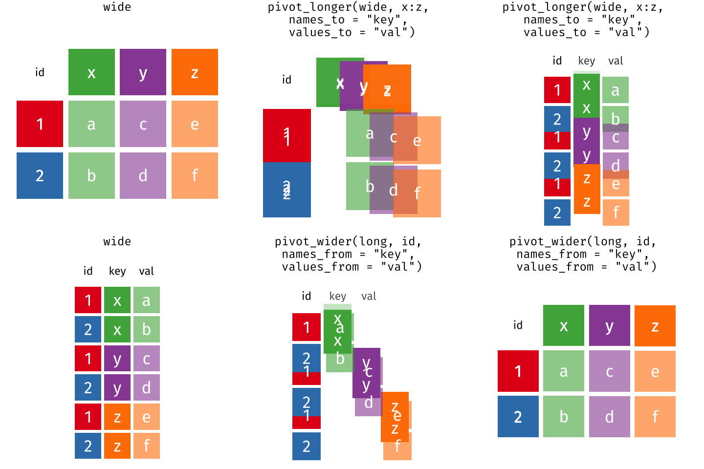 Long and wide
dataframe layouts mainly affect readability. You may find that visually
you may prefer the “wide” format, since you can see more of the data on
the screen. However, all of the R functions we have used thus far expect
for your data to be in a “long” data format. This is because the long
format is more machine readable and is closer to the formatting of
databases.
Questions which warrant different data formats
In our dataset of YouTube videos, each row contains the values of variables associated with each record (the unit), values such as the title of the channel which posted the video, the number of views, or the title and description for the video. This format allows for us to make comparisons across individual videos, but what if we wanted to look at differences in videos grouped by different topics or tags associated with the video?
To facilitate this comparison we would need to create a new table
where each row (the unit) was comprised of values of variables
associated with topics or tags (i.e., the columns
topic_categories or tags in the dataset). In
practical terms this means the values of the topics in
topic_categories (e.g. politics, health, business, society,
etc.) would become the names of column variables and the cells would
contain values of TRUE or FALSE, for whether
the video fitted into that category or not.
Once we we’ve created this new table, we can explore the relationship within and between videos. The key point here is that we are still following a tidy data structure, but we have reshaped the data according to the observations of interest.
Alternatively, consider what we would do if the interview dates were spread across multiple columns, and we were interested in visualizing how the controversy changed over time.
This would require for the interview date to be included in a single column rather than spread across multiple columns. Thus, we would need to transform the column names into values of a single variable.
We can do both of these transformations with two tidyr
functions, pivot_wider() and
pivot_longer().
Pivoting wider
pivot_wider() takes three principal arguments:
- the data
- the names_from column variable whose values will become new column names.
- the values_from column variable whose values will fill the new column variables.
Further arguments include values_fill which, if set,
fills in missing values with the value provided.
Let’s use pivot_wider() to transform videos to create
new columns for each topic category allocated to a video. There are a
couple of new concepts in this transformation, so let’s walk through it
line by line. First we create a new object (videos_topics)
based on the videos data frame.
Then we will actually need to make our data frame longer, because we
have multiple items in a single cell. We will use a new function,
separate_longer_delim(), from the
tidyr package to separate the values of
topic_categories based on the presence of semi-colons
(;). The values of this variable were multiple items
separated by semi-colons, so this action creates a row for each item
listed in a household’s possession. Thus, we end up with a long format
version of the dataset, with multiple rows for each respondent. For
example, if a respondent has a television and a solar panel, that
respondent will now have two rows, one with “television” and the other
with “solar panel” in the topic_categories column.
After this transformation, you may notice that the
topic_categories column contains NA values.
This is because some of the respondents did not own any of the items
that was in the interviewer’s list. We can use the
replace_na() function to change these NA
values to something more meaningful. The replace_na()
function expects for you to give it a list() of columns
that you would like to replace the NA values in, and the
value that you would like to replace the NAs. This ends up
looking like this:
Next, we create a new variable named
topic_categories_logical, which has one value
(TRUE) for every row. This makes sense, since each item in
every row was owned by that household. We are constructing this variable
so that when we spread the topic_categories across multiple
columns, we can fill the values of those columns with logical values
describing whether the household did (TRUE) or didn’t
(FALSE) own that particular item.
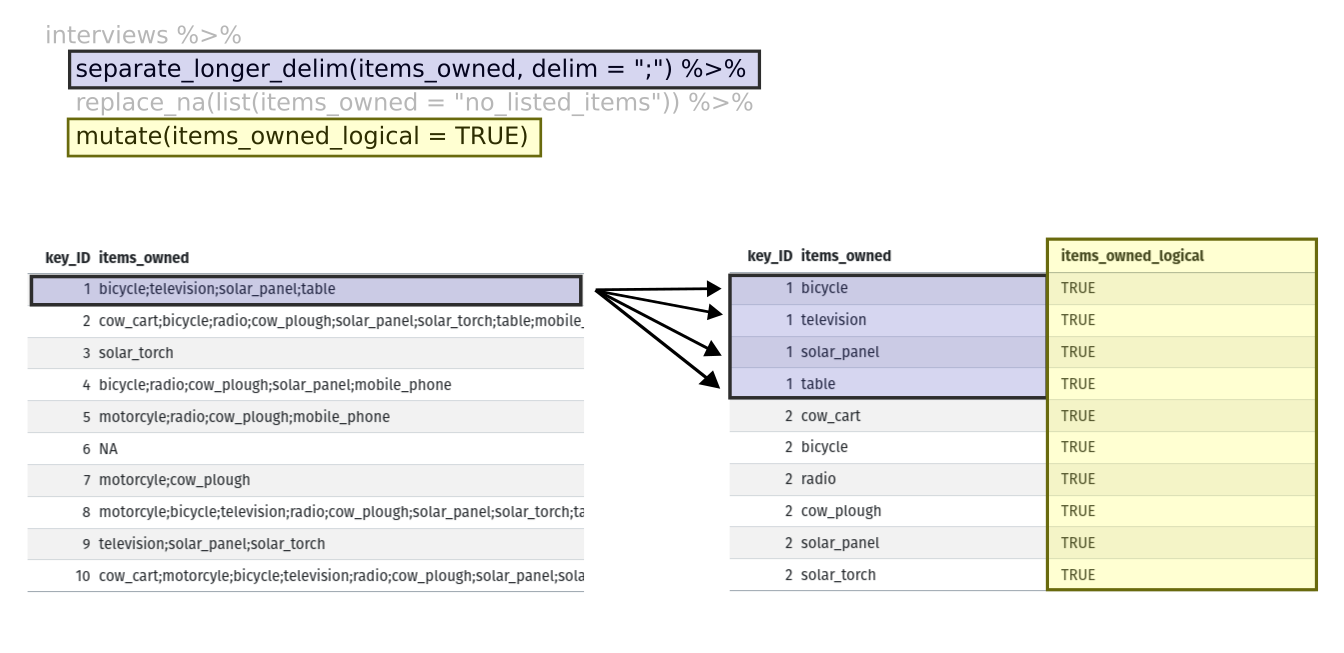
Lastly, we use pivot_wider() to switch from long format
to wide format. This creates a new column for each of the unique values
in the topic_categories column, and fills those columns
with the values of topic_categories_logical. We also
declare that for topics that are missing, we want to fill those cells
with the value of FALSE instead of NA.
R
pivot_wider(names_from = topic_categories,
            values_from = topic_categories_logical,
            values_fill = list(topic_categories_logical = FALSE))
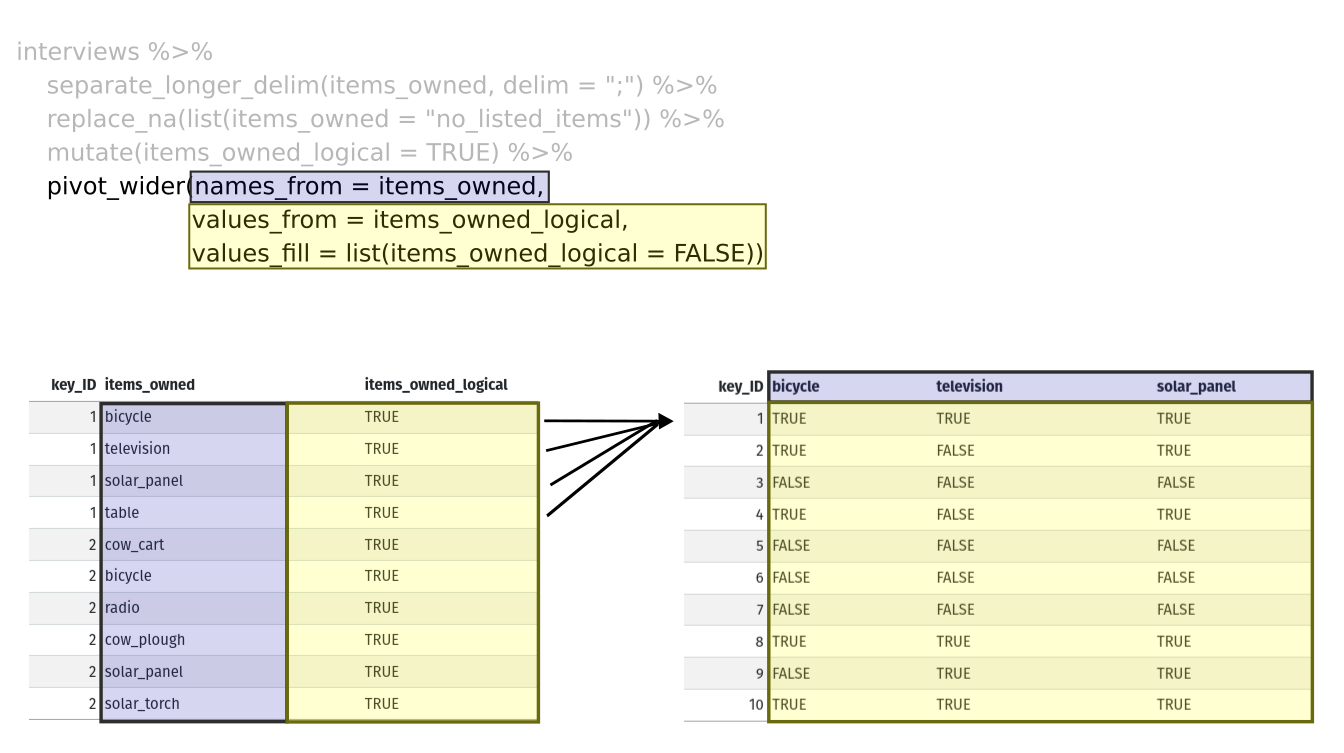
Combining the above steps, the chunk looks like this:
R
videos_topics <- videos %>%
  separate_longer_delim(topic_categories, delim = ";") %>%
  replace_na(list(topic_categories = "no_topics")) %>%
  mutate(topic_categories_logical = TRUE) %>%
  pivot_wider(names_from = topic_categories,
              values_from = topic_categories_logical,
              values_fill = list(topic_categories_logical = FALSE))
  videos_topics
OUTPUT
# A tibble: 200 × 41
   position randomise channel_id               channel_title      video_id url
      <dbl>     <dbl> <chr>                    <chr>              <chr>    <chr>
 1      112       409 UCI3RT5PGmdi1KVp9FG_CneA eNCA               iPUAl1j… http…
 2       50       702 UCI3RT5PGmdi1KVp9FG_CneA eNCA               YUmIAd_… http…
 3      149       313 UCMwDXpWEVQVw4ZF7z-E4NoA StellenboschNews … v8XfpOi… http…
 4      167       384 UCsqKkYLOaJ9oBwq9rxFyZMw SOUTH AFRICAN POL… lnLdo2k… http…
 5      195       606 UC5G5Dy8-mmp27jo6Frht7iQ Umgosi Entertainm… XN6toca… http…
 6      213       423 UCC1udUghY9dloGMuvZzZEzA The Tea World      rh2Nz78… http…
 7      145       452 UCaCcVtl9O3h5en4m-_edhZg Celeb LaLa Land    1l5GZ0N… http…
 8      315       276 UCAurTjb6Ewz21vjfTs1wZxw NOSIPHO NZAMA      j4Y022C… http…
 9      190       321 UCBlX1mnsIFZRqsyRNvpW_rA Zandile Mhlambi    gf2YNN6… http…
10      214       762 UClY87IoUANFZtswyC9GeecQ Beauty recipes     AGJmRd4… http…
# ℹ 190 more rows
# ℹ 35 more variables: published_at <dttm>, published_at_sql <chr>, year <dbl>,
#   month <dbl>, day <dbl>, video_title <chr>, video_description <chr>,
#   tags <chr>, video_category_label <chr>, duration_sec <dbl>,
#   definition <chr>, caption <lgl>, default_language <chr>,
#   default_l_audio_language <chr>, thumbnail_maxres <chr>,
#   licensed_content <dbl>, location_description <chr>, view_count <dbl>, …
View the videos_topics data frame. It should have 200
rows (the same number of rows you had originally), but extra columns for
each item. How many columns were added? Notice that there is no longer a
column titled topic_categories. This is because there is a
default parameter in pivot_wider() that drops the original
column. The values that were in that column have now become columns
named politics, health, business,
etc. You can use dim(videos) and
dim(videos_wide) to see how the number of columns has
changed between the two datasets.
This format of the data allows us to do interesting things, like make a table showing the number of videos in each video category on a particular topic:
R
videos_topics %>%
  filter(politics) %>%
  group_by(video_category_label) %>%
  count(politics)
OUTPUT
# A tibble: 4 × 3
# Groups:   video_category_label [4]
  video_category_label politics     n
  <chr>                <lgl>    <int>
1 Comedy               TRUE         1
2 Entertainment        TRUE         5
3 News & Politics      TRUE        24
4 People & Blogs       TRUE        10
Or below we calculate the average number of topics addressed by each
channel. This code uses the rowSums() function to count the
number of TRUE values in the business to
politics columns for each row, hence its name. Note that we
replaced NA values with the value no_topics,
so we must exclude this value in the aggregation. We then group the data
by channel and calculate the mean number of topics, so each average is
grouped by channel.
R
videos_topics %>%
    select(-no_topics) %>%
    mutate(number_topics = rowSums(select(., business:politics))) %>%
    group_by(channel_title) %>%
    summarize(mean_topics = mean(number_topics))
OUTPUT
# A tibble: 119 × 2
   channel_title                 mean_topics
   <chr>                               <dbl>
 1 2nacheki                              1.5
 2 Absolute Controversy                  1
 3 African Diaspora News Channel         1
 4 Al Jazeera English                    2
 5 Ayanda Mafuyeka                       1
 6 Azana Jezile                          1
 7 BANELE NOCUZE                         1
 8 Banetsi Tshetlo                       1
 9 Beauty recipes                        2
10 Blackish Blue TV                      2
# ℹ 109 more rows
Pivoting longer
The opposing situation could occur if we had been provided with data
in the form of videos_wide, where the items owned are
column names, but we wish to treat them as values of an
topic_categories variable instead.
In this situation we are gathering these columns turning them into a pair of new variables. One variable includes the column names as values, and the other variable contains the values in each cell previously associated with the column names. We will do this in two steps to make this process a bit clearer.
pivot_longer() takes four principal arguments:
- the data
- cols are the names of the columns we use to fill the new values variable (or to drop).
- the names_to column variable we wish to create from the cols provided.
- the values_to column variable we wish to create and fill with values associated with the cols provided.
R
videos_long <- videos_topics %>%
  pivot_longer(cols = business:politics,
               names_to = "topic_categories",
               values_to = "topic_categories_logical")
View both videos_long and videos_topics and
compare their structure.
Exercise
We created some summary tables on videos_topics using
count and summarise. We can create the same
tables on videos_long, but this will require a different
process.
- Make a table showing showing the number of videos from each channel
categorised as a particular topic, and include all items. The difference
between this format and the wide format is that you can now
countall the topics using thetopic_categoriesvariable.
R
videos_long %>%
  filter(topic_categories_logical) %>%
  group_by(channel_title) %>%
  count(topic_categories, sort=TRUE)
OUTPUT
# A tibble: 171 × 3
# Groups:   channel_title [114]
   channel_title   topic_categories       n
   <chr>           <chr>              <int>
 1 SABC News       society               22
 2 eNCA            society               20
 3 eNCA            television_program    19
 4 SABC News       television_program    14
 5 Newzroom Afrika society               13
 6 Newzroom Afrika television_program    11
 7 SABC News       health                10
 8 eNCA            health                 8
 9 eNCA            politics               6
10 Newzroom Afrika politics               5
# ℹ 161 more rows
Exercise (continued)
- Calculate the average number of items from the list owned by
respondents in each village. If you remove rows where
topic_categories_logicalisFALSEyou will have a data frame where the number of rows per household is equal to the number of items owned. You can use that to calculate the mean number of items per village.
Remember, you need to make sure we don’t count
no_listed_items, since this is not an actual item, but
rather the absence thereof.
R
videos_long %>%
  filter(topic_categories_logical,
         topic_categories != "no_topics") %>%
  # to keep information per video, we count video_id
  count(video_id, channel_title) %>% # we want to also keep the channel variable
  group_by(channel_title) %>%
  summarise(mean_topics = mean(n))
OUTPUT
# A tibble: 114 × 2
   channel_title                 mean_topics
   <chr>                               <dbl>
 1 2nacheki                              1.5
 2 Absolute Controversy                  1
 3 African Diaspora News Channel         1
 4 Al Jazeera English                    2
 5 Ayanda Mafuyeka                       2
 6 Azana Jezile                          1
 7 BANELE NOCUZE                         1
 8 Banetsi Tshetlo                       1
 9 Beauty recipes                        2
10 Blackish Blue TV                      2
# ℹ 104 more rows
Applying what we learned to clean our data
Now we have simultaneously learned about pivot_longer()
and pivot_wider(), and fixed a problem in the way our data
is structured. In the spreadsheets lesson, we learned that it’s best
practice to have only a single piece of information in each cell of your
spreadsheet. In this dataset, we have another column that stores
multiple values in a single cell. Some of the cells in the
tags column contain multiple months which, as before, are
separated by semi-colons (;).
To create a data frame where each of the columns contain only one
value per cell, we can repeat the steps we applied to
topic_categories and apply them to tags. Since
we will be using this data frame for the next episode, we will call it
videos_plotting.
R
videos_plotting <- videos %>%
  ## pivot wider by topic_categories
  separate_longer_delim(topic_categories, delim = ";") %>%
  ## if there were no topics listed, changing NA to no_listed_items
  replace_na(list(topic_categories = "no_topics")) %>%
  mutate(topic_categories_logical = TRUE) %>%
  pivot_wider(names_from = topic_categories,
              values_from = topic_categories_logical,
              values_fill = list(topic_categories_logical = FALSE)) #%>%
  ## pivot wider by tags
  #separate_longer_delim(tags, delim = ";") %>%
  #mutate(tags_logical = TRUE) %>%
  #pivot_wider(names_from = tags,
  #           values_from = tags_logical
  #          values_fill = list(tags_logical = FALSE)) %>%
  ## add some summary columns
  #mutate(number_tags = rowSums(select(., Jan:May))) %>% #replace with start and end tags
  #mutate(number_topics = rowSums(select(., business:politics)))

  videos_plotting
OUTPUT
# A tibble: 200 × 41
   position randomise channel_id               channel_title      video_id url
      <dbl>     <dbl> <chr>                    <chr>              <chr>    <chr>
 1      112       409 UCI3RT5PGmdi1KVp9FG_CneA eNCA               iPUAl1j… http…
 2       50       702 UCI3RT5PGmdi1KVp9FG_CneA eNCA               YUmIAd_… http…
 3      149       313 UCMwDXpWEVQVw4ZF7z-E4NoA StellenboschNews … v8XfpOi… http…
 4      167       384 UCsqKkYLOaJ9oBwq9rxFyZMw SOUTH AFRICAN POL… lnLdo2k… http…
 5      195       606 UC5G5Dy8-mmp27jo6Frht7iQ Umgosi Entertainm… XN6toca… http…
 6      213       423 UCC1udUghY9dloGMuvZzZEzA The Tea World      rh2Nz78… http…
 7      145       452 UCaCcVtl9O3h5en4m-_edhZg Celeb LaLa Land    1l5GZ0N… http…
 8      315       276 UCAurTjb6Ewz21vjfTs1wZxw NOSIPHO NZAMA      j4Y022C… http…
 9      190       321 UCBlX1mnsIFZRqsyRNvpW_rA Zandile Mhlambi    gf2YNN6… http…
10      214       762 UClY87IoUANFZtswyC9GeecQ Beauty recipes     AGJmRd4… http…
# ℹ 190 more rows
# ℹ 35 more variables: published_at <dttm>, published_at_sql <chr>, year <dbl>,
#   month <dbl>, day <dbl>, video_title <chr>, video_description <chr>,
#   tags <chr>, video_category_label <chr>, duration_sec <dbl>,
#   definition <chr>, caption <lgl>, default_language <chr>,
#   default_l_audio_language <chr>, thumbnail_maxres <chr>,
#   licensed_content <dbl>, location_description <chr>, view_count <dbl>, …
Exporting data
Now that you have learned how to use
dplyr and
tidyr to wrangle your raw data, you may
want to export these new datasets to share them with your collaborators
or for archival purposes.
Similar to the read_csv() function used for reading CSV
files into R, there is a write_csv() function that
generates CSV files from data frames.
Before using write_csv(), we are going to create a new
folder, data_output, in our working directory that will
store this generated dataset. We don’t want to write generated datasets
in the same directory as our raw data. It’s good practice to keep them
separate. The data folder should only contain the raw,
unaltered data, and should be left alone to make sure we don’t delete or
modify it. In contrast, our script will generate the contents of the
data_output directory, so even if the files it contains are
deleted, we can always re-generate them.
In preparation for our next lesson on plotting, we created a version
of the dataset where each of the columns includes only one data value.
Now we can save this data frame to our data_output
directory.
R
write_csv (videos_plotting, file = "data_output/videos_plotting.csv")
Key Points
- Use the
tidyrpackage to change the layout of data frames. - Use
pivot_wider()to go from long to wide format. - Use
pivot_longer()to go from wide to long format.
Content from Data Visualisation with ggplot2
Last updated on 2025-01-14 | Edit this page
Estimated time: 115 minutes
- This lesson is a broad overview of ggplot2 and focuses on (1)
getting familiar with the layering system of ggplot2, (2) using the
argument
groupin theaes()function, (3) basic customization of the plots.
Overview
Questions
- What are the components of a ggplot?
- How do I create scatterplots, boxplots, and barplots?
- How can I change the aesthetics (ex. colour, transparency) of my plot?
- How can I create multiple plots at once?
Objectives
- Produce scatter plots, boxplots, and barplots using ggplot.
- Set universal plot settings.
- Describe what faceting is and apply faceting in ggplot.
- Modify the aesthetics of an existing ggplot plot (including axis labels and colour).
- Build complex and customized plots from data in a data frame.
We start by loading the required package.
ggplot2 is also included in the
tidyverse package.
R
library(tidyverse)
If not still in the workspace, load the data we saved in the previous lesson.
R
interviews_plotting <- read_csv("data_output/interviews_plotting.csv")
OUTPUT
Rows: 131 Columns: 45
── Column specification ────────────────────────────────────────────────────────
Delimiter: ","
chr   (5): village, respondent_wall_type, memb_assoc, affect_conflicts, inst...
dbl   (8): key_ID, no_membrs, years_liv, rooms, liv_count, no_meals, number_...
lgl  (31): bicycle, television, solar_panel, table, cow_cart, radio, cow_plo...
dttm  (1): interview_date

ℹ Use `spec()` to retrieve the full column specification for this data.
ℹ Specify the column types or set `show_col_types = FALSE` to quiet this message.
If you were unable to complete the previous lesson or did not save the data, then you can create it now.
R
## Not run, but can be used to load in data from previous lesson!
interviews_plotting <- interviews %>%
  ## pivot wider by items_owned
  separate_rows(items_owned, sep = ";") %>%
  ## if there were no items listed, changing NA to no_listed_items
  replace_na(list(items_owned = "no_listed_items")) %>%
  mutate(items_owned_logical = TRUE) %>%
  pivot_wider(names_from = items_owned,
              values_from = items_owned_logical,
              values_fill = list(items_owned_logical = FALSE)) %>%
  ## pivot wider by months_lack_food
  separate_rows(months_lack_food, sep = ";") %>%
  mutate(months_lack_food_logical = TRUE) %>%
  pivot_wider(names_from = months_lack_food,
              values_from = months_lack_food_logical,
              values_fill = list(months_lack_food_logical = FALSE)) %>%
  ## add some summary columns
  mutate(number_months_lack_food = rowSums(select(., Jan:May))) %>%
  mutate(number_items = rowSums(select(., bicycle:car)))
Plotting with ggplot2
ggplot2 is a plotting package that
makes it simple to create complex plots from data stored in a data
frame. It provides a programmatic interface for specifying what
variables to plot, how they are displayed, and general visual
properties. Therefore, we only need minimal changes if the underlying
data change or if we decide to change from a bar plot to a scatterplot.
This helps in creating publication quality plots with minimal amounts of
adjustments and tweaking.
ggplot2 functions work best with data
in the ‘long’ format, i.e., a column for every dimension, and a row for
every observation. Well-structured data will save you lots of time when
making figures with ggplot2
ggplot graphics are built step by step by adding new elements. Adding layers in this fashion allows for extensive flexibility and customization of plots.
Each chart built with ggplot2 must include the following
Data
-
Aesthetic mapping (aes)
- Describes how variables are mapped onto graphical attributes
- Visual attribute of data including x-y axes, color, fill, shape, and alpha
-
Geometric objects (geom)
- Determines how values are rendered graphically, as bars
(
geom_bar), scatterplot (geom_point), line (geom_line), etc.
- Determines how values are rendered graphically, as bars
(
Thus, the template for graphic in ggplot2 is:
<DATA> %>%
    ggplot(aes(<MAPPINGS>)) +
    <GEOM_FUNCTION>()
Remember from the last lesson that the pipe operator
%>% places the result of the previous line(s) into the
first argument of the function. ggplot is
a function that expects a data frame to be the first argument. This
allows for us to change from specifying the data = argument
within the ggplot function and instead pipe the data into
the function.
- use the
ggplot()function and bind the plot to a specific data frame.
R
interviews_plotting %>%
    ggplot()
- define a mapping (using the aesthetic (
aes) function), by selecting the variables to be plotted and specifying how to present them in the graph, e.g. as x/y positions or characteristics such as size, shape, color, etc.
R
interviews_plotting %>%
    ggplot(aes(x = no_membrs, y = number_items))
-
add ‘geoms’ – graphical representations of the data in the plot (points, lines, bars).
ggplot2offers many different geoms; we will use some common ones today, including:-
geom_point()for scatter plots, dot plots, etc. -
geom_boxplot()for, well, boxplots! -
geom_line()for trend lines, time series, etc.
-
To add a geom to the plot use the + operator. Because we
have two continuous variables, let’s use geom_point()
first:
R
interviews_plotting %>%
    ggplot(aes(x = no_membrs, y = number_items)) +
    geom_point()
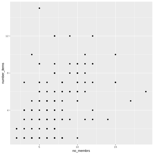
The + in the ggplot2
package is particularly useful because it allows you to modify existing
ggplot objects. This means you can easily set up plot
templates and conveniently explore different types of plots, so the
above plot can also be generated with code like this, similar to the
“intermediate steps” approach in the previous lesson:
R
# Assign plot to a variable
interviews_plot <- interviews_plotting %>%
    ggplot(aes(x = no_membrs, y = number_items))

# Draw the plot as a dot plot
interviews_plot +
    geom_point()
Notes
- Anything you put in the
ggplot()function can be seen by any geom layers that you add (i.e., these are universal plot settings). This includes the x- and y-axis mapping you set up inaes(). - You can also specify mappings for a given geom independently of the
mapping defined globally in the
ggplot()function. - The
+sign used to add new layers must be placed at the end of the line containing the previous layer. If, instead, the+sign is added at the beginning of the line containing the new layer,ggplot2will not add the new layer and will return an error message.
R
## This is the correct syntax for adding layers
interviews_plot +
    geom_point()

## This will not add the new layer and will return an error message
interviews_plot
+ geom_point()
Building your plots iteratively
Building plots with ggplot2 is
typically an iterative process. We start by defining the dataset we’ll
use, lay out the axes, and choose a geom:
R
interviews_plotting %>%
    ggplot(aes(x = no_membrs, y = number_items)) +
    geom_point()

Then, we start modifying this plot to extract more information from
it. For instance, when inspecting the plot we notice that points only
appear at the intersection of whole numbers of no_membrs
and number_items. Also, from a rough estimate, it looks
like there are far fewer dots on the plot than there rows in our
dataframe. This should lead us to believe that there may be multiple
observations plotted on top of each other (e.g. three observations where
no_membrs is 3 and number_items is 1).
There are two main ways to alleviate overplotting issues:
- changing the transparency of the points
- jittering the location of the points
Let’s first explore option 1, changing the transparency of the
points. What we mean when we say “transparency” we mean the opacity of
point, or your ability to see through the point. We can control the
transparency of the points with the alpha argument to
geom_point. Values of alpha range from 0 to 1,
with lower values corresponding to more transparent colors (an
alpha of 1 is the default value). Specifically, an alpha of
0.1, would make a point one-tenth as opaque as a normal point. Stated
differently ten points stacked on top of each other would correspond to
a normal point.
Here, we change the alpha to 0.5, in an attempt to help
fix the overplotting. While the overplotting isn’t solved, adding
transparency begins to address this problem, as the points where there
are overlapping observations are darker (as opposed to lighter
gray):
R
interviews_plotting %>%
    ggplot(aes(x = no_membrs, y = number_items)) +
    geom_point(alpha = 0.3)
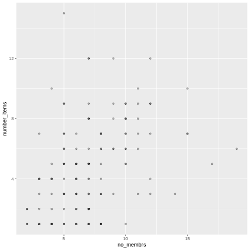
That only helped a little bit with the overplotting problem, so let’s try option two. We can jitter the points on the plot, so that we can see each point in the locations where there are overlapping points. Jittering introduces a little bit of randomness into the position of our points. You can think of this process as taking the overplotted graph and giving it a tiny shake. The points will move a little bit side-to-side and up-and-down, but their position from the original plot won’t dramatically change. Note that this solution is suitable for plotting integer figures, while for numeric figures with decimals, geom_jitter() becomes inappropriate because it obscures the true value of the observation.
We can jitter our points using the geom_jitter()
function instead of the geom_point() function, as seen
below:
R
interviews_plotting %>%
    ggplot(aes(x = no_membrs, y = number_items)) +
    geom_jitter()
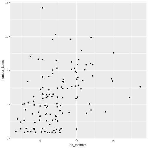
The geom_jitter() function allows for us to specify the
amount of random motion in the jitter, using the width and
height arguments. When we don’t specify values for
width and height, geom_jitter()
defaults to 40% of the resolution of the data (the smallest change that
can be measured). Hence, if we would like less spread in our
jitter than was default, we should pick values between 0.1 and 0.4.
Experiment with the values to see how your plot changes.
R
interviews_plotting %>%
    ggplot(aes(x = no_membrs, y = number_items)) +
    geom_jitter(alpha = 0.3,
                width = 0.2,
                height = 0.2)

For our final change, we can also add colours for all the points by
specifying a color argument inside the
geom_jitter() function:
R
interviews_plotting %>%
    ggplot(aes(x = no_membrs, y = number_items)) +
    geom_jitter(alpha = 0.3,
                color = "blue",
                width = 0.2,
                height = 0.2)
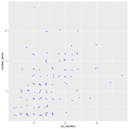
To colour each village in the plot differently, you could use a
vector as an input to the argument color.
However, because we are now mapping features of the data to a colour,
instead of setting one colour for all points, the colour of the points
now needs to be set inside a call to the
aes function. When we map a variable in
our data to the colour of the points,
ggplot2 will provide a different colour
corresponding to the different values of the variable. We will continue
to specify the value of alpha,
width, and
height outside of the
aes function because we are using the same
value for every point. ggplot2 understands both the Commonwealth English
and American English spellings for colour, i.e., you can use either
color or colour. Here is an example where we
color points by the village of the
observation:
R
interviews_plotting %>%
    ggplot(aes(x = no_membrs, y = number_items)) +
    geom_jitter(aes(color = village), alpha = 0.3, width = 0.2, height = 0.2)
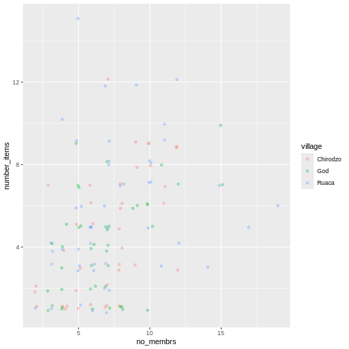
There appears to be a positive trend between number of household members and number of items owned (from the list provided). Additionally, this trend does not appear to be different by village.
Notes
As you will learn, there are multiple ways to plot the a relationship
between variables. Another way to plot data with overlapping points is
to use the geom_count plotting function. The
geom_count() function makes the size of each point
representative of the number of data items of that type and the legend
gives point sizes associated to particular numbers of items.
R
interviews_plotting %>%
   ggplot(aes(x = no_membrs, y = number_items, color = village)) +
   geom_count()
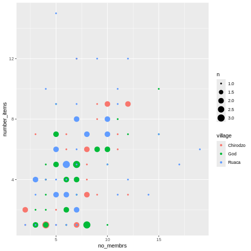
Exercise
Use what you just learned to create a scatter plot of
rooms by village with the
respondent_wall_type showing in different colours. Does
this seem like a good way to display the relationship between these
variables? What other kinds of plots might you use to show this type of
data?
R
interviews_plotting %>%
    ggplot(aes(x = village, y = rooms)) +
    geom_jitter(aes(color = respondent_wall_type),
      alpha = 0.3,
        width = 0.2,
        height = 0.2)
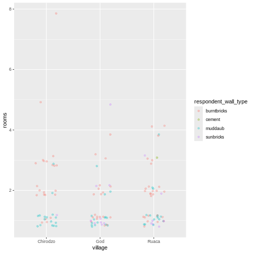
This is not a great way to show this type of data because it is difficult to distinguish between villages. What other plot types could help you visualize this relationship better?
Boxplot
We can use boxplots to visualize the distribution of rooms for each wall type:
R
interviews_plotting %>%
    ggplot(aes(x = respondent_wall_type, y = rooms)) +
    geom_boxplot()
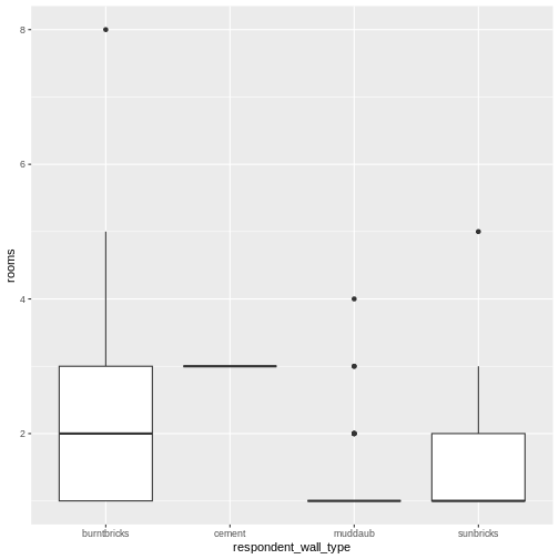
By adding points to a boxplot, we can have a better idea of the number of measurements and of their distribution:
R
interviews_plotting %>%
    ggplot(aes(x = respondent_wall_type, y = rooms)) +
    geom_boxplot(alpha = 0) +
    geom_jitter(alpha = 0.3,
        color = "tomato",
        width = 0.2,
        height = 0.2)
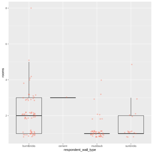
We can see that muddaub houses and sunbrick houses tend to be smaller than burntbrick houses.
Notice how the boxplot layer is behind the jitter layer? What do you need to change in the code to put the boxplot layer in front of the jitter layer?
Exercise
Boxplots are useful summaries, but hide the shape of the distribution. For example, if the distribution is bimodal, we would not see it in a boxplot. An alternative to the boxplot is the violin plot, where the shape (of the density of points) is drawn.
- Replace the box plot with a violin plot; see
geom_violin().
R
interviews_plotting %>%
  ggplot(aes(x = respondent_wall_type, y = rooms)) +
  geom_violin(alpha = 0) +
  geom_jitter(alpha = 0.5, color = "tomato")
WARNING
Warning: Groups with fewer than two datapoints have been dropped.
ℹ Set `drop = FALSE` to consider such groups for position adjustment purposes.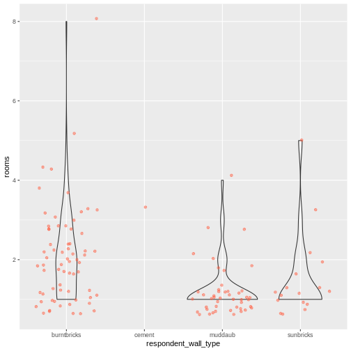
Exercise (continued)
So far, we’ve looked at the distribution of room number within wall type. Try making a new plot to explore the distribution of another variable within wall type.
- Create a boxplot for
liv_countfor each wall type. Overlay the boxplot layer on a jitter layer to show actual measurements.
R
interviews_plotting %>%
   ggplot(aes(x = respondent_wall_type, y = liv_count)) +
   geom_boxplot(alpha = 0) +
   geom_jitter(alpha = 0.5, width = 0.2, height = 0.2)
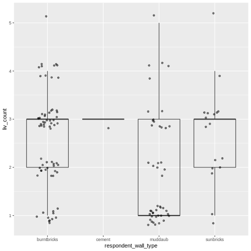
Exercise (continued)
- Add colour to the data points on your boxplot according to whether
the respondent is a member of an irrigation association
(
memb_assoc).
R
interviews_plotting %>%
  ggplot(aes(x = respondent_wall_type, y = liv_count)) +
  geom_boxplot(alpha = 0) +
  geom_jitter(aes(color = memb_assoc), alpha = 0.5, width = 0.2, height = 0.2)
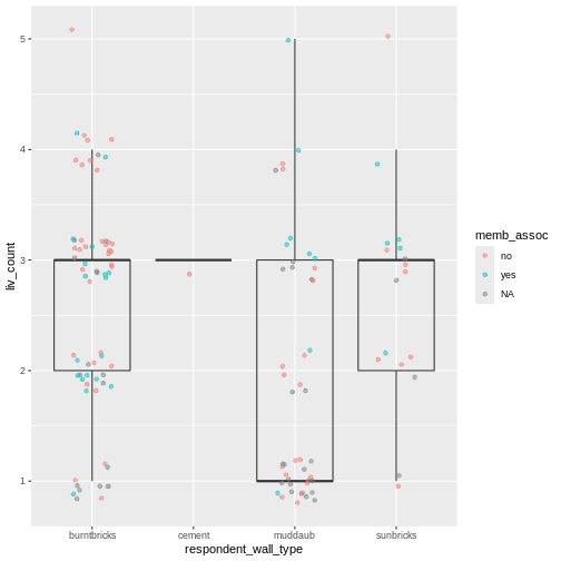
Barplots
Barplots are also useful for visualizing categorical data. By
default, geom_bar accepts a variable for x, and plots the
number of instances each value of x (in this case, wall type) appears in
the dataset.
R
interviews_plotting %>%
    ggplot(aes(x = respondent_wall_type)) +
    geom_bar()
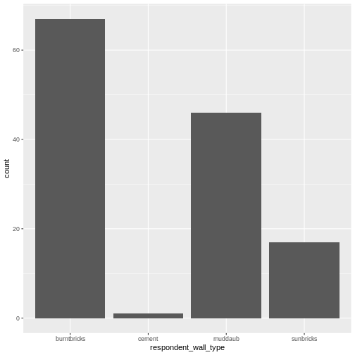
We can use the fill aesthetic for the
geom_bar() geom to colour bars by the portion of each count
that is from each village.
R
interviews_plotting %>%
    ggplot(aes(x = respondent_wall_type)) +
    geom_bar(aes(fill = village))

This creates a stacked bar chart. These are generally more difficult
to read than side-by-side bars. We can separate the portions of the
stacked bar that correspond to each village and put them side-by-side by
using the position argument for geom_bar() and
setting it to “dodge”.
R
interviews_plotting %>%
    ggplot(aes(x = respondent_wall_type)) +
    geom_bar(aes(fill = village), position = "dodge")
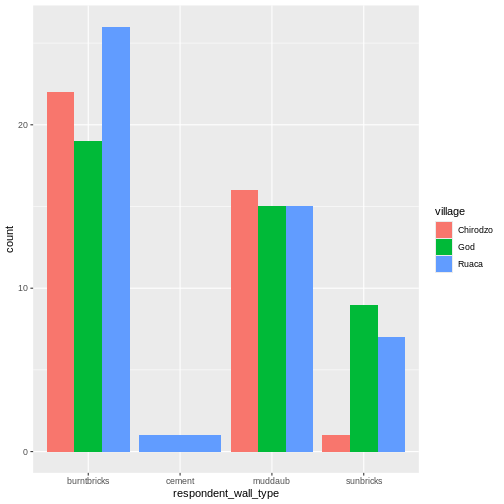
This is a nicer graphic, but we’re more likely to be interested in
the proportion of each housing type in each village than in the actual
count of number of houses of each type (because we might have sampled
different numbers of households in each village). To compare
proportions, we will first create a new data frame
(percent_wall_type) with a new column named “percent”
representing the percent of each house type in each village. We will
remove houses with cement walls, as there was only one in the
dataset.
R
percent_wall_type <- interviews_plotting %>%
    filter(respondent_wall_type != "cement") %>%
    count(village, respondent_wall_type) %>%
    group_by(village) %>%
    mutate(percent = (n / sum(n)) * 100) %>%
    ungroup()
Now we can use this new data frame to create our plot showing the percentage of each house type in each village.
R
percent_wall_type %>%
    ggplot(aes(x = village, y = percent, fill = respondent_wall_type)) +
    geom_bar(stat = "identity", position = "dodge")
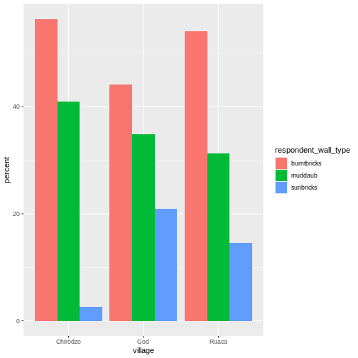
Exercise
Create a bar plot showing the proportion of respondents in each
village who are or are not part of an irrigation association
(memb_assoc). Include only respondents who answered that
question in the calculations and plot. Which village had the lowest
proportion of respondents in an irrigation association?
R
percent_memb_assoc <- interviews_plotting %>%
  filter(!is.na(memb_assoc)) %>%
  count(village, memb_assoc) %>%
  group_by(village) %>%
  mutate(percent = (n / sum(n)) * 100) %>%
  ungroup()

percent_memb_assoc %>%
   ggplot(aes(x = village, y = percent, fill = memb_assoc)) +
    geom_bar(stat = "identity", position = "dodge")
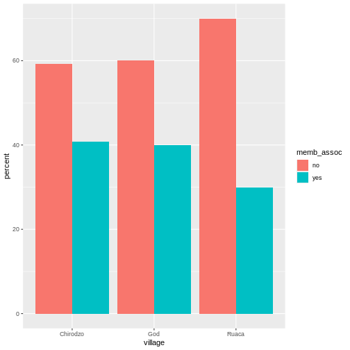
Ruaca had the lowest proportion of members in an irrigation association.
Adding Labels and Titles
By default, the axes labels on a plot are determined by the name of
the variable being plotted. However,
ggplot2 offers lots of customization
options, like specifying the axes labels, and adding a title to the plot
with relatively few lines of code. We will add more informative x-and
y-axis labels to our plot, a more explanatory label to the legend, and a
plot title.
The labs function takes the following arguments:
-
title– to produce a plot title -
subtitle– to produce a plot subtitle (smaller text placed beneath the title) -
caption– a caption for the plot -
...– any pair of name and value for aesthetics used in the plot (e.g.,x,y,fill,color,size)
R
percent_wall_type %>%
    ggplot(aes(x = village, y = percent, fill = respondent_wall_type)) +
    geom_bar(stat = "identity", position = "dodge") +
    labs(title = "Proportion of wall type by village",
         fill = "Type of Wall in Home",
         x = "Village",
         y = "Percent")
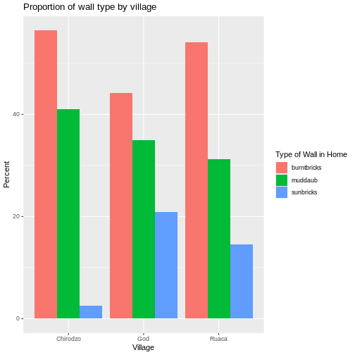
Faceting
Rather than creating a single plot with side-by-side bars for each village, we may want to create multiple plot, where each plot shows the data for a single village. This would be especially useful if we had a large number of villages that we had sampled, as a large number of side-by-side bars will become more difficult to read.
ggplot2 has a special technique called
faceting that allows the user to split one plot into multiple
plots based on a factor included in the dataset. We will use it to split
our barplot of housing type proportion by village so that each village
has its own panel in a multi-panel plot:
R
percent_wall_type %>%
    ggplot(aes(x = respondent_wall_type, y = percent)) +
    geom_bar(stat = "identity", position = "dodge") +
    labs(title="Proportion of wall type by village",
         x="Wall Type",
         y="Percent") +
    facet_wrap(~ village)
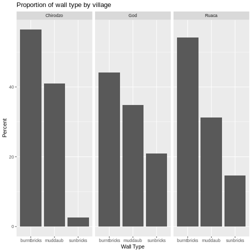
Click the “Zoom” button in your RStudio plots pane to view a larger version of this plot.
Usually plots with white background look more readable when printed.
We can set the background to white using the function
theme_bw(). Additionally, you can remove the grid:
R
percent_wall_type %>%
    ggplot(aes(x = respondent_wall_type, y = percent)) +
    geom_bar(stat = "identity", position = "dodge") +
    labs(title="Proportion of wall type by village",
         x="Wall Type",
         y="Percent") +
    facet_wrap(~ village) +
    theme_bw() +
    theme(panel.grid = element_blank())
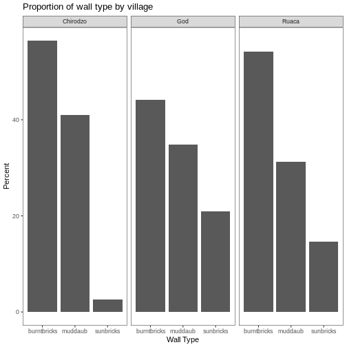
What if we wanted to see the proportion of respondents in each village who owned a particular item? We can calculate the percent of people in each village who own each item and then create a faceted series of bar plots where each plot is a particular item. First we need to calculate the percentage of people in each village who own each item:
R
percent_items <- interviews_plotting %>%
    group_by(village) %>%
    summarize(across(bicycle:no_listed_items, ~ sum(.x) / n() * 100)) %>%
    pivot_longer(bicycle:no_listed_items, names_to = "items", values_to = "percent")
To calculate this percentage data frame, we needed to use the
across() function within a summarize()
operation. Unlike the previous example with a single wall type variable,
where each response was exactly one of the types specified, people can
(and do) own more than one item. So there are multiple columns of data
(one for each item), and the percentage calculation needs to be repeated
for each column.
Combining summarize() with across() allows
us to specify first, the columns to be summarized
(bicycle:no_listed_items) and then the calculation. Because
our calculation is a bit more complex than is available in a built-in
function, we define a new formula:
-
~indicates that we are defining a formula, -
sum(.x)gives the number of people owning that item by counting the number ofTRUEvalues (.xis shorthand for the column being operated on), - and
n()gives the current group size.
After the summarize() operation, we have a table of
percentages with each item in its own column, so a
pivot_longer() is required to transform the table into an
easier format for plotting. Using this data frame, we can now create a
multi-paneled bar plot.
R
percent_items %>%
    ggplot(aes(x = village, y = percent)) +
    geom_bar(stat = "identity", position = "dodge") +
    facet_wrap(~ items) +
    theme_bw() +
    theme(panel.grid = element_blank())
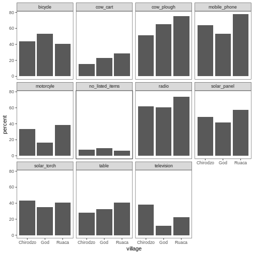
ggplot2 themes
In addition to theme_bw(), which changes the plot
background to white, ggplot2 comes with
several other themes which can be useful to quickly change the look of
your visualization. The complete list of themes is available at https://ggplot2.tidyverse.org/reference/ggtheme.html.
theme_minimal() and theme_light() are popular,
and theme_void() can be useful as a starting point to
create a new hand-crafted theme.
The ggthemes
package provides a wide variety of options (including an Excel 2003
theme). The ggplot2
extensions website provides a list of packages that extend the
capabilities of ggplot2, including
additional themes.
Exercise
Experiment with at least two different themes. Build the previous plot using each of those themes. Which do you like best?
Customization
Take a look at the ggplot2
cheat sheet, and think of ways you could improve the plot.
Now, let’s change names of axes to something more informative than ‘village’ and ‘percent’ and add a title to the figure:
R
percent_items %>%
    ggplot(aes(x = village, y = percent)) +
    geom_bar(stat = "identity", position = "dodge") +
    facet_wrap(~ items) +
    labs(title = "Percent of respondents in each village who owned each item",
         x = "Village",
         y = "Percent of Respondents") +
    theme_bw()
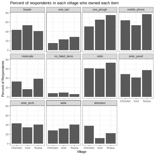
The axes have more informative names, but their readability can be improved by increasing the font size:
R
percent_items %>%
    ggplot(aes(x = village, y = percent)) +
    geom_bar(stat = "identity", position = "dodge") +
    facet_wrap(~ items) +
    labs(title = "Percent of respondents in each village who owned each item",
         x = "Village",
         y = "Percent of Respondents") +
    theme_bw() +
    theme(text = element_text(size = 16))
Note that it is also possible to change the fonts of your plots. If
you are on Windows, you may have to install the extrafont
package, and follow the instructions included in the README for this
package.
After our manipulations, you may notice that the values on the x-axis are still not properly readable. Let’s change the orientation of the labels and adjust them vertically and horizontally so they don’t overlap. You can use a 90-degree angle, or experiment to find the appropriate angle for diagonally oriented labels. With a larger font, the title also runs off. We can add “\n” in the string for the title to insert a new line:
R
percent_items %>%
    ggplot(aes(x = village, y = percent)) +
    geom_bar(stat = "identity", position = "dodge") +
    facet_wrap(~ items) +
    labs(title = "Percent of respondents in each village \n who owned each item",
         x = "Village",
         y = "Percent of Respondents") +
    theme_bw() +
    theme(axis.text.x = element_text(colour = "grey20", size = 12, angle = 45,
                                     hjust = 0.5, vjust = 0.5),
          axis.text.y = element_text(colour = "grey20", size = 12),
          text = element_text(size = 16))
If you like the changes you created better than the default theme,
you can save them as an object to be able to easily apply them to other
plots you may create. We can also add
plot.title = element_text(hjust = 0.5) to centre the
title:
R
grey_theme <- theme(axis.text.x = element_text(colour = "grey20", size = 12,
                                               angle = 45, hjust = 0.5,
                                               vjust = 0.5),
                    axis.text.y = element_text(colour = "grey20", size = 12),
                    text = element_text(size = 16),
                    plot.title = element_text(hjust = 0.5))


percent_items %>%
    ggplot(aes(x = village, y = percent)) +
    geom_bar(stat = "identity", position = "dodge") +
    facet_wrap(~ items) +
    labs(title = "Percent of respondents in each village \n who owned each item",
         x = "Village",
         y = "Percent of Respondents") +
    grey_theme
Exercise
With all of this information in hand, please take another five
minutes to either improve one of the plots generated in this exercise or
create a beautiful graph of your own. Use the RStudio ggplot2
cheat sheet for inspiration. Here are some ideas:
- See if you can make the bars white with black outline.
- Try using a different colour palette (see http://www.cookbook-r.com/Graphs/Colors_(ggplot2)/).
After creating your plot, you can save it to a file in your favourite format. The Export tab in the Plot pane in RStudio will save your plots at low resolution, which will not be accepted by many journals and will not scale well for posters.
Instead, use the ggsave() function, which allows you to
easily change the dimension and resolution of your plot by adjusting the
appropriate arguments (width, height and
dpi).
Make sure you have the fig_output/ folder in your
working directory.
R
my_plot <- percent_items %>%
    ggplot(aes(x = village, y = percent)) +
    geom_bar(stat = "identity", position = "dodge") +
    facet_wrap(~ items) +
    labs(title = "Percent of respondents in each village \n who owned each item",
         x = "Village",
         y = "Percent of Respondents") +
    theme_bw() +
    theme(axis.text.x = element_text(color = "grey20", size = 12, angle = 45,
                                     hjust = 0.5, vjust = 0.5),
          axis.text.y = element_text(color = "grey20", size = 12),
          text = element_text(size = 16),
          plot.title = element_text(hjust = 0.5))

ggsave("fig_output/name_of_file.png", my_plot, width = 15, height = 10)
Note: The parameters width and height also
determine the font size in the saved plot.
Key Points
-
ggplot2is a flexible and useful tool for creating plots in R. - The data set and coordinate system can be defined using the
ggplotfunction. - Additional layers, including geoms, are added using the
+operator. - Boxplots are useful for visualizing the distribution of a continuous variable.
- Barplots are useful for visualizing categorical data.
- Faceting allows you to generate multiple plots based on a categorical variable.
Content from Getting started with R Markdown (Optional)
Last updated on 2025-01-14 | Edit this page
Estimated time: 45 minutes
- This is an optional lesson intended to introduce learners to R Markdown.
- While it is listed after the core lessons, some instructors may prefer to teach it early in the workshop, depending on the audience.
Overview
Questions
- What is R Markdown?
- How can I integrate my R code with text and plots?
- How can I convert .Rmd files to .html?
Objectives
- Create a .Rmd document containing R code, text, and plots
- Create a YAML header to control output
- Understand basic syntax of (R)Markdown
- Customise code chunks to control formatting
- Use code chunks and in-line code to create dynamic, reproducible documents
R Markdown
R Markdown is a flexible type of document that allows you to seamlessly combine executable R code, and its output, with text in a single document. These documents can be readily converted to multiple static and dynamic output formats, including PDF (.pdf), Word (.docx), and HTML (.html).
The benefit of a well-prepared R Markdown document is full reproducibility. This also means that, if you notice a data transcription error, or you are able to add more data to your analysis, you will be able to recompile the report without making any changes in the actual document.
The rmarkdown package comes pre-installed with RStudio, so no action is necessary.

Creating an R Markdown file
To create a new R Markdown document in RStudio, click File -> New File -> R Markdown:
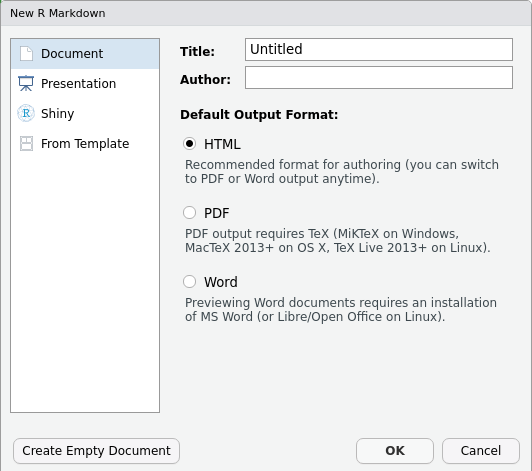
Then click on ‘Create Empty Document’. Normally you could enter the title of your document, your name (Author), and select the type of output, but we will be learning how to start from a blank document.
Basic components of R Markdown
To control the output, a YAML (YAML Ain’t Markup Language) header is needed:
---
title: "My Awesome Report"
author: "Emmet Brickowski"
date: ""
output: html_document
---
The header is defined by the three hyphens at the beginning
(---) and the three hyphens at the end
(---).
In the YAML, the only required field is the output:,
which specifies the type of output you want. This can be an
html_document, a pdf_document, or a
word_document. We will start with an HTML doument and
discuss the other options later.
The rest of the fields can be deleted, if you don’t need them. After
the header, to begin the body of the document, you start typing after
the end of the YAML header (i.e. after the second ---).
Markdown syntax
Markdown is a popular markup language that allows you to add
formatting elements to text, such as bold,
italics, and code. The formatting will not be
immediately visible in a markdown (.md) document, like you would see in
a Word document. Rather, you add Markdown syntax to the text, which can
then be converted to various other files that can translate the Markdown
syntax. Markdown is useful because it is lightweight, flexible, and
platform independent.
Some platforms provide a real time preview of the formatting, like RStudio’s visual markdown editor (available from version 1.4).
First, let’s create a heading! A # in front of text
indicates to Markdown that this text is a heading. Adding more
#s make the heading smaller, i.e. one # is a
first level heading, two ##s is a second level heading,
etc. upto the 6th level heading.
# Title
## Section
### Sub-section
#### Sub-sub section
##### Sub-sub-sub section
###### Sub-sub-sub-sub section
(only use a level if the one above is also in use)
Since we have already defined our title in the YAML header, we will use a section heading to create an Introduction section.
## IntroductionYou can make things bold by surrounding the word
with double asterisks, **bold**, or double underscores,
__bold__; and italicize using single asterisks,
*italics*, or single underscores,
_italics_.
You can also combine bold and italics to
write something really important with
triple-asterisks, ***really***, or underscores,
___really___; and, if you’re feeling bold (pun intended),
you can also use a combination of asterisks and underscores,
**_really_**, **_really_**.
To create code-type font, surround the word with
backticks, code-type.
Now that we’ve learned a couple of things, it might be useful to implement them:
## Introduction

This report uses the **tidyverse** package along with the *SAFI* dataset,
which has columns that include:
Then we can create a list for the variables using -,
+, or * keys.
## Introduction

This report uses the **tidyverse** package along with the *SAFI* dataset,
which has columns that include:

- village
- interview_date
- no_members
- years_liv
- respondent_wall_type
- rooms
You can also create an ordered list using numbers:
1. village
2. interview_date
3. no_members
4. years_liv
5. respondent_wall_type
6. rooms
And nested items by tab-indenting:
- village
  + Name of village
- interview_date
  + Date of interview
- no_members
  + How many family members lived in a house
- years_liv
  + How many years respondent has lived in village or neighbouring village
- respondent_wall_type
  + Type of wall of house
- rooms
  + Number of rooms in house
For more Markdown syntax see the following reference guide.
Now we can render the document into HTML by clicking the Knit button in the top of the Source pane (top left), or use the keyboard shortcut Ctrl+Shift+K on Windows and Linux, and Cmd+Shift+K on Mac. If you haven’t saved the document yet, you will be prompted to do so when you Knit for the first time.
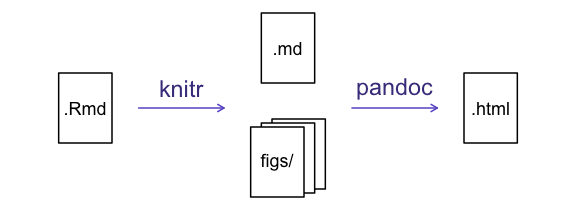
Writing an R Markdown report
Now we will add some R code from our previous data wrangling and visualisation, which means we need to make sure tidyverse is loaded. It is not enough to load tidyverse from the console, we will need to load it within our R Markdown document. The same applies to our data. To load these, we will need to create a ‘code chunk’ at the top of our document (below the YAML header).
A code chunk can be inserted by clicking Code > Insert Chunk, or by using the keyboard shortcuts Ctrl+Alt+I on Windows and Linux, and Cmd+Option+I on Mac.
The syntax of a code chunk is:
An R Markdown document knows that this text is not part of the report
from the ``` that begins and ends the chunk. It also knows
that the code inside of the chunk is R code from the r
inside of the curly braces ({}). After the r
you can add a name for the code chunk . Naming a chunk is optional, but
recommended. Each chunk name must be unique, and only contain
alphanumeric characters and -.
To load tidyverse and our
SAFI_clean.csv file, we will insert a chunk and call it
‘setup’. Since we don’t want this code or the output to show in our
knitted HTML document, we add an include = FALSE option
after the code chunk name ({r setup, include = FALSE}).
MARKDOWN
```{r setup, include = FALSE}
library(tidyverse)
library(here)
interviews <- read_csv(here("data/SAFI_clean.csv"), na = "NULL")
```
Important Note!
The file paths you give in a .Rmd document, e.g. to load a .csv file, are relative to the .Rmd document, not the project root.
As suggested in the Starting with Data episode, we highly recommend
the use of the here() function to keep the file paths
consistent within your project.
Insert table
Next, we will re-create a table from the Data Wrangling episode which
shows the average household size grouped by village and
memb_assoc. We can do this by creating a new code chunk and
calling it ‘interview-tbl’. Or, you can come up with something more
creative (just remember to stick to the naming rules).
It isn’t necessary to Knit your document every time you want to see the output. Instead you can run the code chunk with the green triangle in the top right corner of the the chunk, or with the keyboard shortcuts: Ctrl+Alt+C on Windows and Linux, or Cmd+Option+C on Mac.
To make sure the table is formatted nicely in our output document, we
will need to use the kable() function from the
knitr package. The kable() function takes
the output of your R code and knits it into a nice looking HTML table.
You can also specify different aspects of the table, e.g. the column
names, a caption, etc.
Run the code chunk to make sure you get the desired output.
R
interviews %>%
    filter(!is.na(memb_assoc)) %>%
    group_by(village, memb_assoc) %>%
    summarize(mean_no_membrs = mean(no_membrs)) %>%
  knitr::kable(caption = "We can also add a caption.",
               col.names = c("Village", "Member Association",
                             "Mean Number of Members"))
| Village | Member Association | Mean Number of Members |
|---|---|---|
| Chirodzo | no | 8.062500 |
| Chirodzo | yes | 7.818182 |
| God | no | 7.133333 |
| God | yes | 8.000000 |
| Ruaca | no | 7.178571 |
| Ruaca | yes | 9.500000 |
Many different R packages can be used to generate tables. Some of the more commonly used options are listed in the table below.
| Name | Creator(s) | Description |
|---|---|---|
| condformat | Oller Moreno (2022) | Apply and visualize conditional formatting to data frames in R. It renders a data frame with cells formatted according to criteria defined by rules, using a tidy evaluation syntax. |
| DT | Xie et al. (2023) | Data objects in R can be rendered as HTML tables using the JavaScript library ‘DataTables’ (typically via R Markdown or Shiny). The ‘DataTables’ library has been included in this R package. |
| formattable | Ren and Russell (2021) | Provides functions to create formattable vectors and data frames. ‘Formattable’ vectors are printed with text formatting, and formattable data frames are printed with multiple types of formatting in HTML to improve the readability of data presented in tabular form rendered on web pages. |
| flextable | Gohel and Skintzos (2023) | Use a grammar for creating and customizing pretty tables. The following formats are supported: ‘HTML’, ‘PDF’, ‘RTF’, ‘Microsoft Word’, ‘Microsoft PowerPoint’ and R ‘Grid Graphics’. ‘R Markdown’, ‘Quarto’, and the package ‘officer’ can be used to produce the result files. |
| gt | Iannone et al. (2022) | Build display tables from tabular data with an easy-to-use set of functions. With its progressive approach, we can construct display tables with cohesive table parts. Table values can be formatted using any of the included formatting functions. |
| huxtable | Hugh-Jones (2022) | Creates styled tables for data presentation. Export to HTML, LaTeX, RTF, ‘Word’, ‘Excel’, and ‘PowerPoint’. Simple, modern interface to manipulate borders, size, position, captions, colours, text styles and number formatting. |
| pander | Daróczi and Tsegelskyi (2022) | Contains some functions catching all messages, ‘stdout’ and other useful information while evaluating R code and other helpers to return user specified text elements (e.g., header, paragraph, table, image, lists etc.) in ‘pandoc’ markdown or several types of R objects similarly automatically transformed to markdown format. |
| pixiedust | Nutter and Kretch (2021) | ‘pixiedust’ provides tidy data frames with a programming interface intended to be similar to ’ggplot2’s system of layers with fine-tuned control over each cell of the table. |
| reactable | Lin et al. (2023) | Interactive data tables for R, based on the ‘React Table’ JavaScript library. Provides an HTML widget that can be used in ‘R Markdown’ or ‘Quarto’ documents, ‘Shiny’ applications, or viewed from an R console. |
| rhandsontable | Owen et al. (2021) | An R interface to the ‘Handsontable’ JavaScript library, which is a minimalist Excel-like data grid editor. |
| stargazer | Hlavac (2022) | Produces LaTeX code, HTML/CSS code and ASCII text for well-formatted tables that hold regression analysis results from several models side-by-side, as well as summary statistics. |
| tables | Murdoch (2022) | Computes and displays complex tables of summary statistics. Output may be in LaTeX, HTML, plain text, or an R matrix for further processing. |
| tangram | Garbett et al. (2023) | Provides an extensible formula system to quickly and easily create production quality tables. The processing steps are a formula parser, statistical content generation from data defined by a formula, and rendering into a table. |
| xtable | Dahl et al. (2019) | Coerce data to LaTeX and HTML tables. |
| ztable | Moon (2021) | Makes zebra-striped tables (tables with alternating row colors) in LaTeX and HTML formats easily from a data.frame, matrix, lm, aov, anova, glm, coxph, nls, fitdistr, mytable and cbind.mytable objects. |
Customising chunk output
We mentioned using include = FALSE in a code chunk to
prevent the code and output from printing in the knitted document. There
are additional options available to customise how the code-chunks are
presented in the output document. The options are entered in the code
chunk after chunk-nameand separated by commas,
e.g. {r chunk-name, eval = FALSE, echo = TRUE}.
| Option | Options | Output |
|---|---|---|
eval |
TRUE or FALSE
|
Whether or not the code within the code chunk should be run. |
echo |
TRUE or FALSE
|
Choose if you want to show your code chunk in the output document.
echo = TRUE will show the code chunk. |
include |
TRUE or FALSE
|
Choose if the output of a code chunk should be included in the
document. FALSE means that your code will run, but will not
show up in the document. |
warning |
TRUE or FALSE
|
Whether or not you want your output document to display potential warning messages produced by your code. |
message |
TRUE or FALSE
|
Whether or not you want your output document to display potential messages produced by your code. |
fig.align |
default, left, right,
center
|
Where the figure from your R code chunk should be output on the page |
Tip
- The default settings for the above chunk options are all
TRUE. - The default settings can be modified per chunk, or with
knitr::opts_chunk$set(), - Entering
knitr::opts_chunk$set(echo = FALSE)will change the default of value ofechotoFALSEfor every code chunk in the document.
Exercise
Play around with the different options in the chunk with the code for the table, and re-Knit to see what each option does to the output.
What happens if you use eval = FALSE and
echo = FALSE? What is the difference between this and
include = FALSE?
Create a chunk with {r eval = FALSE, echo = FALSE}, then
create another chunk with {r include = FALSE} to compare.
eval = FALSE and echo = FALSE will neither run
the code in the chunk, nor show the code in the knitted document. The
code chunk essentially doesn’t exist in the knitted document as it was
never run. Whereas include = FALSE will run the code and
store the output for later use.
In-line R code
Now we will use some in-line R code to present some descriptive
statistics. To use in-line R-code, we use the same backticks that we
used in the Markdown section, with an r to specify that we
are generating R-code. The difference between in-line code and a code
chunk is the number of backticks. In-line R code uses one backtick
(r), whereas code chunks use three backticks
(r).
For example, today’s date is `r Sys.Date()`, will be
rendered as: today’s date is 2025-01-14.
The code will display today’s date in the output document (well,
technically the date the document was last knitted).
The best way to use in-line R code, is to minimise the amount of code you need to produce the in-line output by preparing the output in code chunks. Let’s say we’re interested in presenting the average household size in a village.
R
# create a summary data frame with the mean household size by village
mean_household <- interviews %>%
    group_by(village) %>%
    summarize(mean_no_membrs = mean(no_membrs))

# and select the village we want to use
mean_chirodzo <- mean_household %>%
  filter(village == "Chirodzo")
Now we can make an informative statement on the means of each village, and include the mean values as in-line R-code. For example:
The average household size in the village of Chirodzo is
`r round(mean_chirodzo$mean_no_membrs, 2)`
becomes…
The average household size in the village of Chirodzo is 7.08.
Because we are using in-line R code instead of the actual values, we have created a dynamic document that will automatically update if we make changes to the dataset and/or code chunks.
Plots
Finally, we will also include a plot, so our document is a little
more colourful and a little less boring. We will use the
interview_plotting data from the previous episode.
If you were unable to complete the previous lesson or did not save the data, then you can create it in a new code chunk.
R
## Not run, but can be used to load in data from previous lesson!
interviews_plotting <- interviews %>%
  ## pivot wider by items_owned
  separate_rows(items_owned, sep = ";") %>%
  ## if there were no items listed, changing NA to no_listed_items
  replace_na(list(items_owned = "no_listed_items")) %>%
  mutate(items_owned_logical = TRUE) %>%
  pivot_wider(names_from = items_owned,
              values_from = items_owned_logical,
              values_fill = list(items_owned_logical = FALSE)) %>%
  ## pivot wider by months_lack_food
  separate_rows(months_lack_food, sep = ";") %>%
  mutate(months_lack_food_logical = TRUE) %>%
  pivot_wider(names_from = months_lack_food,
              values_from = months_lack_food_logical,
              values_fill = list(months_lack_food_logical = FALSE)) %>%
  ## add some summary columns
  mutate(number_months_lack_food = rowSums(select(., Jan:May))) %>%
  mutate(number_items = rowSums(select(., bicycle:car)))
Exercise
Create a new code chunk for the plot, and copy the code from any of the plots we created in the previous episode to produce a plot in the chunk. I recommend one of the colourful plots.
If you are feeling adventurous, you can also create a new plot with
the interviews_plotting data frame.
R
interviews_plotting %>%
  ggplot(aes(x = respondent_wall_type)) +
  geom_bar(aes(fill = village))
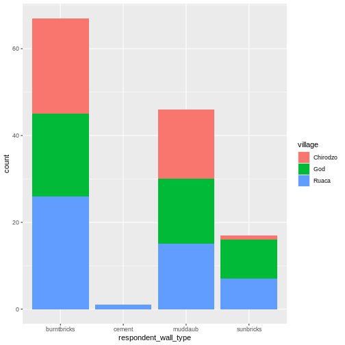
We can also create a caption with the chunk option
fig.cap.
MARKDOWN
```{r chunk-name, fig.cap = "I made this plot while attending an
awesome Data Carpentries workshop where I learned a ton of cool stuff!"}
Code for plot
```
…or, ideally, something more informative.
R
interviews_plotting %>%
  ggplot(aes(x = respondent_wall_type)) +
  geom_bar(aes(fill = village), position = "dodge") +
  labs(x = "Type of Wall in Home", y = "Count", fill = "Village Name") +
  scale_fill_viridis_d() # add colour deficient friendly palette
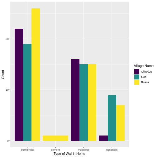
Other output options
You can convert R Markdown to a PDF or a Word document (among
others). Click the little triangle next to the Knit
button to get a drop-down menu. Or you could put
pdf_document or word_document in the initial
header of the file.
---
title: "My Awesome Report"
author: "Emmet Brickowski"
date: ""
output: word_document
---
Note: Creating PDF documents
Creating .pdf documents may require installation of some extra
software. The R package tinytex provides some tools to help
make this process easier for R users. With tinytex
installed, run tinytex::install_tinytex() to install the
required software (you’ll only need to do this once) and then when you
Knit to pdf tinytex will automatically
detect and install any additional LaTeX packages that are needed to
produce the pdf document. Visit the tinytex website for more
information.
Note: Inserting citations into an R Markdown file
It is possible to insert citations into an R Markdown file using the
editor toolbar. The editor toolbar includes commonly seen formatting
buttons generally seen in text editors (e.g., bold and italic buttons).
The toolbar is accessible by using the settings dropdown menu (next to
the ‘Knit’ dropdown menu) to select ‘Use Visual Editor’, also accessible
through the shortcut ‘Crtl+Shift+F4’. From here, clicking ‘Insert’
allows ‘Citation’ to be selected (shortcut: ‘Crtl+Shift+F8’). For
example, searching ‘10.1007/978-3-319-24277-4’ in ‘From DOI’ and
inserting will provide the citation for ggplot2 [@wickham2016]. This will also save the
citation(s) in ‘references.bib’ in the current working directory. Visit
the R
Studio website for more information. Tip: obtaining citation
information from relevant packages can be done by using
citation("package").
Resources
- Knitr in a knutshell tutorial
- Dynamic Documents with R and knitr (book)
- R Markdown documentation
- R Markdown cheat sheet
- Getting started with R Markdown
- Markdown tutorial
- R Markdown: The Definitive Guide (book by Rstudio team)
- Reproducible Reporting
- The Ecosystem of R Markdown
- Introducing Bookdown
Key Points
- R Markdown is a useful language for creating reproducible documents combining text and executable R-code.
- Specify chunk options to control formatting of the output document
Content from Processing JSON data (Optional)
Last updated on 2025-01-14 | Edit this page
Estimated time: 45 minutes
- This is an optional lessons intended to introduce learners to JSON data, as well as how to read JSON data into R and how to convert the data into a data frame or array.
- Note that his lesson was community-contributed and remains a work in progress. As such, it could benefit from feedback from instructors and/or workshop participants.
Overview
Questions
- What is JSON format?
- How can I convert JSON to an R dataframe?
- How can I convert an array of JSON record into a table?
Objectives
- Describe the JSON data format
- Understand where JSON is typically used
- Appreciate some advantages of using JSON over tabular data
- Appreciate some disadvantages of processing JSON documents
- Use the jsonLite package to read a JSON file
- Display formatted JSON as dataframe
- Select and display nested dataframe fields from a JSON document
- Write tabular data from selected elements from a JSON document to a csv file
The JSON data format
The JSON data format was designed as a way of allowing different machines or processes within machines to communicate with each other by sending messages constructed in a well defined format. JSON is now the preferred data format used by APIs (Application Programming Interfaces).
The JSON format although somewhat verbose is not only Human readable but it can also be mapped very easily to an R dataframe.
We are going to read a file of data formatted as JSON, convert it into a dataframe in R then selectively create a csv file from the extracted data.
The JSON file we are going to use is the SAFI.json file. This is the output file from an electronic survey system called ODK. The JSON represents the answers to a series of survey questions. The questions themselves have been replaced with unique Keys, the values are the answers.
Because detailed surveys are by nature nested structures making it possible to record different levels of detail or selectively ask a set of specific questions based on the answer given to a previous question, the structure of the answers for the survey can not only be complex and convoluted, it could easily be different from one survey respondent’s set of answers to another.
Advantages of JSON
- Very popular data format for APIs (e.g. results from an Internet search)
- Human readable
- Each record (or document as they are called) is self contained. The equivalent of the column name and column values are in every record.
- Documents do not all have to have the same structure within the same file
- Document structures can be complex and nested
Use the JSON package to read a JSON file
R
library(jsonlite)
As with reading in a CSV, you have a couple of options for how to access the JSON file.
You can read the JSON file directly into R with
read_json() or the comparable fromJSON()
function, though this does not download the file.
R
json_data <- read_json(
  "https://raw.githubusercontent.com/datacarpentry/r-socialsci/main/episodes/data/SAFI.json"
  )
To download the file you can copy and paste the contents of the file
on GitHub,
creating a SAFI.json file in your data
directory, or you can download the file with R.
R
download.file(
  "https://raw.githubusercontent.com/datacarpentry/r-socialsci/main/episodes/data/SAFI.json",
   "data/SAFI.json", mode = "wb")
Once you have the data downloaded, you can read it into R with
read_json():
R
json_data <- read_json("data/SAFI.json")
We can see that a new object called json_data has appeared in our
Environment. It is described as a Large list (131 elements). In this
current form, our data is messy. You can have a glimpse of it with the
head() or view() functions. It will look not
much more structured than if you were to open the JSON file with a text
editor.
This is because, by default, the read_json() function’s
parameter simplifyVector, which specifies whether or not to
simplify vectors is set to FALSE. This means that the default setting
does not simplify nested lists into vectors and data frames. However, we
can set this to TRUE, and our data will be read directly as a
dataframe:
R
json_data <- read_json("data/SAFI.json", simplifyVector = TRUE)
Now we can see we have this json data in a dataframe format. For
consistency with the rest of the lesson, let’s coerce it to be a tibble
and use glimpse to take a peek inside (these functions were
loaded by library(tidyverse)):
R
json_data <- json_data %>% as_tibble()
glimpse(json_data)
OUTPUT
Rows: 131
Columns: 74
$ C06_rooms                      <int> 1, 1, 1, 1, 1, 1, 1, 3, 1, 5, 1, 3, 1, …
$ B19_grand_liv                  <chr> "no", "yes", "no", "no", "yes", "no", "…
$ A08_ward                       <chr> "ward2", "ward2", "ward2", "ward2", "wa…
$ E01_water_use                  <chr> "no", "yes", "no", "no", "no", "no", "y…
$ B18_sp_parents_liv             <chr> "yes", "yes", "no", "no", "no", "no", "…
$ B16_years_liv                  <int> 4, 9, 15, 6, 40, 3, 38, 70, 6, 23, 20, …
$ E_yes_group_count              <chr> NA, "3", NA, NA, NA, NA, "4", "2", "3",…
$ F_liv                          <list> [<data.frame[1 x 2]>], [<data.frame[3 …
$ `_note2`                       <lgl> NA, NA, NA, NA, NA, NA, NA, NA, NA, NA,…
$ instanceID                     <chr> "uuid:ec241f2c-0609-46ed-b5e8-fe575f6ce…
$ B20_sp_grand_liv               <chr> "yes", "yes", "no", "no", "no", "no", "…
$ F10_liv_owned_other            <lgl> NA, NA, NA, NA, NA, NA, NA, NA, NA, NA,…
$ `_note1`                       <lgl> NA, NA, NA, NA, NA, NA, NA, NA, NA, NA,…
$ F12_poultry                    <chr> "yes", "yes", "yes", "yes", "yes", "no"…
$ D_plots_count                  <chr> "2", "3", "1", "3", "2", "1", "4", "2",…
$ C02_respondent_wall_type_other <lgl> NA, NA, NA, NA, NA, NA, NA, NA, NA, NA,…
$ C02_respondent_wall_type       <chr> "muddaub", "muddaub", "burntbricks", "b…
$ C05_buildings_in_compound      <int> 1, 1, 1, 1, 1, 1, 1, 2, 2, 1, 2, 2, 1, …
$ `_remitters`                   <list> [<data.frame[0 x 0]>], [<data.frame[0 …
$ E18_months_no_water            <list> <NULL>, <"Aug", "Sept">, <NULL>, <NULL…
$ F07_use_income                 <chr> NA, "Alimentação e pagamento de educa…
$ G01_no_meals                   <int> 2, 2, 2, 2, 2, 2, 3, 2, 3, 3, 2, 3, 2, …
$ E17_no_enough_water            <chr> NA, "yes", NA, NA, NA, NA, "yes", "yes"…
$ F04_need_money                 <chr> NA, "no", NA, NA, NA, NA, "no", "no", "…
$ A05_end                        <chr> "2017-04-02T17:29:08.000Z", "2017-04-02…
$ C04_window_type                <chr> "no", "no", "yes", "no", "no", "no", "n…
$ E21_other_meth                 <chr> NA, "no", NA, NA, NA, NA, "no", "no", "…
$ D_no_plots                     <int> 2, 3, 1, 3, 2, 1, 4, 2, 3, 2, 2, 2, 4, …
$ F05_money_source               <list> <NULL>, <NULL>, <NULL>, <NULL>, <NULL>…
$ A07_district                   <chr> "district1", "district1", "district1", …
$ C03_respondent_floor_type      <chr> "earth", "earth", "cement", "earth", "e…
$ E_yes_group                    <list> [<data.frame[0 x 0]>], [<data.frame[3 …
$ A01_interview_date             <chr> "2016-11-17", "2016-11-17", "2016-11-17…
$ B11_remittance_money           <chr> "no", "no", "no", "no", "no", "no", "no…
$ A04_start                      <chr> "2017-03-23T09:49:57.000Z", "2017-04-02…
$ D_plots                        <list> [<data.frame[2 x 8]>], [<data.frame[3 …
$ F_items                        <list> [<data.frame[3 x 3]>], [<data.frame[2 …
$ F_liv_count                    <chr> "1", "3", "1", "2", "4", "1", "1", "2",…
$ F10_liv_owned                  <list> "poultry", <"oxen", "cows", "goats">, …
$ B_no_membrs                    <int> 3, 7, 10, 7, 7, 3, 6, 12, 8, 12, 6, 7, …
$ F13_du_look_aftr_cows          <chr> "no", "no", "no", "no", "no", "no", "no…
$ E26_affect_conflicts           <chr> NA, "once", NA, NA, NA, NA, "never", "n…
$ F14_items_owned                <list> <"bicycle", "television", "solar_panel…
$ F06_crops_contr                <chr> NA, "more_half", NA, NA, NA, NA, "more_…
$ B17_parents_liv                <chr> "no", "yes", "no", "no", "yes", "no", "…
$ G02_months_lack_food           <list> "Jan", <"Jan", "Sept", "Oct", "Nov", "…
$ A11_years_farm                 <dbl> 11, 2, 40, 6, 18, 3, 20, 16, 16, 22, 6,…
$ F09_du_labour                  <chr> "no", "no", "yes", "yes", "no", "yes", …
$ E_no_group_count               <chr> "2", NA, "1", "3", "2", "1", NA, NA, NA…
$ E22_res_change                 <list> <NULL>, <NULL>, <NULL>, <NULL>, <NULL>…
$ E24_resp_assoc                 <chr> NA, "no", NA, NA, NA, NA, NA, "yes", NA…
$ A03_quest_no                   <chr> "01", "01", "03", "04", "05", "6", "7",…
$ `_members`                     <list> [<data.frame[3 x 12]>], [<data.frame[7…
$ A06_province                   <chr> "province1", "province1", "province1", …
$ `gps:Accuracy`                 <dbl> 14, 19, 13, 5, 10, 12, 11, 9, 11, 14, 1…
$ E20_exper_other                <chr> NA, "yes", NA, NA, NA, NA, "yes", "yes"…
$ A09_village                    <chr> "village2", "village2", "village2", "vi…
$ C01_respondent_roof_type       <chr> "grass", "grass", "mabatisloping", "mab…
$ `gps:Altitude`                 <dbl> 698, 690, 674, 679, 689, 692, 709, 700,…
$ `gps:Longitude`                <dbl> 33.48346, 33.48342, 33.48345, 33.48342,…
$ E23_memb_assoc                 <chr> NA, "yes", NA, NA, NA, NA, "no", "yes",…
$ E19_period_use                 <dbl> NA, 2, NA, NA, NA, NA, 10, 10, 6, 22, N…
$ E25_fees_water                 <chr> NA, "no", NA, NA, NA, NA, "no", "no", "…
$ C07_other_buildings            <chr> "no", "no", "no", "no", "no", "no", "ye…
$ observation                    <chr> "None", "Estes primeiros inquéritos na…
$ `_note`                        <lgl> NA, NA, NA, NA, NA, NA, NA, NA, NA, NA,…
$ A12_agr_assoc                  <chr> "no", "yes", "no", "no", "no", "no", "n…
$ G03_no_food_mitigation         <list> <"na", "rely_less_food", "reduce_meals…
$ F05_money_source_other         <lgl> NA, NA, NA, NA, NA, NA, NA, NA, NA, NA,…
$ `gps:Latitude`                 <dbl> -19.11226, -19.11248, -19.11211, -19.11…
$ E_no_group                     <list> [<data.frame[2 x 6]>], [<data.frame[0 …
$ F14_items_owned_other          <lgl> NA, NA, NA, NA, NA, NA, NA, NA, NA, NA,…
$ F08_emply_lab                  <chr> "no", "yes", "no", "no", "no", "no", "n…
$ `_members_count`               <chr> "3", "7", "10", "7", "7", "3", "6", "12…
Looking good, but you might notice that actually we have a variable, F_liv that is a list of dataframes! It is very important to know what you are expecting from your data to be able to look for things like this. For example, if you are getting your JSON from an API, have a look at the API documentation, so you know what to look for.
Often when we have a very large number of columns, it can become
difficult to determine all the variables which may require some special
attention, like lists. Fortunately, we can use special verbs like
where to quickly select all the list columns.
R
json_data %>%
    select(where(is.list)) %>%
    glimpse()
OUTPUT
Rows: 131
Columns: 14
$ F_liv                  <list> [<data.frame[1 x 2]>], [<data.frame[3 x 2]>], …
$ `_remitters`           <list> [<data.frame[0 x 0]>], [<data.frame[0 x 0]>], …
$ E18_months_no_water    <list> <NULL>, <"Aug", "Sept">, <NULL>, <NULL>, <NULL…
$ F05_money_source       <list> <NULL>, <NULL>, <NULL>, <NULL>, <NULL>, <NULL>…
$ E_yes_group            <list> [<data.frame[0 x 0]>], [<data.frame[3 x 14]>],…
$ D_plots                <list> [<data.frame[2 x 8]>], [<data.frame[3 x 8]>], …
$ F_items                <list> [<data.frame[3 x 3]>], [<data.frame[2 x 3]>], …
$ F10_liv_owned          <list> "poultry", <"oxen", "cows", "goats">, "none", …
$ F14_items_owned        <list> <"bicycle", "television", "solar_panel", "tabl…
$ G02_months_lack_food   <list> "Jan", <"Jan", "Sept", "Oct", "Nov", "Dec">, <…
$ E22_res_change         <list> <NULL>, <NULL>, <NULL>, <NULL>, <NULL>, <NULL>…
$ `_members`             <list> [<data.frame[3 x 12]>], [<data.frame[7 x 12]>]…
$ G03_no_food_mitigation <list> <"na", "rely_less_food", "reduce_meals", "day_…
$ E_no_group             <list> [<data.frame[2 x 6]>], [<data.frame[0 x 0]>], …
So what can we do about F_liv, the column of dataframes?
Well first things first, we can access each one. For example to access
the dataframe in the first row, we can use the bracket ([)
subsetting. Here we use single bracket, but you could also use double
bracket ([[). The [[ form allows only a single
element to be selected using integer or character indices, whereas
[ allows indexing by vectors.
R
json_data$F_liv[1]
OUTPUT
[[1]]
  F11_no_owned F_curr_liv
1            1    poultry
We can also choose to view the nested dataframes at all the rows of our main dataframe where a particular condition is met (for example where the value for the variable C06_rooms is equal to 4):
R
json_data$F_liv[which(json_data$C06_rooms == 4)]
OUTPUT
[[1]]
  F11_no_owned F_curr_liv
1            3       oxen
2            2       cows
3            5      goats

[[2]]
  F11_no_owned F_curr_liv
1            4       oxen
2            5       cows
3            3      goats

[[3]]
data frame with 0 columns and 0 rows

[[4]]
  F11_no_owned F_curr_liv
1            4       oxen
2            4       cows
3            4      goats
4            1      sheep

[[5]]
  F11_no_owned F_curr_liv
1            2       cows
Write the JSON file to csv
If we try to write our json_data dataframe to a csv as we would
usually in a regular dataframe, we won’t get the desired result. Using
the write_csv function from the readr
package won’t give you an error for list columns, but you’ll only see
missing (i.e. NA) values in these columns. Let’s try it out
to confirm:
R
write_csv(json_data, "json_data_with_list_columns.csv")
read_csv("json_data_with_list_columns.csv")
To write out as a csv while maintaining the data within the list
columns, we will need to “flatten” these columns. One way to do this is
to convert these list columns into character types. (However, we don’t
want to change the data types for any of the other columns). Here’s one
way to do this using tidyverse. This command only applies the
as.character command to those columns ‘where’
is.list is TRUE.
R
flattened_json_data <- json_data %>%
mutate(across(where(is.list), as.character))
flattened_json_data
OUTPUT
# A tibble: 131 × 74
C06_rooms B19_grand_liv A08_ward E01_water_use B18_sp_parents_liv
<int> <chr> <chr> <chr> <chr>
1 1 no ward2 no yes
2 1 yes ward2 yes yes
3 1 no ward2 no no
4 1 no ward2 no no
5 1 yes ward2 no no
6 1 no ward2 no no
7 1 yes ward2 yes no
8 3 yes ward1 yes yes
9 1 yes ward2 yes no
10 5 no ward2 yes no
# ℹ 121 more rows
# ℹ 69 more variables: B16_years_liv <int>, E_yes_group_count <chr>,
# F_liv <chr>, `_note2` <lgl>, instanceID <chr>, B20_sp_grand_liv <chr>,
# F10_liv_owned_other <lgl>, `_note1` <lgl>, F12_poultry <chr>,
# D_plots_count <chr>, C02_respondent_wall_type_other <lgl>,
# C02_respondent_wall_type <chr>, C05_buildings_in_compound <int>,
# `_remitters` <chr>, E18_months_no_water <chr>, F07_use_income <chr>, …Now you can write this to a csv file:
R
write_csv(flattened_json_data, "data_output/json_data_with_flattened_list_columns.csv")
Note: this means that when you read this csv back into R, the column of the nested dataframes will now be read in as a character vector. Converting it back to list to extract elements might be complicated, so it is probably better to keep storing these data in a JSON format if you will have to do this.
You can also write out the individual nested dataframes to a csv. For example:
R
write_csv(json_data$F_liv[[1]], "data_output/F_liv_row1.csv")
Key Points
- JSON is a popular data format for transferring data used by a great many Web based APIs
- The complex structure of a JSON document means that it cannot easily be ‘flattened’ into tabular data
- We can use R code to extract values of interest and place them in a csv file
Content from Text as data (Optional)
Last updated on 2025-01-14 | Edit this page
Estimated time: 45 minutes
- This is an optional lesson intended to introduce approaches to text as data by applying key concepts from corpus linguistics and natural language processing, with a focus on using computational approaches to qualitatively oriented discourse analysis.
- Note that his lesson was community-contributed and remains a work in progress. As such, it could benefit from feedback from instructors and/or workshop participants.
Overview
Questions
- What are the most important concepts for automating text analysis?
- How can I prepare text data for analysis?
- How can I visualise frequency, collocation and concordance for a corpus of textual data?
Objectives
- Introduce basic concepts needed to use the
quantedapackage for discourse analysis: corpus, tokens, dfm,and frequency. - Prepare text for analysis with the
quantedafunctionscorpus,tokens,dfm, anddfm_remove. - Investigate the most frequent features in a dfm using the
quantedafunctiontextstat_frequency. - Plot frequencies using
ggplot - Select and modify a list of stopwords to remove unwanted words from a dataset.
- Visualise frequencies as a wordcloud using the
quantedafunctiontextplot_wordcloud. - Identify the strengths and weaknesses of these approaches to visualising text data.
Using quanteda for text analysis
Before conducting automated text analysis, we will need to install
and load a suitable package. For this tutorial we will be using the
quanteda package which offers many useful
text analysis functions.
R
# install.packages("quanteda")
library(quanteda)
Example data
We will start by exploring the text from some historical speeches by Nelson Mandela. You can download the required data from this link
Using automated text analysis for media research
Classic approaches to media research can be expanded and enhanced by using computational approaches such as automated text analysis. Nonetheless it is important for researchers to know where these new tools originate and what they assume about language. This tutorial is intended to provide a foundation for media researchers who would like to use computational tools for discourse analysis on collections of textual data such as social media posts, web pages, text output from machine vision services, or interview transcripts. These techniques have their roots in both computational linguistics and corpus linguistics.
Computational linguistics and Corpus Linguistics are two related areas which provide different approaches, concepts and tools for analysing textual data.
Media scholars have used corpus linguistics together with discourse analysis to explore dominant discourses, and to investigate the social implications of certain linguistic choices. Computational linguistics has been used to automate some aspects of content analysis, such as sentiment analysis (which identifies positive and negative sentiments in text) or to label texts or automatically identify topics . In all these cases, researchers need to manage textual data and to prepare it for analysis by sorting, categorising and summarising it.
Computational linguistics is a broad inter-disciplinary area of study where software and algorithms are developed to analyse and synthesise language and speech for applications such as machine translation, speech recognition, machine learning and deep learning (“AI”). Corpus linguistics has developed methods to study trends and patterns in language use and sociolinguistic variation by analysing large collections of electronically stored, naturally occurring texts. Both of these areas are also related to Natural Language Processing (NLP) which is a subfield of computer science.
While Computational Linguistics has a strongly quantitative focus, Corpus Linguistics can also include qualitative analysis (such as examining concordance lines). Corpus linguistics involves much qualitative work interpreting text, and so can be used to extend the scope of Critical Discourse Analysis (CDA) and other smaller-scale media studies approaches to analysing linguistic discourse.
For more about these approaches, see these additional readings below.
References
Baker, P. et al. (2008) A useful methodological synergy? Combining critical discourse analysis and corpus linguistics to examine discourses of refugees and asylum seekers in the UK press. Discourse & society. [19 (3), 273–306.
Baker, P. 2006. Using Corpora in Discourse Analysis. Continuum: London.
Van Atteveldt, W. & T. Peng, (2018) When Communication Meets Computation: Opportunities, Challenges, and Pitfalls in Computational Communication Science, Communication Methods and Measures, 12:2-3, 81-92, DOI: 10.1080/19312458.2018.1458084
Theocharis, Y. & A. Jungherr (2020) Computational Social Science and the Study of Political Communication, Political Communication, DOI: 10.1080/10584609.2020.1833121
What is a Corpus?
A corpus is a set of documents which stores large quantities of real-life text. The plural form of the word is corpora.
You can find a set of South African language corpora on the SADILAR corpus portal website.
In this tutorial you can think of the corpus as your back-up or raw data which needs to be kept unchanged by the analysis. The individual documents which make up the corpus can be labelled and stored separately from one another in the corpus format.
Using a Document-Term Matrix
Computers work by using numbers, and so corpora are analysed by generating a numerical representations of text.
A popular representation of text in CL is the Document-Term Matrix or DTM (also known as Term-Document Matrix (TDM) or Document-Feature Matrix (DFM).
A DTM represents a corpus as a large table (known as a matrix) which organises all the words (terms) in the corpus according to how often they occur in each of the documents included in the corpus.
We will start with a small example of a document-term matrix, using this famous quotation from Nelson Mandela’s 1964 speech during the Rivonia Trial:
“I have cherished the ideal of a democratic and free society in which all persons will live together in harmony and with equal opportunities. It is an idea for which I hope to live for and to see realized. But, my Lord, if it needs be, it is an ideal for which I am prepared to die.”
Once we understand how a short paragraph like this is represented numerically as a DFM, we will use a larger DFM to compare Mandela’s linguistic choices across different speeches made in 1964 and in 1994.
In quanteda the function to create a DTM is
dfm(), as it can be used for textual features other than
individual words or tokens (e.g. emojis or punctuation marks).
In a DTM, each document is allocated a separate row. (In this case we are treating each sentence as a separate row.) Each word in the document has a separate column. (As a result a DTM can be extremely wide.) Each cell has a number showing how often a particular word appears in a particular document.
We start by creating a list of the individual words in the sentences,
which in quanteda uses the tokens()
function. Our second step is to convert these words into a DTM using
dfm(). For the purposes of this example, we will treat each
sentence as a separate “text”.
R
texts <- c(
"I have cherished the ideal of a democratic and free society
in which all persons will live together in harmony and with equal
opportunities",
"It is an idea for which I hope to live for and to see realized",
"But my Lord if it needs be it is an ideal for which I am prepared
to die")
d <- tokens(texts) %>%
dfm()
Let’s take the DTM created by the dfm() function and look more closely at its matrix structure.
Since it’s a very wide matrix with 40 columns, we will focus on the first 10 words, or features.
R
print(d)
OUTPUT
Document-feature matrix of: 3 documents, 40 features (56.67% sparse) and 0 docvars.
features
docs i have cherished the ideal of a democratic and free
text1 1 1 1 1 1 1 1 1 2 1
text2 1 0 0 0 0 0 0 0 1 0
text3 1 0 0 0 1 0 0 0 0 0
[ reached max_nfeat ... 30 more features ]The example matrix above shows the losses and the gains when we represent the closing sentences of Mandela’s four hour long speech from the dock as a DTM.
We lose the original word order of the conclusion to the speech, its poetic use of repetition and the impact of the final statement.
At the same time, we gain other insights. Since we represent the speech in a numeric matrix format Mandela’s linguistic choices are quantified and we can see certain lexical patterns. This draws attention to some rhetorical strategies, such as the repetition of the first person pronoun “I” and the repeated words “ideal” and “live”, which lead up to the shock of the final emphatic “die”.
Furthermore, by converting the whole speech into the quantitative DTM format, we can more easily use computational methods to compare Mandela’s 1964 speech to other famous speeches, such as his speech in 1994, or to speeches made by other political leaders and statesmen.
Creating a corpus
We need to load the full text of the speech from a collection of
speeches (speeches.tsv) and create a reference corpus to
investigate these linguistic patterns.
R
# load file with text of political speeches
speeches <- read_tsv(
here("data","speeches.tsv"),
na= ""
)
OUTPUT
Rows: 2 Columns: 7
── Column specification ────────────────────────────────────────────────────────
Delimiter: "\t"
chr (6): first_name, president, delivery, type, party, text
date (1): date
ℹ Use `spec()` to retrieve the full column specification for this data.
ℹ Specify the column types or set `show_col_types = FALSE` to quiet this message.Our dataframe includes a column with the full text of the speeches, as well as various other metadata for the speeches.
R
colnames(speeches)
OUTPUT
[1] "first_name" "president" "date" "delivery" "type"
[6] "party" "text" Now that we have loaded the collection we create a unique “docid”
column for each speach. Usingmutate() we combine the year
of the speech with the name of the speaker, and the mode of delivery.
Then we select only the Rivonia speech using filter().
Now we can use the corpus() function to convert the
dataframe to a corpus object.
R
# select only the Rivonia speech and convert to a DTM
d_corpus <- speeches %>%
mutate(doc_id=paste(year(date), president, delivery)) %>%
filter(year(date) == "1964" ) %>%
corpus()
Tokens - preparing for analysis
Tokens are usually the words in a document. (They can also be sentences.) We will now prepare the text for analysis by deciding what tokens are important for us to address the research question.
In many cases, we will not want to keep all of the tokens in a text. For example, we might convert all words to lowercase, remove punctuation and numbers, and stem words to reduce the size of the eventual matrix. Of course, in cases where numbers or punctuataion are important to our analysis, we would keep them intact!
In this case we will remove all punctuation and numbers.
R
# tokenize, remove punctuation and number, and convert to a DTM
d <- d_corpus %>%
tokens(remove_punct = T, remove_numbers = T) %>%
dfm()
Starting Analysis - the DTM
Once the speech is converted to a DTM with the dtm()
function, we can start exploring its linguistic patterns.
R
head(d)
OUTPUT
Document-feature matrix of: 1 document, 2,119 features (0.00% sparse) and 6 docvars.
features
docs i am the first accused hold a bachelor's degree in
1964 Mandela speech 179 12 751 9 1 2 171 1 1 264
[ reached max_nfeat ... 2,109 more features ]The head() function tells us that the resulting DFM has
2154 tokens. It is a sparse matrix, (0.00% sparse). In other words, very
few of the 2154 words are ever repeated.
The function topfeatures() highlights the most commonly
used words in the speech. Unsurprisingly, these are common words in
English such as “I”, “the”, “a” and “in”.
We will likely need to remove these words - unless we are specifically interested in Mandela’s use of pronouns. But first let us see what the frequency distribution looks like with them in the text.
Charting frequencies with
quanteda
Using the textstat_frequency() function and
ggplot() we can chart the most frequently used 60 words
(features) from Mandela’s speech:
R
topfeatures(d)
OUTPUT
the of to and in i a that was this
751 461 387 339 264 179 171 152 140 107 R
tstat_freq_d <- textstat_frequency(d, n = 60)
feature_freq <- ggplot(tstat_freq_d, aes(x = frequency, y = reorder(feature, frequency))) +
geom_point() +
labs(x = "Frequency", y = "Feature")
feature_freq
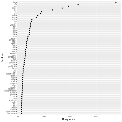
Grammatical/Function words
The chart shows us that the most commonly used words in the speech as a whole are similar to the common English words we saw repeated in the final sentences.These words are known as grammatical or function words and are the most commonly used in a language. They seldom change over short periods of time.
For this reason, grammatical and function words are on lists of words to be excluded from frequency counts. These lists are known as “stop words”
Lexical words
By contrast, the frequencies of the lexical words in Mandela’s speech (“African”, “ANC”, “Africans”, “people”, “political”, “umkhonto”, “Africa”, “white”, “South”,“violence”, “government”,“policy”,“against”,“communist”) give far more clues if we’re interested in what this specific text or corpus is about.
Defining stopwords
We can start identifying these important lexical words by excluding common English words from our analysis:
R
## exclude common english words
mystopwords <- stopwords("english",
source="snowball")
str(mystopwords)
OUTPUT
chr [1:175] "i" "me" "my" "myself" "we" "our" "ours" "ourselves" "you" ...R
mystopwords
OUTPUT
[1] "i" "me" "my" "myself" "we"
[6] "our" "ours" "ourselves" "you" "your"
[11] "yours" "yourself" "yourselves" "he" "him"
[16] "his" "himself" "she" "her" "hers"
[21] "herself" "it" "its" "itself" "they"
[26] "them" "their" "theirs" "themselves" "what"
[31] "which" "who" "whom" "this" "that"
[36] "these" "those" "am" "is" "are"
[41] "was" "were" "be" "been" "being"
[46] "have" "has" "had" "having" "do"
[51] "does" "did" "doing" "would" "should"
[56] "could" "ought" "i'm" "you're" "he's"
[61] "she's" "it's" "we're" "they're" "i've"
[66] "you've" "we've" "they've" "i'd" "you'd"
[71] "he'd" "she'd" "we'd" "they'd" "i'll"
[76] "you'll" "he'll" "she'll" "we'll" "they'll"
[81] "isn't" "aren't" "wasn't" "weren't" "hasn't"
[86] "haven't" "hadn't" "doesn't" "don't" "didn't"
[91] "won't" "wouldn't" "shan't" "shouldn't" "can't"
[96] "cannot" "couldn't" "mustn't" "let's" "that's"
[101] "who's" "what's" "here's" "there's" "when's"
[106] "where's" "why's" "how's" "a" "an"
[111] "the" "and" "but" "if" "or"
[116] "because" "as" "until" "while" "of"
[121] "at" "by" "for" "with" "about"
[126] "against" "between" "into" "through" "during"
[131] "before" "after" "above" "below" "to"
[136] "from" "up" "down" "in" "out"
[141] "on" "off" "over" "under" "again"
[146] "further" "then" "once" "here" "there"
[151] "when" "where" "why" "how" "all"
[156] "any" "both" "each" "few" "more"
[161] "most" "other" "some" "such" "no"
[166] "nor" "not" "only" "own" "same"
[171] "so" "than" "too" "very" "will" It’s always a good idea to look carefully at what stopwords are being removed. In this case, notice that pronoouns (e.g. “us” and “them”) as well as negative terms (“not” or “no”) are on the stoplist. These could be important for understanding discourse around collective identity, and so we may want to come back to add or remove words from the list at a later stage.
Removing stopwords
After removing stopwords from the DTM using the function
dfm_remove() we can chart frequencies for the most common
lexical words used in the Rivonia speech.
R
d <- d %>%
dfm_remove(mystopwords)
tstat_freq_d <- textstat_frequency(d, n = 60)
feature_freq <- ggplot(tstat_freq_d, aes(x = frequency, y = reorder(feature, frequency))) +
geom_point() +
labs(x = "Frequency", y = "Feature")
feature_freq
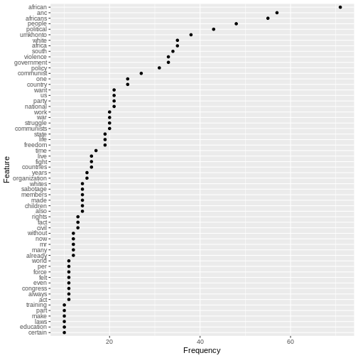
Once the grammatical/function words have been excluded with the stopword list, the frequency chart shows more clearly what the speech was about.
Before we start to make sense of these word frequencies in Mandela’s speech, we should pause briefly and reflect on an important concept in computational analysis of text, namely frequency.
Using Word Frequencies to Analyse Text
Frequency is a key concept underpinning the analysis of text and corpora. As a purely quantitative measure, media researchers need to use word frequencies with a sensitivity to the word-distribution patterns in human languages, and the importance of context for meaning
Word frequency lists are an important starting point and can help direct an investigation. We combine them with measures of dispersion, which are used to reveal trends across texts. For example, certain linguistic patterns may occur more often at the beginning or ends of texts.
At the same time, frequencies can be reductive and generalising. If we’re interested in meaning it’s important not to oversimplify. Focusing only on general patterns and individual word distributions without paying attention to context can obscure what is going on in a text.
Why is frequency important?
Language is not a random affair - it is rule based. Words are likely to occur predictably in relationship to other words.
At the same time, human beings use language creatively and people can make many choices about how they want to use language. Language has rule-generating qualities which is why it changes over time and varies depending on the context where it is used.
The relationship between frequency and ideology
Media studies builds on the insights of discourse analysis and corpus linguistics, which have sensitised researchers to the ideological implications of the words people choose to use.
“If people speak or write in an unexpected way, or make one linguistic choice over another, more obvious one, then that reveals something about their intentions, whether conscious or not.” (Baker:48)
Wordclouds and visualisation
Wordclouds are a popular visualisation format for frequencies because they allow us to focus on meanings.
R
topfeatures(d)
OUTPUT
african anc africans people political umkhonto africa white
71 57 55 48 43 38 35 35
south violence
34 33 R
textplot_wordcloud(d, max_words=100)

We notice the duplication of related words, such as “africa”,
“african” or “africans”. It is possible to combine these by using by
using the tokens_wordstem() function, which will reduce all
words to their stems.
R
topfeatures(d)
OUTPUT
african anc africans people political umkhonto africa white
71 57 55 48 43 38 35 35
south violence
34 33 R
d <- d_corpus %>%
tokens(remove_punct = T, remove_numbers = T) %>%
tokens_wordstem()%>%
dfm() %>%
dfm_remove(mystopwords)
textplot_wordcloud(d, max_words=100)

Exercise
How would you go about using quanteda functions to study linguistic choices in the inaugural speech given by Mandela when he became President on 10 May 1994?
R
d <- speeches %>%
mutate(doc_id=paste(lubridate::year(date), president, delivery)) %>%
filter(lubridate::year(date) == "1994" ) %>%
corpus() %>%
tokens(remove_punct=T) %>%
dfm() %>%
dfm_remove(mystopwords)
topfeatures(d)
OUTPUT
us world people country peace human south let freedom never
9 8 8 6 6 5 5 5 4 4 R
textplot_wordcloud(d, max_words=20)
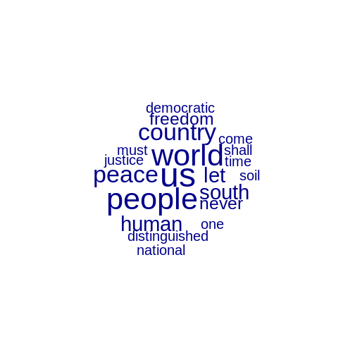
Exercise (continued)
The most frequent word in the 1994 speech is “us”. Edit the stopword list to check for frequency of other pronouns which may be used to construct a group identity.
R
## edit the list of stopwords
mystopwords <- mystopwords[! mystopwords %in% c('we', 'they', 'i')]
d <- d_corpus %>%
tokens(remove_punct = T, remove_numbers = T) %>%
dfm() %>%
dfm_remove(mystopwords)
textplot_wordcloud(d, max_words=20)

Exercise (continued)
What are the pros and cons of using ggplot and textplot_wordcloud to represent textual data?
Using a wordcloud
Pro: The wordcloud allows quick exploration of the meaning of a speech.
Con: Wordclouds can give undue emphasis to long words.
Using a ggplot feature-frequency chart
Pro: The frequency plot using ggplot allows for precise comparisons and shows the exact frequency for each word.
Con: As a visualisation a frequency plot is not as intuitively read for meaning.
Using any visualisation of simple frequencies
Wordclouds and frequency plots both rely on simple frequency counts, which don’t handle negatives well e.g. (“not violent” vs “violent”) and also split up multi-word concepts like “south africa”.
Key Points
- Use the
quantedapackage to analyse text data. - Use
corpus(),tokens(),dfm(),dfm_remove()and stopword lists to prepare text for analysis. - Use
textstat_frequencyto investigate the most frequently used tokens or features in a dfm. - Plot frequencies using
ggplotand thequantedafunctiontextplot_wordcloud.
